It is 2 a.m., and you are just one step away from purchasing the phone of your dreams, but a technical issue on the website is preventing you from applying the promo code. You may hesitate and refrain from making an impulsive purchase. Therefore, every organization makes sure that the checkout process is flawless and customers can easily complete the process. The checkout process is an integral part of every organization, and it should be inclusive. In our blog, we will explore the various factors that result in non-compliance with the checkout process and the ways to fix it.
Table of Contents
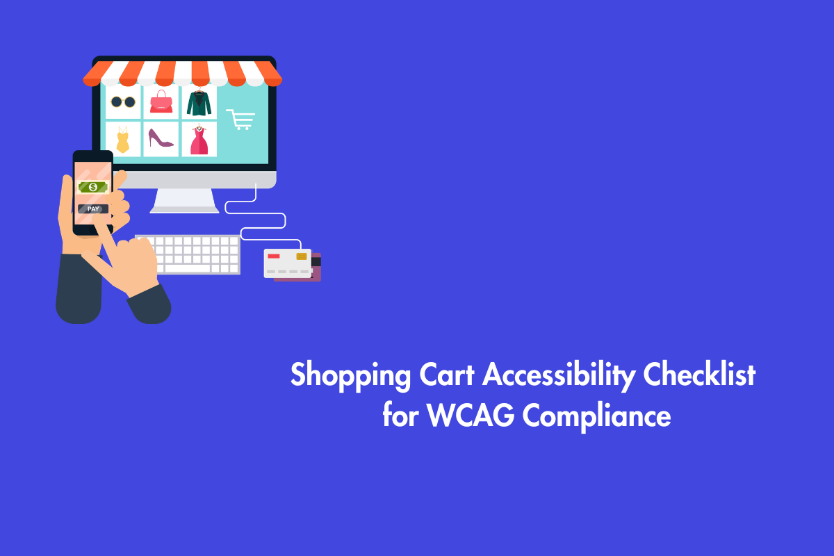
What is shopping cart accessibility?
It means people using assistive technology can review their cart, update items, apply discounts, and finish checkout without relying on visual cues. If any part of that flow breaks, they can’t complete the purchase on their own. Most accessibility issues show up in the cart, not the product pages. The cart is where things constantly change, messages appear, and multiple actions happen at once, which makes it harder to get right.
To help you understand the barriers, we have divided them into four categories:
- Screen Reader barriers
- Keyboard-only barriers
- Cognitive overload
- Smartphone Barriers
Shopping in the Dark: Screen Reader Barriers
For screen reader users, the shopping cart often presents insurmountable barriers that make the shopping experience unpleasant:
1. Unlabeled Action Buttons
Modern shopping carts include utility buttons like “Delete” and “Change Quantity,” but developers often neglect to add appropriate aria-labels. This oversight leads to problems for blind shoppers using screen readers, which either skip these unlabeled buttons or provide unhelpful file names, preventing users from modifying their cart contents effectively.
2. Missing Variant Information
When a product has a lot of variants, then the website should ensure that users have all the information during the checkout process. For example, usually apparel, cosmetics, etc., come in various colors, sizes, and shapes. So, if a user is buying a red shirt of size 32 (UK), the screen reader should be able to relay this information to the user to confidently modify (if needed) or purchase it. Furthermore, any status changes such as “out of stock,” etc. should not rely only on visual banners to update users.
3. The Promotion Code Trap
Designers often create visually appealing promotion code fields that lack standard HTML structure, making them undetectable by screen readers. This prevents shoppers from applying discounts. In other cases, the input field is present, but screen readers do not provide auditory feedback of the typed text, leaving users uncertain about typos or code issues.
Additionally, some websites have this feature of activating the “Apply” button rather than being automatic. Screen reader users should be informed whether the promo code is applied to the product or not.
Nowadays, buy now, pay later (BNPL) services like Klarna are massively popular across the US, UK, and European markets. These options are seamless ways to purchase products faster. Although these options are a boon to visual users, they need to be inclusive.
Keyboard-Only Roadblocks: Traps and Navigation
Many users often rely entirely on a keyboard to navigate the web. Here are some barriers associated with keyboard navigation:
1. The Keyboard Trap
Many websites often have these pop-up discounts such as “ Wait! Sign up for our newsletter to save 10%”. However, when these pop-ups are not properly designed, the keyboard users might not be able to close it. Therefore, developers need to provide a keyboard-accessible close button.
2. Illogical Tab Order
Messy HTML structures sometimes result in creating an illogical tab order that might be chaotic and may force users to abandon the transaction. The keyboard navigation must always follow a logical and visual flow.
3. Focus Indicator
The focus indicator is basically the keyboard user’s cursor. It shows them where they are on the page. Just like you wouldn’t hide a mouse cursor, you shouldn’t hide the focus indicator.
Cognitive Overload: Timeouts and Error Messages
Shopping carts not having a clear, predictable interface may make it difficult for users with cognitive impairments to get through with the purchase.
Here are some common barriers that you can avoid with clear planning:
1. Stress-Inducing Session Timeouts
Avoid using countdown timers during the checkout process, as it might create anxiety for cognitively impaired users. WCAG guidelines strictly require websites to allow users to turn off, adjust, or extend these time limits. Additionally, when an order fails, checkouts must provide clear, text-based error messages that explain exactly why it happened and how to fix it.
2. CAPTCHAs
CAPTCHAs can stop bots, but they often block real shoppers too. Only use them if necessary, and avoid image puzzles. Choose options that work with keyboards and screen readers, or you risk losing the sale.
3. Complex, Unmarked Progression
Multi-step checkouts often lack clear progress indicators. Users need to know exactly where they are in the process (e.g., “Step 2 of 4: Shipping Information”). When checkouts hide this information or introduce surprise-hidden fees at the final screen, users become disoriented and lose trust in the platform.
4. Visual Impairment
Good design makes things clear at a glance.
Here are a few ways to do that:
- Designers frequently use color alone to indicate important meanings, such as marking required fields in red, which is ineffective for individuals with color blindness.’
- Minimalist design trends often favor low-contrast text, such as light gray on white backgrounds, which fails to meet WCAG contrast ratio requirements.
- High contrast is essential, especially for shoppers using mobile devices in bright conditions. Accessibility standards require the use of additional visual indicators alongside color cues (e.g., asterisks or icons) to clarify form requirements.
The Smartphone Barriers
Mobile commerce accounts for a massive portion of online sales across the US, Canada, and Europe, yet mobile checkouts introduce a unique set of accessibility failures.
Inadequate Touch Targets: Mobile checkouts often feature tiny checkboxes for “Billing address same as shipping” or small “X” icons to remove items. Users with motor tremors struggle to activate these small targets accurately. WCAG requires touch targets to be at least 44 by 44 CSS pixels.
Orientation Locks: Many users with disabilities mount their tablets or smartphones to wheelchairs in a fixed landscape orientation. Some eCommerce websites force the checkout screen to display only in portrait mode, forcing the user to read text sideways. Responsive design must adapt to the user’s preferred orientation.
The Illusion of Automated Accessibility Testing
Automated tools are still evolving and are far behind when it comes to detecting all the accessibility issues (they can only identify up to 40% of issues). The core reason behind it is that these tools lack human context.
For example, if an image has alt text that reads ”Image 456.jpg”, the tool cannot distinguish that the alt text is wrong. It can only check whether the alt attribute is provided or not. Fortunately, as AI is evolving, these tools are becoming better at identifying and reviewing images based on context. However, it is essential that alt-text always goes through a manual check before publishing to ensure there are no errors.
Here is a table listing out some common differences between automated tool scans and real human experience:
| Feature Tested | What the Automated Tool Sees | What the Human Shopper Experiences |
| Checkout Buttons | Detects a <button> tag and passes the page. | Encounters an unlabeled icon and hears “Button, Unlabeled.” |
| Form Fields | Sees <input> tags with placeholder text. | Loses context when placeholder text vanishes upon typing. |
| Error Messages | Verifies the presence of red text on the screen. | Hears nothing, as the screen reader does not announce the error. |
| Pop-ups | Reads the HTML structure of the modal window. | Becomes physically trapped inside the modal using only a keyboard. |
Conclusion
Shopping cart accessibility issues are often easy to miss, but they can quietly cost you sales. Here’s a quick summary of our post to pore through why creating a checkout that works for everyone takes more than just running an automated scan:
- Real-world checkout accessibility fails when screen readers encounter unlabeled action buttons, missing product variants, and silent cart updates.
- Assistive technology users hit dead ends when custom promo code fields and third-party payment logos lack proper semantic coding.
- Meanwhile, keyboard-only shoppers abandon transactions when caught in pop-up traps, invisible focus indicators, or chaotic tab orders.
- Checkout designs further alienate users through cognitive and visual barriers like stress-inducing countdown timers, CAPTCHAs, vague error messages, low-contrast text, and form instructions that rely solely on color.
- Mobile carts actively block purchases with tiny touch targets and forced screen orientations. Ultimately, true accessibility requires human-led testing to ensure every shopper can independently navigate your cart, review their items, and confidently complete their purchase.
- Finally, automated accessibility scanners only catch surface-level code errors; they completely miss the dynamic workflow failures of a live checkout. To achieve true WCAG compliance and capture every sale across the US, Canada, and Europe, you must look beyond the algorithm.
Hopefully, our blog answers all your questions related to accessibility in the checkout process. If you need assistance to make your website accessible, our experts at AEL Data can help you.