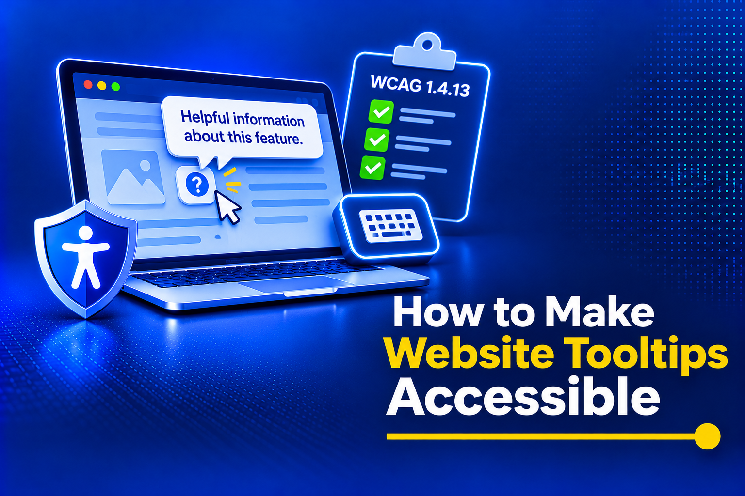
Tooltips are the heroes without capes in the design-verse. They help developers to enclose dense information such as definitions, hints, etc., about an element and still maintain a clean user interface. You can find these hints behind a small question mark icon. Users can hover around it and get the complete information. However, since it requires hovering, it may not be accessible to everyone. Most CSS tooltips are usually inaccessible to assistive technology users. The most accessible way to build them is with the aria-describedby attribute, which connects a UI element to a helpful description that screen readers can announce when users interact with it. It’s a simple attribute, but it makes tooltips much more useful for people using assistive technologies.
In this blog, we’ll explore how to make your tooltips accessible by following accessibility compliance guidelines and implementing code patterns that work for you.
Table of Contents
Role of a Tooltip in Accessibility
When tooltips are clear and placed well, they make navigation smoother without covering important content. They’re especially helpful for people with cognitive disabilities, offering extra context to understand icons, buttons, and other interface elements. For example, a tooltip can remind someone what an unfamiliar icon does. But when a tooltip is vague, hard to find, or poorly positioned, it creates confusion and frustration, and users may abandon the task altogether.
Top Three Tooltip Accessibility Failures
Accessibility audits consistently flag tooltips for the exact same implementation errors. To build a compliant component, you have to understand how standard UI practices actively break the experience for people using assistive tech.
1. Hover-Only Activation
The most pervasive error is tying a tooltip’s visibility exclusively to the CSS “:hover” pseudo-class or JavaScript “mouseenter” events. This assumes every user navigates with a highly precise mouse.
For users with motor limitations who rely on keyboards, switch devices, or voice dictation, a mouse isn’t part of the workflow. They navigate sequentially by pressing the Tab key. If a tooltip only triggers on hover, the keyboard focus ring will jump right over the element. The user remains entirely unaware that crucial context exists, creating an unequal digital experience.
2. The Native Title Attribute Trap
Many developers attempt a “quick fix” by using the native HTML `title` attribute, which provides additional information about an HTML element, assuming browsers and assistive tech will handle the accessibility automatically. This is a critical failure. The “title” attribute is notoriously unreliable.
Screen readers process it inconsistently. Some ignore it entirely to prevent audio clutter; others read it twice, causing severe cognitive friction. More importantly, the native `title` attribute cannot be triggered via keyboard focus in most major browsers. If you put a title attribute on an icon, a sighted keyboard user tabbing onto that icon will see absolutely nothing. Relying on this attribute provides a false sense of security and almost guarantees an audit failure.
3. Inaccessible Content (The Toggletip Confusion)
Strictly speaking, a tooltip is a short static text part that explains the functionality of the control it is attached to.
In reality, it’s common for the developers to fill the tooltip container with all sorts of interactive elements: hyperlinks, buttons, etc. This turns it into a form of a “dropdown” or “popover” (more correctly called a “toggletip” in this case). Toggle elements require a very complex set of focus-trapping scripts. These scripts allow a screen reader user to safely move focus into the tooltip. They also help in safely interacting with any links inside the tooltip and move on to interactive elements on the webpage. Therefore, combining these two functions (tooltip and toggletip) is a recipe for disaster.
Other Challenges
Building accessible tooltips is all about balancing good design with good usability. A tooltip should look clean and fit your interface, but it also needs to work for people using screen readers, keyboards, touch devices, or other assistive technologies. Fancy styling, low-contrast colors, or hover-only interactions may look polished, but they can make tooltips difficult or impossible to use. The goal isn’t to choose between aesthetics and accessibility. It’s to design tooltips that are both visually appealing and easy for everyone to discover, read, and interact with using patterns like aria-describedby or aria-labelledby where appropriate.
Demystifying WCAG 1.4.13: Content on Hover or Focus
Under WCAG 2.1, Success Criterion 1.4.13 brings stringent legal requirements for pop-ups, tooltips, and hidden content. To achieve compliance, any content that appears on hover or focus must meet three non-negotiable conditions.
1. Dismissible (The Escape Key Rule)
A user must have the ability to dismiss the tooltip without moving their pointer or shifting their keyboard focus. This rule exists primarily to protect individuals using screen magnification software.
When a user magnifies their screen to 400%, a tooltip can suddenly cover their entire viewport, obscuring the primary content. If they have to move their mouse to dismiss it, they risk triggering other tooltips or losing their place. Developers must implement a global JavaScript listener that immediately hides the active tooltip when the user presses the `Escape` key, restoring their view while keeping focus firmly on the original trigger element.
2. Hoverable (The Safe Triangle)
A user must be able to move their mouse pointer from the trigger element into the tooltip container itself without the tooltip disappearing.
This is critical for users with hand tremors or fine motor control challenges. If a user tries to move their cursor over the text to read it more clearly, a poorly coded tooltip will vanish the microsecond the cursor leaves the trigger button. You must build a “safe triangle” or “pointer tunnel” in your CSS/JS to allow the mouse to transit from the button to the pop-up without firing a `mouseleave` event that prematurely closes the container.
3. Persistent
The tooltip must remain visible until the user explicitly dismisses it (via Escape key), removes their keyboard focus, or moves their mouse pointer completely away.
Never use arbitrary JavaScript timeouts (e.g., setTimeout) to automatically hide a tooltip after a few seconds. People with cognitive disabilities, dyslexia, or those reading in a non-native language require varying amounts of time to process information. Forcing a tooltip to vanish while the user is actively engaged with it violates the persistence rule and causes massive frustration.
Building A WCAG-Compliant Tooltip
Building a compliant tooltip requires semantic HTML for structure, CSS for presentation, and JavaScript for robust state management.
Semantic HTML and aria-describedby
Create a programmatic bridge between the hidden content and the trigger and refer to it in the ARIA attributes. Floating boxes next to buttons are not visible to assistive technologies.
Assigning aria-describedby to the interactive element (in this case, the button) to the “id” of the hidden element that contains the text to read (in this case, the floating rectangle) is standard practice for building such programmatic bridges.
- The Trigger: Since a button element is used for the trigger, it automatically receives focus by default. Using a span or div element to create the trigger would require specifying “tabindex=0” on it, and then write custom event handlers for focus/activate as well as for key down events.
- The Container: The element that contains the text should be assigned the role “role=”tooltip”” in order to make the Accessibility Semantics clear for assistive technologies and also inform users of how the function of the tooltip works.
Screen readers read the Trigger element first (announcing its name). They then pause for a moment before reading the additional supplementary information contained in the Tooltip element, which has been connected to the Trigger element.
Managing State with JavaScript
Because CSS alone cannot handle the Escape key dismissal requirement, you must manage the tooltip’s state using JavaScript.
To ensure parity between mouse and keyboard users. You need to bind your listeners for mouseenter and focus to show elements, while mouseleave and blur are used to hide them.
When these events fire, use JS to toggle a CSS class or the aria-hidden attribute on the container. Whenever the tooltip is visible, attach the global `keydown` listener for the Escape key.
Mobile & Touch Support: Surviving Without Hover
Touchscreens do not have a native hover state. If a tooltip relies purely on hover mechanics, a mobile user tapping the trigger might immediately activate a link or submit a form without ever seeing the supplementary info.
You must convert hover-based tooltips into tap-to-toggle elements for mobile. The Trigger element should intercept the initial touchstart or click event to display the tooltip, rather than executing its primary action. A secondary tap anywhere outside the tooltip should dismiss it.
In addition, inclusive tooltips are clear, easy to read, and easy to access for everyone. Keep the text short, descriptive, and free of jargon to reduce cognitive load. Use sufficient color contrast that meets WCAG 2.1 AA, choose legible fonts and readable text sizes, and position tooltips so they don’t cover important content. Most importantly, make sure they work with keyboard navigation as well as mouse and touch interactions, so every user can access the same information.
Manual Testing Your Tooltips
Automated accessibility scanners are great for catching missing ARIA attributes, but they cannot verify human interaction flows. Guaranteeing compliance requires manual QA testing. Use this strict checklist:
- Unplug the Mouse: Use only the Tab key. Does the tooltip appear when the trigger receives focus? Does it disappear when you tab away?
- Test the Escape Route: While the tooltip is visibly focused via the keyboard, press Escape. The tooltip must vanish immediately, but the focus outline must remain perfectly locked onto the trigger button.
- Verify the Safe Triangle: Reconnect the mouse. Hover over the trigger to reveal the tooltip, then slowly move your cursor into the text of the tooltip itself. If the pop-up disappears before your cursor reaches the text, your CSS positioning or JS timing requires adjustment.
- Listen to the Output: Turn on VoiceOver or NVDA. Tab to the Trigger element. The software should announce the primary button text, followed cleanly by the hidden tooltip text. If it reads raw HTML or stutters endlessly, your “aria-describedby” configuration is broken.
Conclusion
Web accessibility is rarely about solving a problem for a single demographic. It’s about elevating the baseline quality of the product. The technical rigor required to build a WCAG-compliant tooltip fundamentally creates a more resilient UI component. By abandoning the flawed `:hover` and `title` attribute shortcuts, development teams protect their organizations from compliance liabilities while drastically reducing friction for all users.
Tooltips may be small, but they’re one of the easiest UI components to get wrong from an accessibility perspective. While they help keep interfaces clean by revealing hints, definitions, or extra context on demand, hover-only tooltips exclude keyboard users, touch users, and many people using assistive technologies.
Reach out to us at AEL Data today to understand better.