“Turn off, turn off, turn off..”, you hear everyone screaming when you enter your new office. Puzzled, you ask what is happening. They tell you that there was a data breach, and since all computers are voice-activated, they can only switch it off by saying “Turn off!”. Sounds ridiculous, right? Voice-activated systems are unnecessary when there is already a better solution: physical buttons/ switches. People with disabilities go through a similar exhaustive experience when organizations sprinkle aria-label to make their code accessible.
Remember the golden rule of Accessible Rich Internet Applications (ARIA): No ARIA is better than bad ARIA. Hence, you don’t need to use it when there is already a perfectly created HTML element like <button>, <nav>, etc. The aria-label is a highly powerful tool that can bridge programmatic gaps when visual context is missing. ARIA (Accessible Rich Internet Applications) adds information to web elements so screen readers and other assistive technologies can understand custom or dynamic UI components when HTML alone is not enough. Using ARIA labels correctly gives interactive elements clear, accessible names. When used incorrectly, they can make websites less accessible for people with disabilities.
In this blog, we will help you avoid misusing the label and create an inclusive experience for all users.
Table of Contents
The Mechanics of the Accessible Name
To use aria-label safely, you have to understand the W3C Accessible Name and Description Computation logic. When a screen reader parses a webpage, it ignores the visual CSS layer entirely and reads the Accessibility Tree, a parallel DOM built by the browser specifically for assistive tech.
An accessible name is the label that screen readers and voice control software use to identify buttons, links, form fields, and other UI elements. It tells users what an element does and helps them interact with it.
When the browser encounters an element, it runs down a strict, uncompromising hierarchy to calculate its Accessible Name (the exact string the screen reader will announce).
- aria-labelledby: Does the element point to the ID of another element? If yes, it pulls that text. (Highest priority).
- aria-label: Does the element feature an explicit string inside an aria-label? If yes, it uses that string.
- Native Content: Does the element contain visible text nodes (e.g., ‘<button>Submit</button>’) or an associated native ‘<label>’?
You can check an element’s computed accessible name and role in Chrome DevTools. WCAG 2.5.3 recommends keeping visible text as part of the accessible name. If you use ARIA, make sure the accessible name still includes the text users see on the screen.
Aria-label vs. Aria-labelledby
While both attributes provide accessible names, their core mechanics are completely distinct.
Aria-label: It is used exclusively when the text you want the screen reader to announce does not exist visually anywhere on the screen. Use aria-label to provide an accessible name when no visible label or aria-labelledby reference is available.
HTML:
<button aria-label="Close modal">X</button>Aria-labelledby: It is used to programmatically tie two elements together, ensuring the visual UI matches the screen reader experience perfectly. Usually, aria-label becomes the primary accessible name for an element when it is present.
HTML:
<section aria-labelledby="billing-header">

    <p>Visa ending in 5485</p>

    <p>Next billing date: December 1st</p>

</section>
Whenever possible, prefer aria-labelledby. It keeps your visual layout and your accessibility tree perfectly synchronized, making localization, translation, and long-term maintenance drastically easier.
Use Cases
So, if HTML is always a better option, why do we need aria-label? Here are our top 3 examples to help you understand where the label usage is allowed.
Icon-Only Buttons
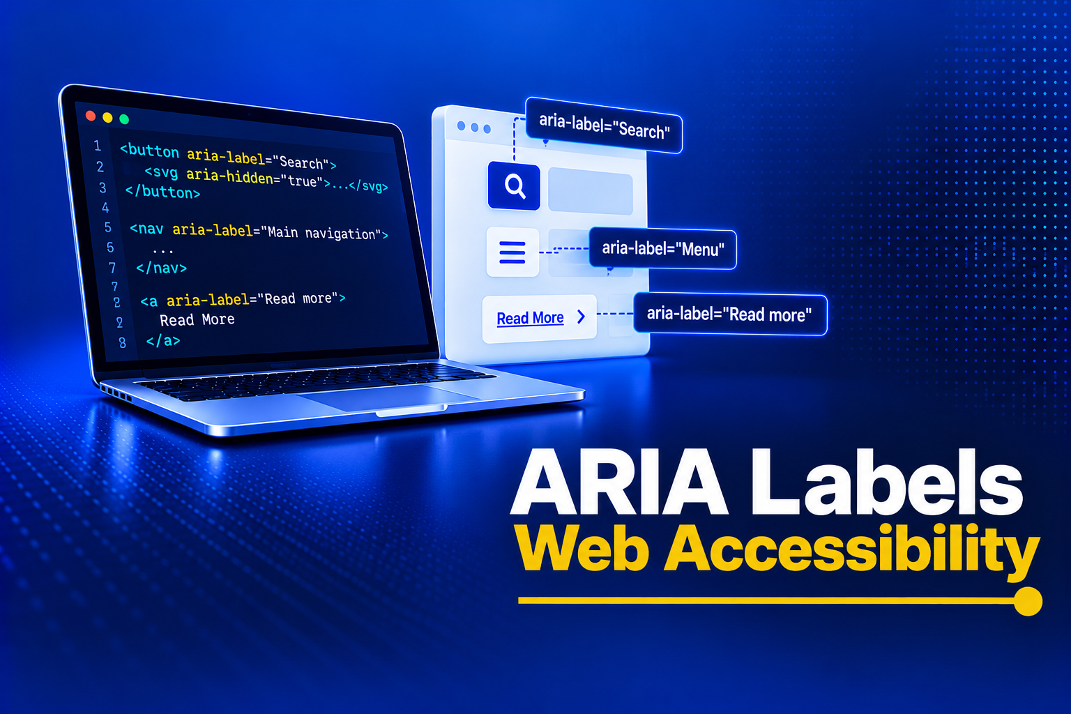
Modern UI favors minimalism, frequently deploying standalone icons for actions without accompanying text. It is like a magnifying glass for a search bar, a trash can for a delete action, or a hamburger menu icon. Icon-only buttons look clean, but icons don’t automatically have meaning for screen readers. If a button has no visible text, it needs an accessible name so assistive technologies can announce what it does.
Example, :
HTML:
<button><svg class="icon-search" ...></svg></button>

A screen reader will announce it as an "Unlabelled button," leaving the user completely stranded.

HTML:

<button aria-label="Search the website"><svg aria-hidden="true" ...></svg></button>
Note: Always pair this with ‘aria-hidden=”true”‘ on the underlying SVG. This stops the screen reader from trying to parse the raw vector paths, ensuring a clean, single announcement.
Disambiguating Identical Links
Many e-commerce websites, blogs, etc. websites have generic links that say “Buy Now”, “Read More,” etc. Screen reader users may find it difficult to navigate as the software clubs all links together as a list. The users will just hear “ Buy Now, Read More” and without context it will not make any sense to them.
HTML:
<a href="/article-123" aria-label="Read more about React Performance Optimization">Read More</a>The sighted user sees a clean, minimalist card; the screen reader user gets the critical context they need to navigate.
Landmark Navigation Distinctions
HTML5 landmark tags such as <nav>, <header>, and <footer>, allow users to jump through page structures efficiently. However, complex applications often feature multiple navigation menus on a single page (e.g., a primary header menu, a sidebar table of contents, and a footer link farm). If you use ‘<nav>’ three times without a differentiator, the screen reader announces “Navigation, Navigation, Navigation.” You must distinguish them:
HTML:
<nav aria-label="Primary site">...</nav>

<nav aria-label="Table of contents">...</nav>

<nav aria-label="Footer links">...</nav>
Fatal Mistakes That Break WCAG Compliance
The road to non-compliance is paved with well-intentioned ARIA attributes. Even senior engineers make catastrophic errors that leave the interface worse than if they had left it alone.
Violating WCAG 2.5.3 (Label in Name)
Success Criterion 2.5.3 Label in Name (Level A): For user interface components with labels that include text or images of text, the name contains the text that is presented visually.
A best practice is to have the text of the label at the start of the name.
HTML:
<button aria-label="Update tax document details for John Doe ">Edit</button>Aria-label has a higher hierarchy over native text content. Therefore, in the above HTML code, screen reader users will hear “Update tax document details for John Doe” rather than the “Edit” button. This may cause confusion among users with visual impairments, as visual and auditory information don’t match.
The <div> and <span> Trap
Remember the aria-label is not a magic wand that makes a generic block element into an accessible control.
Screen readers often ignore aria when the elements are non-interactive and non-semantic as <div> has no inherent role for a screen reader. For screen readers to understand their role, the labels should have an interactive role with accessible keyboard support.
Therefore, instead of using:
HTML:
<div class="custom-button" onClick={submit} aria-label="Submit Form">Submit</div>Prefer using:
HTML:
<div role="button" tabIndex="0" onClick={submit} aria-label="Submit Form">Submit</div>Redundant Semantics on Native Controls
Avoid using ARIA when items are already programmatically linked.
For example
HTML:
<label for="email">Email Address</label>

<input type="email" id="email" aria-label="Email Address" placeholder="Enter email" />
Since <input> is already explicitly linked to the <label>, adding the matching aria-label forces the screen reader to stutter. It will announce: “Email Address, Email Address, edit text, Enter email.”
Trust the native HTML. If you have a valid, visible visual label, you do not need an aria-label.
Testing ARIA Labels
Use both automated tools and manual testing to make sure ARIA labels work as expected. Chrome DevTools and Lighthouse can catch common issues like missing or incorrect accessible names, while a quick screen reader test with NVDA, VoiceOver, or TalkBack helps confirm that labels are announced clearly and match visible text. Stick to native HTML whenever possible, keep accessible names short and meaningful, use aria-labelledby for visible labels and aria-describedby for extra instructions, and avoid unnecessary or conflicting ARIA labels.
Conclusion
aria-label is a powerful accessibility tool, but only when it’s used in the right place. Native HTML elements already provide accessible names and behavior, so adding ARIA unnecessarily can make the experience worse for screen reader users. One of the popular reasons the experts tell you to avoid aria-labels is that it’s difficult to identify these errors with automated tools like Google Lighthouse, etc.
Accessibility experts often advise against overusing aria-labels, as it is not easily detected by automated tools like Google Lighthouse, WAVE, etc. Although these scanners are brilliant in identifying errors like missing alt text, poor color contrast, etc.,they can only tell you whether an aria-label is present, not whether it is an accessibility error. Use aria-label only when visual text is missing, test with a screen reader, and remember: No ARIA is better than bad ARIA.
For example, if you write <button aria-label=”Pineapple”>Submit Form</button>, the tools will not flag it as an accessibility error. In reality, screen readers will announce “Pineapple” when users come across the submit button. Therefore, always get your website audited by accessibility experts before going live.
The aria-label attribute is a vital asset when handling icon-only actions, disambiguating repeating feeds, or mapping multiple landmarks. But only its capacity for destruction matches its capability. We hope our blog helped you understand the importance of using aria labels in the right places without overusing it. When in doubt, test with a screen reader and include manual accessibility reviews alongside automated scans. A small ARIA attribute can make a big difference, but only when it’s used thoughtfully. Reach out to us at AEL Data to help you better.