In the current digital scenario, where smartphones, tablets, and various devices are everywhere, websites must adjust and serve users on different platforms. Enter responsive web design, a pivotal element in this dynamic scenario.
It ensures that websites offer seamless access, user-friendly interfaces, and visually appealing designs, irrespective of the device in play. Now, let’s delve into the compelling reasons why every website should embrace the essence of responsive design.
Table of Contents
- 1 Creating a Smooth User Experience with Adaptive Design
- 2 Building Responsive, Accessible Web Designs
- 3 Mobile Optimization and Accessibility
- 4 Increasing Website Speed with Image Optimization
- 5 Testing Responsive and Accessible Websites
- 6 Web Trends: Accessibility, 5G Growth, and SEO Strategies
- 7 Adapting Your Website for Lasting Impact
Creating a Smooth User Experience with Adaptive Design
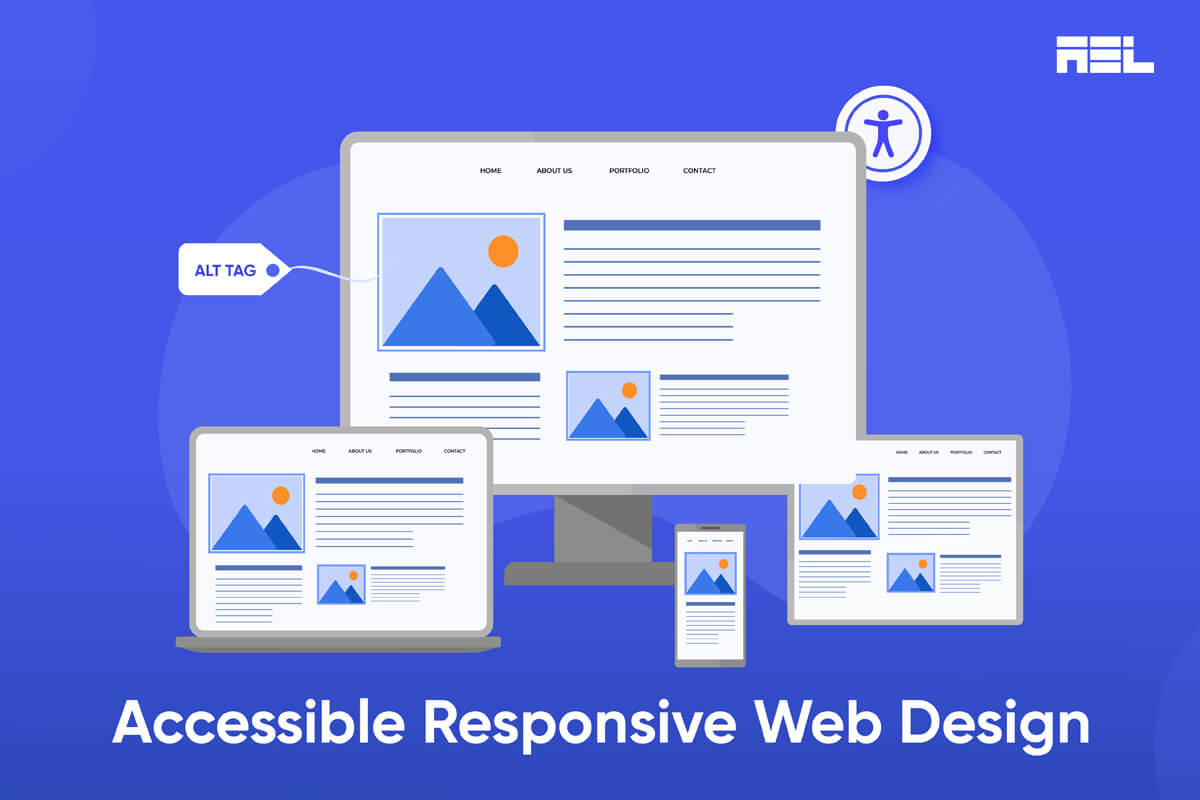
Ever heard of responsive web design (RWD)? It’s not just tech jargon; it’s the art of inventing web pages that feel like they were made just for your device. Imagine layouts that effortlessly adjust to everything from roomy desktop monitors to the cozy confines of mobile phone screens.
No more awkward resizing or endless scrolling—just smooth reading and navigation. Instead of developing separate sites for different devices, RWD empowers designers to create a single site that adapts to each accessing device, providing the appropriate display.
By adopting a responsive design, we automatically comply with WCAG Success Criterion 1.4.4: Resize Text, which emphasizes the importance of readable and functional pages even when the text size is doubled.
Building Responsive, Accessible Web Designs
When creating a website for your business, it’s crucial to know that the majority of browsing in 2024 will occur on mobile phones. Responsive design becomes crucial, adjusting your site’s architecture to the size and connection speed of smaller devices like mobiles.
Utilize Flexible Layouts
Employ adaptable layouts that adjust to available space and screen orientation. Avoid absolute dimensions like pixels, opting instead, for relative units like percentages or ems. CSS grid layouts and Flexbox also aid in creating dynamic and responsive grids. This ensures fluid and consistent designs across various devices.
Select Suitable Fonts
Typography styles and size impact accessibility and readability. Choose clear, legible fonts like Sans Serif based fonts that are compatible with different browsers. Font size is also an important factor. You don’t want the size too small, making it difficult for regular users to read. Take senior citizens for example. They may not use browser resizing or zoom magnification software like low-vision users, but they will benefit from a big, legible font size. This is where WCAG 1.4.4. comes into play along with 1.4.12 Text Spacing.
Touch Navigation
Ensure your website is navigable upon resizing or on smaller screens. Design a clear and logical structure using semantic HTML elements. Use CSS to define effective padding and margins and ensure all the elements fit within the screen with no overflow. Optimize for touch by employing enough space between elements so that they can be activated easily without accidentally touching the adjacent element. Hover effects and pop-ups may also be challenging on touch devices and should be used cautiously.
Mobile Optimization and Accessibility
The rise in mobile device usage emphasizes the importance of optimizing websites for mobile accessibility. According to Statista, over half of worldwide website traffic starts on mobile devices.
Overlooking responsive design translates to missing out on many potential visitors. Responsive websites prioritize the requirements of mobile users, ensuring a flawless and enjoyable browsing experience.
Modern mobile devices exhibit good accessibility and support for web standards. Gone are the days when mobile devices operated on entirely different web technologies than desktop browsers, leading developers to create separate sites.
Today, mobile devices can handle fully featured websites, and major platforms have built-in screen readers that aid visually impaired users. Modern mobile browsers also offer strong support for WAI-ARIA.
Following general web design and accessibility best practices is essential to ensure a website is accessible and usable on mobile.
However, some exceptions require special consideration for mobile, including accessible control mechanisms (especially touchscreens on mobile devices) and user input that minimizes typing, as well as maintaining responsive designs for various screen sizes and resolutions.
Increasing Website Speed with Image Optimization
In responsive website design, optimizing images heavily relies on enhancing website performance and user experience. Image optimization entails reducing size and file weight while maintaining visual quality.
Why does this matter?
Ensuring swift and efficient image loading is crucial when users access websites from various devices and screen sizes. Large, uncompressed images can result in slower load times, causing user frustration and higher bounce rates.
While images and media contribute to visual appeal and engagement, they can also impede website speed and create accessibility challenges. Optimize images and media for diverse screen sizes and resolutions, employing responsive image techniques like srcset, sizes, or picture elements.
This ensures that the most suitable image version is served based on the device and context. Additionally, alternative text for images, captions for videos, and transcripts for audio enhance accessibility for users relying on assistive technologies or facing low bandwidth.
Testing Responsive and Accessible Websites
In designing responsive and accessible websites, the crucial final step is thorough testing and refinement across diverse devices, browsers, and scenarios.
Employ tools like Chrome DevTools, Firefox Responsive Design Mode, or online emulators to simulate your website’s appearance and behavior on varying screen sizes and resolutions.
Conduct accessibility audits using tools like Lighthouse, WebAIM WAVE, or Axe to address issues such as color contrast, keyboard accessibility, and alt text.
Additionally, seek feedback from actual users, particularly those with diverse abilities and preferences, to uncover and enhance usability or accessibility issues that might have been overlooked.
Web Trends: Accessibility, 5G Growth, and SEO Strategies
In response to the surging global mobile user base, designers must now prioritize accessibility to cater to the evolving needs of their audience.
Mobile and Desktop Prioritization:
Currently, global mobile users stand at 6 billion, projected to reach 7.6 billion by 2027. Designers need to prioritize both mobile and desktop experiences due to this surge.
5G Growth and Mobile Usage:
With the expansion of 5G technology, mobile phone usage is increasing. Users utilize smartphones for various needs, like online shopping, ticket booking, and content creation.
Web developers must focus on mobile web accessibility, emphasizing small screen optimization, touch-based navigation, and addressing slow internet connections.
SEO and Enhanced Website Usability:
Search Engine Optimization (SEO) is one of the most popular web accessibility trends, ensuring proper webpage optimization and structure. It enhances overall site usability and navigation for users with disabilities.
SEO involves elements like proper heading tags, alt text for images, and establishing a clear site hierarchy. Combining SEO with web accessibility solutions is strategic, as 59% of marketers consider it the most crucial lead-generation source.
Adapting Your Website for Lasting Impact
It’s crucial to keep pace with evolving technology. Embrace responsive design to ensure a lasting impression on your online presence. Deliver an exceptional user experience, regardless of the device visitors use. Connect with us today to discover more about our website design services. Let us assist in creating a responsive site tailored to your needs.