Did you know that 93% of online shoppers base their decisions mostly on color and appearance? Your website’s color scheme has a significant impact on how visitors perceive it and has an immediate effect on your revenue. The use of color can influence a customer’s decision to purchase a good or service in a number of ways, including boosting brand identification and loyalty. By keeping in mind the following factors, you can select a website color scheme that will increase accessibility.
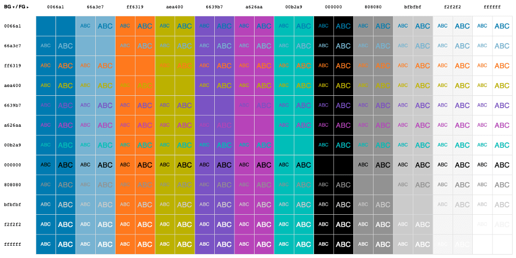
Image Credits: Pinterest
Table of Contents
- 1 Color Schemes: What Are They and Why Do They Matter?
- 2 What Are Colors for an Accessible Website?
- 3 WCAG guidelines for color use
- 4 The contrast of Colors for Websites
- 5 Aesthetically Pleasant Color Combinations
- 6 Accessibility Exceptions for Color
- 7 Colors to Avoid for ADA Compliance
- 8 Is Color Accessibility Required in Web Design?
Color Schemes: What Are They and Why Do They Matter?
A color scheme is a mixture of hues used in specific design situations, such as the layout of a website. Colors on websites are essential for multiple reasons, the first being color psychology. Certain color combinations, such as a brilliantly pigmented or dark and bold palette, can trigger emotions and affect how individuals connect with your brand and website. Digital accessibility, or web color accessibility, is another manner in which color affects how users engage with your site.
To ensure that everyone can understand your site design colors, you must consider people with impairments (26 percent of Americans) and certain situations. A person with color blindness, for instance, may perceive webpage hues differently. Some of the most frequent varieties of color blindness include red-green and blue-yellow, making it difficult for people to distinguish between these tones when placed together.
Web color accessibility in design takes into account your audience’s condition or handicap in viewing pigmentation, if applicable.
What Are Colors for an Accessible Website?
Color selection is important when designing an accessible website. Incorporating accessible colors into your color pallet will make your website more useful for those with disabilities such as vision impairment or low vision.
The Web Content Accessibility Guidelines (WCAG) provide several guidelines for color accessibility, including suggestions for color contrast ratios, brightness, backdrops, and color spacing, in order to make a website more accessible to persons with any type of vision impairment. The following characteristics of website color schemes will assist you in designing with accessibility in mind.
Colors and their specific connotations
- Red: passion, enthusiasm, energy
- Orange: vivacity, warmth, and originality
- Yellow: signifies happiness and optimism.
- Green: tranquility, nature, and health
- Blue: stability, tranquility, trust
- Purple represents achievement, knowledge, and monarchy.
- Pink: Romantic and feminine
- Black: luxury, strength, elegance
Note:
- DO NOT allow a website’s color scheme to interfere with its readability.
- DO NOT use text with low contrast. It may cause eye strain and make the page less accessible overall.
- DO NOT use digital black text or pure black on a pure white backdrop, as the contrast may cause eye strain. Consider employing a muted version of the major color you employ in your brand as the backdrop color.
WCAG guidelines for color use
Here are the WCAG success criteria that specifically focus on the use of color:
- Use of Color (SC 1.4.1): Color should not be the only visual means of conveying information, indicating an action, prompting a response, or distinguishing a visual element.
The above success criterion address color usage directly. Additionally, the below success criteria indirectly affect the usage of colors.
- Contrast (Minimum) (SC 1.4.3): Text and images of text must have a contrast ratio of at least 4.5:1 against their background. For larger text, a contrast ratio of 3:1 is acceptable.
- Non-Text Contrast (SC 1.4.11): Non-text elements like icons and graphical objects should have a contrast ratio of at least 3:1 against adjacent colors.
These criteria ensure that web content is accessible to users with visual impairments, including those with color blindness.
The contrast of Colors for Websites
The contrast ratio must adhere to WCAG standards for your website to be color-accessible. A screen’s contrast ratio impacts how light or dark colors look. It might range between 1 and 21 (written as 1:1 and 21:1, respectively). The first value in the ratio represents the relative luminance of light colors, while the second reflects the relative luminance of dark hues. The WCAG suggests a minimum aspect ratio of 4.5:1 for text and interactive components. This WCAG contrast ratio will accommodate colorblind and vision impaired users.
This recommendation also specifies that pigmentation should not be the only indicator for interactive elements, thus an extra non-color element, such as an asterisk or a symbol, should be employed. Since the red-green type of color blindness is the most prevalent, avoid placing green on red or vice versa.
To meet the contrast aspect of web accessibility, the color contrast ratio, color as an indicator, and red/green and blue/yellow colors must be considered while building a website.
Aesthetically Pleasant Color Combinations

Focus on background colors, text and typeface colors, calls-to-action (CTAs), and buttons to begin determining how to choose website color schemes. The following dos and don’ts will assist you in selecting the most effective color scheme for your website.
- Start the process by determining your brand’s primary color.
- Increase the amount of white space to improve reading.
- Increase brand loyalty by utilizing varied saturations of your brand’s primary hues.
Creating aesthetically pleasing yet accessible color combinations can be a bit of a balancing act, but it’s definitely achievable.
Here are some background and text color combinations that are both visually appealing and accessible:
Black and white: Let us start with the simplest of color schemes. You can’t go wrong with this combination. Although it may look bland, many websites prefer this combination. For example, Squarespace, one of the best web design companies, uses the black-and-white combination on its website.
Green and white: It is another great color scheme that is accessible and visually appealing. Starbucks, one of the biggest coffee chain brands, uses green and white color scheme on their website.
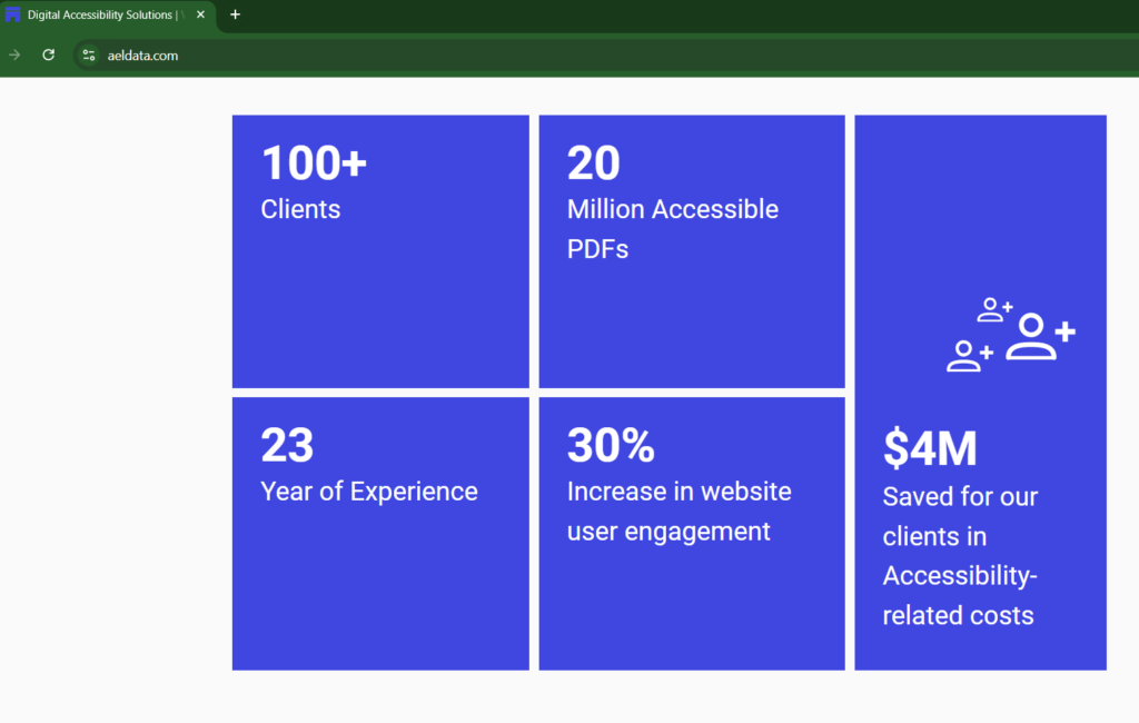
Blue and White: It is a color scheme that has a high contrast ratio and helps users with visual impairments easily distinguish and read text and other elements. AEL Data, an experienced digital accessibility organization uses this combination to significant effect on their website.
However, it is essential to know that not all shades of the combination are accessible. Therefore, always consult an accessibility expert to ensure your website is accessible.
Accessibility Exceptions for Color
There are a few exceptions to the WCAG color accessibility rules.
- Logos and incidental visual components are exempt from color contrast ratio restrictions because they are not necessarily necessary for the user to comprehend the information or functionality.
- Text included in a logo is not subject to a minimum contrast criterion.
- Text within disabled buttons is exempt from the minimum contrast ratio requirement. While there are a few exceptions, you should do your best to adhere to best practices in web design to avoid unintended violations of color accessibility.
Colors to Avoid for ADA Compliance
There are many colors to choose from however some color schemes do more harm than good. It’s important to avoid certain color combinations that can be problematic for users with visual impairments, including color blindness. Here are some color combinations to avoid:
Problematic for color-blind users:
It is difficult for people with color blindness to use your website.
- Red and Green
- Red and Black
Difficult to distinguish:
The below color schemes are difficult distinguish from one another or may blend together. It can make it difficult for users with visual impairments to use your website:
- Green and Brown
- Blue and Green
- Purple and Blue
- Blue and Yellow
- Lastly, avoid the Yellow and Light Green combination as they can be too similar in hue.
Lack of sufficient contrast:
These two color combinations lack sufficient contrast to be used on websites.
- Grey and Blue
- Grey and Green
Make sure that your website colors have sufficient contrast, and avoiding these combinations can help make your content more accessible.
Is Color Accessibility Required in Web Design?
Although WCAG is not a legal requirement, its recommendations are widely cited in cases involving the Americans with Disabilities Act (ADA). Businesses must adhere to digital accessibility rules as closely as possible, otherwise their likelihood of being sued can increase, as in the Domino’s case. With nearly 12 million visually impaired Americans aged 40 and older, there is a compelling argument for developing accessible web content.
Nevertheless, if you’re developing a website for a U.S. federal government agency or an organization that collaborates with one, Section 508 requires color accessibility in web design. Section 508 guarantees that people with disabilities have complete access to digital information and communications.