You’ve probably heard about web accessibility. Maybe you think it’s only about screen readers for blind users. You might think it’s a long and complicated list of legal checklists for major companies. It is about time to change that story. Website accessibility is a lively design philosophy that puts people first and has surprises around every turn. It’s not enough to merely follow the rules; we need to make the web better and not forget stronger for everyone! Let’s look at some facts that will completely shift how you perceive the digital world.
Table of Contents
- 1 What is Web Accessibility?
- 1.1 1. Accessibility Supercharges Your SEO (They’re Best Friends)
- 1.2 2. People of all hearing abilities can use captions
- 1.3 3. Color Contrast Isn’t (Just) About Color Blindness
- 1.4 4. Keyboard Accessibility is the Ultimate Usability Test
- 1.5 5. Accessibility is a Lifesaver in Situational Disabilities
- 1.6 6. ARIA Landmarks: Powerful, But Often the Wrong Tool
- 2 7. Accessibility Fuels Innovation
- 3 Conclusion
What is Web Accessibility?
Web accessibility means designing websites so people with disabilities can use them easily. This is usually done by following the Web Content Accessibility Guidelines (WCAG), which help ensure a smoother, more inclusive user experience. WCAG is built around four simple ideas: content should be perceivable, operable, understandable, and robust (POUR). These are supported by different levels of conformance. Level A covers the basics and avoids major issues, Level AA is the standard most organizations aim for, and Level AAA is the most advanced, addressing almost all accessibility barriers.
In practice, this includes things like making sites work with screen readers, adding alt text to images, captioning videos, enabling keyboard navigation, and using clear color contrast.
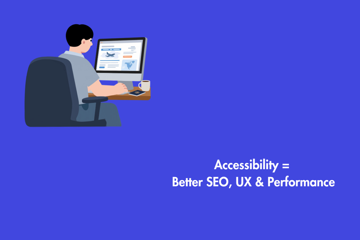
1. Accessibility Supercharges Your SEO (They’re Best Friends)
This is the fact that makes marketers sit up straight. Search engines and screen readers have a shocking amount in common. Think about it! A Googlebot, which sees a webpage much like a screen reader does, crawls the code, reads the alt text for images, understands headings for structure, and values clear, semantic links.
Authors who add detailed alt text to images help more than just people with visual impairments. The picture’s content is clearly communicated to Google, improving your image search ranking. Organizing your page with appropriate HTML header elements, such as H1, H2, and H3, does more than merely make it easier for users with cognitive impairments to browse. Google will be able to tell how your information is grouped and what’s critical. Semantic HTML is the secret language that both machines and assistive technologies adore. Investing in accessibility isn’t just the right thing to do; it’s a powerful and often overlooked SEO strategy.
2. People of all hearing abilities can use captions
We often file captions under “accommodation.” But the data tells a wildly different story. A staggering 80% of people who use captions are not deaf or hard of hearing. Why?
The Sound-Off Scrollers: How often do you scroll through social media in a waiting room, on public transit, or in a quiet office with the sound off? You’re relying on captions. They’re essential for context in a muted world.
The Language Learners: People learning a new language use captions to connect written and spoken words, drastically improving comprehension.
The Focus Finders: Many people, including those with ADHD, auditory processing disorders, or simply in a noisy environment, use captions to maintain focus and ensure they catch every word.
The Vocabulary Builders: Ever heard an unfamiliar word? Captions let you see it spelled out instantly.
Captions have quietly become a part of how we all consume content today. Captions, therefore, are a universal design feature. They make your video content consumable in sound-sensitive environments, noisy places, and for a myriad of learning styles. Turning them on isn’t a niche feature; it’s a mainstream demand.
3. Color Contrast Isn’t (Just) About Color Blindness
Yes, proper color contrast is crucial for the estimated 300 million people worldwide with color vision deficiency. But its impact is far broader. You may have to consider everyday scenarios such as the below:
The Glare Glare: Using your phone in bright sunlight. High contrast between text and background is the difference between reading and squinting.
The Aging Eye: As we age, the lens in our eye yellows, and contrast sensitivity decreases. What looks fine at 25 years can be a blurry challenge at 65 years. Good contrast benefits a massive, growing segment of the population.
The Cheap Screen: Viewing your site on an older monitor or a low-quality tablet display. Poor contrast can render text completely illegible on subpar screens.
Focusing on contrast isn’t about catering to a small group with a specific condition. It’s about acknowledging the vast spectrum of human vision and the unpredictable conditions in which people access your content. It’s designing for reality.
4. Keyboard Accessibility is the Ultimate Usability Test
Screen readers often rely on keyboard navigation, but so do many power users. Developers, gamers, people with temporary injuries like a broken wrist, or those with motor disabilities who use alternative keyboards or switches—they all navigate without a mouse.
Here’s the unexpected part: Forcing yourself to navigate your website using only the TAB key is one of the most revealing usability tests you will ever run. You will instantly discover:
Keyboard Traps: Places where you get stuck in a loop and can’t escape.
Invisible Focus: Not knowing where you are on the page because there’s no visual indicator.
Illogical Order: Tabbing through links and form fields in a chaotic, nonsensical sequence.
Unreachable Functions: Fancy menus or buttons that simply don’t work without a mouse hover.
If a site is smooth and intuitive by keyboard, it’s almost guaranteed to be more robust and logically structured for everyone. It’s a foundational test that exposes deep structural flaws.
5. Accessibility is a Lifesaver in Situational Disabilities
This concept flips the entire narrative. Disability isn’t always permanent. Think of the “curb-cut effect.” Curb cuts (the ramps at sidewalk corners) were designed for wheelchair users, but who else uses them? Parents with strollers, traveler’s with rolling suitcases, delivery workers with dollies, and cyclists.
The digital world has perfect parallels:
A person with visual impairment relies on a screen reader. A sighted person is a distracted driver using voice-over to hear a webpage.
A person with a motor impairment uses voice commands to navigate. A busy cook uses voice commands to look up a recipe with floury hands.
Someone with a cognitive disability needs clear, simple language and predictable layouts. An exhausted, sleep-deprived new parent needs the exact same thing at 3 AM.
We all experience “situational disabilities” throughout our lives. Designing for permanent disabilities doesn’t just help a minority; it creates a more flexible, forgiving, and user-friendly web for every single person in a moment of need.
6. ARIA Landmarks: Powerful, But Often the Wrong Tool
Accessible Rich Internet Applications (ARIA) is a set of special HTML attributes. It feels like the “advanced” tool for complex problems. The unexpected truth? The first rule of ARIA is don’t use ARIA. Or more precisely, don’t use it if you can use native HTML instead.
Developers often reach for ARIA to fix accessibility problems they created by using non-semantic elements. Need a button? Use a <button> tag. It comes built-in with keyboard focus, click events, and screen reader announcements for free. Using a <div> and then adding role=”button” and a bunch of JavaScript is like building a car from scratch when you have a perfectly good one in the driveway.
ARIA is a powerful bridge for truly custom, complex widgets where HTML falls short. But in 80% of cases, using HTML correctly—<nav>, <main>, <button>, proper <label> for forms—solves the problem more reliably and with less code. The most accessible code is often the simplest.
In addition, using proper labels, clear instructions, helpful error messages, and a logical tab order makes forms easier to complete. This improves user experience and also helps search engines better understand your content.
7. Accessibility Fuels Innovation
Think of accessibility as a design constraint that breeds creativity. History is filled with examples: The telephone was initially developed for the deaf community. Closed captions, now ubiquitous, were created for the deaf. Voice-controlled assistants have roots in helping people with motor impairments.
In the digital realm, the drive to describe images for screen readers forced us to think critically about visual content, leading to better practices in information architecture. The need for keyboard navigation led to more streamlined, efficient user flows. The demand for clear, understandable error messages improved communication for all users.
Conclusion
The Web Content Accessibility Guidelines (WCAG) can feel like an insurmountable mountain. The unexpected, liberating fact? Perfection is the enemy of progress. The goal isn’t to launch a 100% WCAG 2.1 AA-compliant site from day one (though that’s a great vision). The goal is to start, to learn, and to make consistent, meaningful improvements.
- Fix the critical barriers first:
- Add alt text to all informational images.
- Ensure all interactive elements work with a keyboard.
- Check color contrast on your top three call-to-action buttons.
- Add a visible focus indicator.
Accessibility becomes manageable when you stop treating it as a massive, intimidating project and start approaching it step by step. Makes it part of your team’s everyday workflow: design reviews, development, and content generation.
The most surprising fact? Designing for human experience edges improves the center for everyone. We improve SEO, usability, reach, and code resilience. Build a web that functions in the messy, unpredictable realities of human existence instead of perfect settings. Contact us at AEL Data today to ensure your website performs better, is accessible, and is UX and SEO-friendly.