Despite the increasing emphasis on creating websites that are inclusive and accessible to all users, many websites still opt for decorative cursive fonts and illegible text paired with poor color contrast combinations, all in the name of “style.” This remains a widespread issue, with WebAIM’s 2023 assessment revealing that 83% of websites have color contrast problems, making it difficult for all users, not just those with visual impairments.
Color contrast is a fundamental and essential element in improving the digital accessibility of a website. The term “color contrast” refers to the visual difference between the text (foreground) and the background color. To ensure that everyone can easily read the content you’ve worked hard to create, it’s important to select color combinations that provide sufficient contrast with the text. Adhering to WCAG guidelines for color contrast can eliminate any uncertainty during the design process and help create a more accessible experience for all users.
Table of Contents
Why is it required?
At this juncture, it is well-established that being inclusive can lead to a larger audience engagement compared to focusing solely on presentation, which may alienate certain segments of the audience.
It is a misconception to consider a website fully inclusive if it doesn’t accommodate individuals with low vision or poor contrast sensitivity, let alone those with normal vision. Following the WCAG guidelines is the best approach, as it ensures the website meets widely accepted and established standards for accessibility.
The below section clearly drives the point home that designing websites with web color accessibility involves creating color schemes that are inclusive and easily discernible for all users, including those with visual impairments or color blindness.
How can I achieve color contrast compliance?
Before we jump in, let us understand the basics first:
What is color contrast and what are color contrast ratios?
Color contrast (web accessibility) refers to the difference in brightness or color between text and its background, crucial for readability and accessibility. In WCAG 2, contrast refers to the difference in perceived “luminance” or brightness between two colors (the term “color contrast” is not used in WCAG).
A color contrast ratio is a quantitative measure of the visible intensity difference between a foreground object and its background.
WCAG and Color Contrast
Here’s a summary of the WCAG guidelines related to contrast and color usage:
- 1.4.3 Contrast (Minimum)
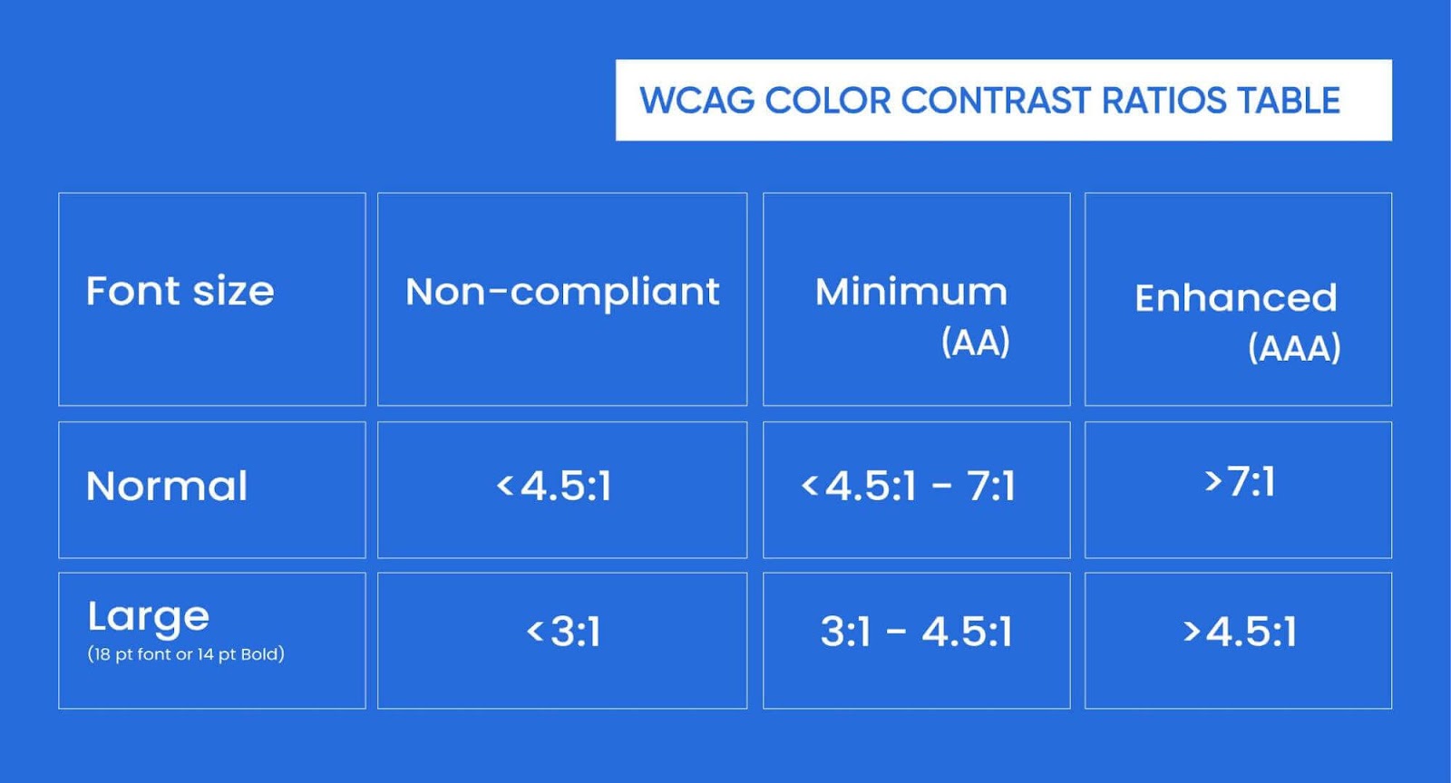
This guideline ensures that text has a sufficient contrast ratio against its background to be readable by users with visual impairments. It requires a minimum contrast ratio of 4.5:1 for normal text and 3:1 for large text (over 18pt or 14pt bold). - 1.4.6 Contrast (Enhanced)
This guideline applies to content that requires enhanced contrast, especially for users with severe visual impairments. It specifies a higher contrast ratio of at least 7:1 for normal text and 4.5:1 for large text, aiming to improve accessibility for those with low vision or color blindness. - 1.4.11 Non-text Contrast
This guideline ensures that non-text elements (like buttons, icons, and form fields) have sufficient contrast with their background. Non-text elements must meet a contrast ratio of at least 3:1 to be visible to users with limited vision. - 1.4.1 Use of Color
This guideline emphasizes that color should not be the only method used to convey important information. It requires that there be alternative cues (like text labels or patterns) in addition to color, to ensure accessibility for users with color blindness or other visual disabilities.
Understanding the WCAG success criterion 1.4.3 is crucial since it specifies the level of contrast that is typically accepted as being accessible. According to the criterion, the WCAG contrast ratio between regular text and any pictures of text must be at least 4.5:1, while the contrast ratio between normal text and big text (18 point or larger, or 14 point or larger and bold) must be at least 3:1.
Level AA of the Web Content Accessibility Guidelines (WCAG) specifies a minimum contrast ratio of 4.5:1, whereas Level AAA specifies an “improved” ratio (success criterion 1.4.6) that calls for an even greater degree of contrast. In order to achieve the improved ratio, a contrast of 7:1 is required. Remember that these precise values, like other WCAG checkpoints, are intended to increase the number of users on your website.
For people with 20/40 vision, the 4.5:1 ratio should be sufficient, while the 7:1 ratio should accommodate users with approximately 20/80 vision.
Don’t forget to design with Levels A and AA conformance levels in mind.
Furthermore, WCAG 2.1, updated in June 2018, introduced a new rule under guideline 1.4 “Distinguishable,” which is part of the “Perceivable” principle. This rule is aimed at achieving Level AA compliance, the standard level for products. Adhering to this rule helps individuals with vision impairments, especially those with low vision, identify important non-text elements.
It is essential to consider the significance of website contrast ratios when developing a site, as this factor can greatly impact viewership for users with related disabilities. Additionally, it is important to note that font colors should also be considered to improve web accessibility.
When designing for accessibility, it’s important to avoid using color combinations that are hard to differentiate or have low contrast, such as:
- Red and green: This combination is often problematic for individuals with color blindness, as approximately 5% of people struggle to distinguish between these two colors.
- Red and black: For those with color blindness, red and black may appear similar, making text difficult to read.
- Blue and yellow: This pairing can also be challenging for some people to distinguish clearly.
- Other low-contrast combinations: Examples include green and brown, green and blue, blue and gray, blue and purple, green and gray, and green and black.
Additional tips for improving text accessibility include:
- Use a contrast checker tool to ensure your color choices align with WCAG standards.
- Ensure a high contrast ratio between the text and background.
- Opt for light text on a dark background, or vice versa.
- Choose simple, easy-to-read fonts.
- Avoid using small font sizes.
- Don’t rely solely on color to communicate information.
- Emphasize text using bold, italics, or distinct shapes.
- Use solid backgrounds instead of gradients or photographic backgrounds.
Criterion 1.4.11 Non-text Contrast demands a contrast ratio of at least 3:1 for:
UI Elements: Visual features required to identify user interface components and their states, unless they are inactive or determined by the user agent and not modified by the author.
Visual Components: Graphic elements are essential for comprehending content unless a particular presentation is vital to convey the intended message.
This criterion ensures that non-text elements have clear visibility. The text itself undergoes a separate test for contrast under WCAG Success Criterion 1.4.3 Contrast (Minimum).
Keep in mind all users from the inception

When developing a website, it’s important to design with all users in mind, including those with disabilities, from the start. It’s easier to build an accessible site initially than to fix issues later. To ensure color contrast is considered, don’t overlook navigational elements, footnotes, menus, and other areas where users interact. These must be clearly visible for functionality.
Always consider accessible color palettes and brand colors early in the design process. Without access to compliant color combinations, designers may struggle to create accessible sites. Prioritizing color accessibility helps accommodate users with various types of color blindness. Colors should be reviewed and tested during the design phase to avoid rework and allow more time for important updates.
The website should also meet level AA and AAA contrast ratio compliance standards.
Here are a few best practices for web designers:
- Design with Accessibility in Mind: Start with accessibility in the design process rather than trying to fix it later. Ensure that your color choices, font sizes, and overall layout adhere to WCAG standards from the start.
- Consider Colorblind Users: Use color palettes that are friendly to colorblind users. Tools like ColorBrewer and Sim Daltonism can simulate how your website might appear to someone with color blindness. This can help you adjust your design for optimal accessibility.
- Prioritize Content Hierarchy: Make sure that the most important elements, such as headings, buttons, and calls to action, have sufficient contrast to stand out. This helps users quickly identify and navigate critical content.
- Regularly Audit Your Website: Accessibility should be an ongoing process. Regular accessibility audits with tools and real users can help ensure that your website remains compliant with color contrast standards and continues to meet the needs of all visitors.
Wrapping up
Here is a simple table to help you easily understand the color contrast ratio.
Conforming to color contrast criteria is one of the most significant accessibility factors, yet it is often a simple fix. Talk to experts at AEL Data if you need assistance with color contrast for your website or want to learn more about what we can do to help you achieve accessibility compliance.