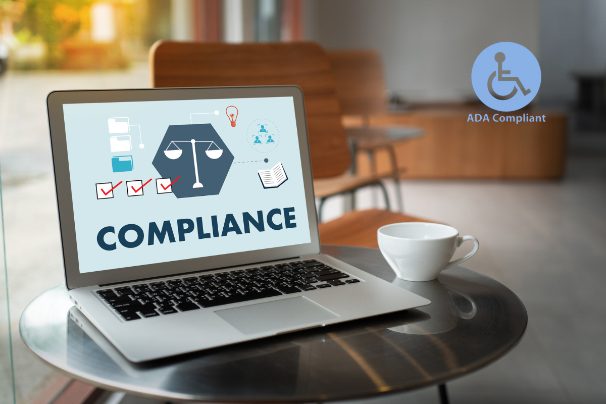
In the world of e-commerce, your digital storefront must welcome every potential customer. Accessibility is not just a legal safeguard against ADA (Americans with Disabilities Act) lawsuits, but it is a fundamental aspect of user experience that opens your business to millions of shoppers with disabilities. More than anything, a compliant store builds trust, improves SEO, and ensures that no one is left behind because of a barrier in your code or design.
Shopify is popular because it’s easy to use, with drag-and-drop tools, built-in checkout, and global payment options, making it possible to launch stores without a full developer team. Many business owners rely on DIY guides or freelancers, but accessibility often gets overlooked in the process.
Our guide provides a practical, step-by-step checklist to help you align your Shopify store with ADA standards. We have stripped away the complex jargon to give you a clear, actionable roadmap by dividing it into five phases.
Table of Contents
Phase 1: The Foundation (Theme and Visual Design)
Design plays a quiet but powerful role in accessibility. The colors you choose, the fonts you use, and the way elements respond all shape how easy your store is to use. Accessibility compliance begins with theme customisation, even for compliance-ready themes like Dawn. Here is how you can do it:
Verify Color Contrast Ratios
Low contrast is a common accessibility failure; ensuring a contrast ratio of at least 4.5:1 in regular text is essential.
- Large text, such as 18 pt+ or 14 pt bold; UI components and graphics should meet a 3:1 ratio.
- Color should not be the only way to convey information
- Use tools like the WebAIM Contrast Checker to test colors across various elements.
- Adjust primary and secondary color schemes in Shopify under Theme Settings to meet compliance.
Standardize Typography
- Use legible font families and a minimum text size of 16px.
- Avoid “light” or “thin” font weights for readability.
- Select clean sans-serif or serif fonts in Theme Settings and ensure the base size is at least 16px.
- Text should be resizable up to 200% without losing content or functionality.
Enable Visible Focus Indicators
- Interactive elements must show a visible outline for users navigating with a keyboard.
- Test focus visibility by pressing the “Tab” key on the site; outlines should appear on menu items and buttons.
- If outlines are absent, CSS adjustments may be required in the theme file to ensure clear “:focusvisible” properties.
Eliminate Seizure Triggers
- Content must not flash more than three times per second.
- Examine existing GIFs, hero banners, and promotional animations for rapid flashing.
- Eliminate or decrease the speed of any rapid flashing effects. Ensure smooth and gradual transitions if using a slider.
Additionally, your design should remain responsive across devices, supporting zoom up to 400% and adapting smoothly to different screen sizes and orientations.
Phase 2: Navigation and Menu Structure
Not everyone navigates a website with a mouse. Many users rely on a keyboard or assistive technologies to move through pages and interact with content. Your website should be logical, predictable, and operable by non-mouse users too. Here’s how:
- Test keyboard navigation by using only keyboard keys (Tab, Enter, etc.) and ensure all links, buttons, and menus are accessible without a mouse.
- Check for accessibility issues like keyboard traps.
- Provide a “Skip to Content” link, as it is essential for screen reader users to avoid repetitive navigation through menus. It should also be operable by keyboard.
- Organize heading hierarchy for screen readers, following a logical order from H1 to H6
Phase 3: Product Pages and Content
Content should be clear, descriptive, and easy to understand for everyone, including people using screen readers. Effective communication of product details is essential for all users.
Here’s a quick list to achieve that:
- Descriptive Alt Text: Every meaningful image should have alternative text describing its function or content. If the images are purely intended to be decorative, they must be hidden from screen readers.
- Replace phrases like “Click here” with descriptive phrases like “Read our Return Policy.”
- Prices and stock status must be clear and easily understandable by screen readers and maintain the consistent format.
- More complex visuals like charts or infographics need detailed explanations, and functional elements such as icons, logos, and product galleries should be clearly labeled and keyboard accessible.
- Visual color swatches must have accompanying text labels for accessibility.
- Any supporting documents like PDFs should also be structured for accessibility, with clear labels and alternative formats available where possible.
The above image should have alt text as: “Men’s navy blue cotton t-shirt with crew neck having the Calvin Klein logo on the chest,” rather than just “shirt”.
Phase 4: Multimedia and Dynamic Content
Multimedia and interactive elements should be easy to control and accessible to everyone. Videos and popups can engage users but may also act as barriers.
Here’s a checklist on how to engage and include all users effectively:
Videos
- All prerecorded videos must include synchronized captions for deaf and hard-of-hearing users.
- Use YouTube/Vimeo captioning tools or upload a separate “.vtt” file for Shopify uploads.
- Videos and multimedia should include captions, transcripts, and accessible controls, without autoplaying sound.
Control Audio Autoplay
- Audio must not autoplay; if it does, provide a stop mechanism within 3 seconds.
- If audio or video plays automatically on your site, ensure autoplay is disabled, with muted autoplay for backgrounds being acceptable if non-flashing.
Manage Popups and Modals
- Popups must move keyboard focus when opened and return focus when closed.
- Test closing popups using only the keyboard; if focus remains behind the popup, consider replacing noncompliant apps with accessible alternatives.
Phase 5: The Checkout Experience
Shopify checkout code modifications are limited, but content control is allowed. Error messages must be text-based and provide guidance on resolution for user mistakes.
- Ensure that error messages like “Email address is required” are clear when users skip something while entering details.
- Avoid CAPTCHA barriers that can be challenging for people with visual impairments and provide alternative verification methods.
- Shopify’s built-in spam protection is accessible. Additionally, all third-party tools related to spam protection should support Google reCAPTCHA v3 or offer audio options.
- Your cart should be simple and clear to use. Product images need descriptive alt text, actions like removing items should be clearly labeled, and quantity updates should work smoothly. Details like size, color, and pricing should always be easy to understand.
Scope an Accessibility Audit for Your Store. Here’s how!
When your Shopify store has thousands of pages, you don’t need to audit each one individually. Since most pages use the same templates, you can focus on key page types that reflect the overall experience, like the homepage, product listings, product pages, and checkout. It also helps to review areas like store locators, account pages, and contact forms, making sure navigation, filters, forms, and interactive elements are all accessible and easy to use.
Conclusion
Accessibility is not a one-time fix but an ongoing commitment to making your store usable for everyone. By focusing on thoughtful design, clear navigation, meaningful content, and inclusive interactions, you create an experience that goes beyond compliance. It becomes easier to browse, understand, and trust.
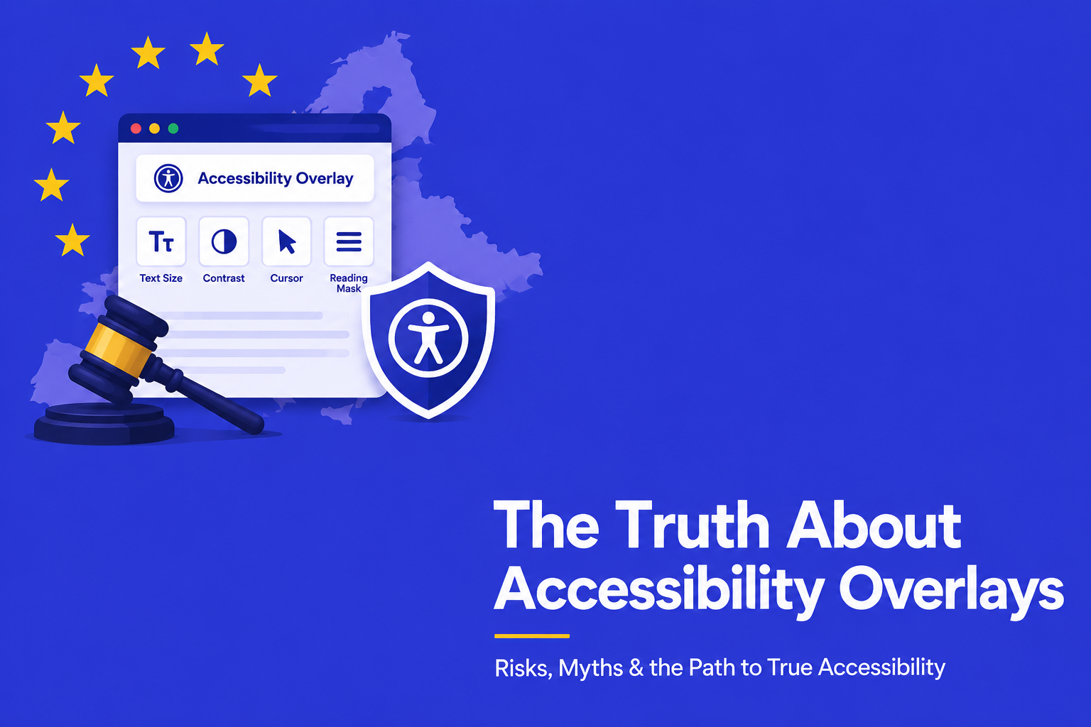
You need to pay attention to the little things when you build an accessible Shopify store. It’s not enough to just install an “overlay” plugin, which often doesn’t really protect you legally. You need to build a strong foundation. Begin with your theme. Make sure your fonts and colors are easy to read. Carefully label the pictures of your products. Be tough on the third-party apps you use. If they don’t help your disabled customers, they don’t belong in your store. Following this checklist keeps your business safe and, more importantly, gives every visitor the respect they deserve by making their shopping experience smooth.
Your accessibility strategy fails if you ignore third-party apps or treat compliance as a one-time event. From reviews to chatbots all of them should support keyboard navigation & not trap user focus. If an app breaks accessibility, replace it immediately. Sustain your compliance by running automated scans with tools like Google Lighthouse, etc., after every theme update and validate those results through manual keyboard and screen reader testing. Complete your strategy by publishing an Accessibility Statement that commits to WCAG standards and offers a direct way for users to report issues.
You can download our Shopify ADA Compliance Checklist for free. Remember to always get your website audited by an accessibility expert like AEL Data before creating an Accessibility Statement.
When you build with accessibility in mind, you are not just meeting standards; you are building a store that truly welcomes every customer.