In our digital world, forms serve as gatekeepers to numerous experiences; everyone must possess the key. Imagine a reality where filling out forms, an elementary task for most doesn’t pose unnecessary challenges for individuals with disabilities. Imagine an environment where inclusivity guides form and design and opens doors to opportunities instead of callously closing them off. This is the world we strive for, and it’s closer than you might think.
Everywhere, forms perform a crucial role. They act as gatekeepers for numerous services and opportunities, from the simple task of ordering pizza to the more complex job application process.
However, an essential question arises: what happens if these indispensable tools are inaccessible to all?
Inaccessible forms frustrate and even exclude individuals with disabilities. They must navigate through a perplexing layout, decipher vague instructions, or battle to click on minuscule buttons. Such experiences can easily discourage anyone from pursuing pizza or a new career. In this article, we aim to explore the best practices for creating accessible forms.
Table of Contents
Structural Considerations for Accessible Forms
The following are some of the best practices for creating a well-structured form that is accessible to all users:
Form Layout Guidelines
- Use a clear, consistent layout for form elements, avoiding gaps or overlaps.
- A vertical layout is preferred for easy scanning and followability.
- Horizontal layout is suitable for short, simple forms or closely related elements.
- Avoid multiple columns or rows to avoid confusion for users using linear navigation methods.
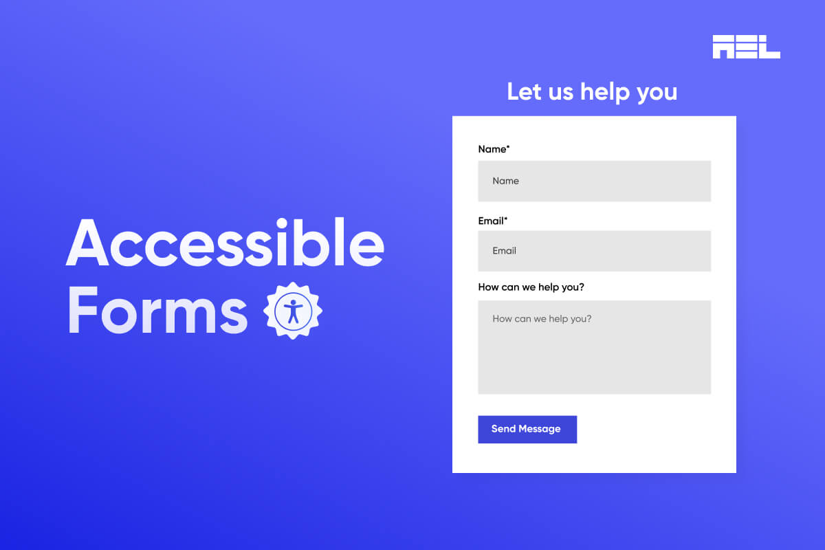
- Use descriptive and visible labels for each form element, providing the name and purpose.
- Labels should be concise, clear, and meaningful, using plain language for the target audience with a 4.5:1 contrast ratio and avoiding placeholders for usability and accessibility issues.
- Fieldsets and legends group form elements, providing descriptive titles and a 3:1 contrast ratio, aiding users in understanding form structure and assistive technologies.
- Use a logical and intuitive order for the form elements, following the natural and expected flow of the form.
Providing Meaningful and Descriptive Text for Form Elements
The following are some of the best practices for providing meaningful and descriptive text for form elements:
- Labels are crucial for form elements, providing their name and purpose. They should be concise, clear, and meaningful.
- Instructions should be visible and accessible, using a 4.5:1 contrast ratio and semantic HTML elements, and placed close to form elements for assistive technologies.
- Feedback is crucial for user interaction with form elements, providing confirmation or error messages. It should be visible, accessible, and placed near form elements, using semantic HTML and assistive technologies.
Aria Roles and Attributes
ARIA roles and attributes are essential for enhancing the semantics and functionality of forms. These roles define the role and type of web content and application elements, making them accessible and operable with assistive technologies. They can create new or custom form elements that are not supported by native HTML elements.
ARIA attributes provide additional information about form elements, making them more understandable and usable. ARIA landmarks and regions define the structure and organization of web content and applications, aiding efficient navigation for users using assistive technologies. ARIA keyboard shortcuts define keyboard commands for interaction with web content and application elements and should be consistently used following ARIA specifications and best practices.
Keyboard Accessibility
The following are some of the best practices for ensuring keyboard accessibility for form navigation and interaction:
Native HTML Form Elements and Attributes
- Provide basic functionality and accessibility for form elements.
- Allow users to navigate and interact with form elements using the keyboard.
- Follow HTML specifications and best practices for standard keyboard commands and behaviors.
- Use the tab key for movement, the enter key for button activation, the spacebar key for checkbox toggle, and the arrow keys for slider/spin button value change.
- Avoid replacing native elements with custom or non-standard ones to avoid usability and accessibility issues.
ARIA roles and attributes
- Define the role and type of elements, providing additional context.
- Create new or custom form elements not supported by native HTML elements.
- Enhance the semantics and functionality of existing HTML form elements.
Keyboard Focus Indicators
- Visual cues that indicate the current form element with keyboard focus.
- It is provided by the browser, platform, or assistive technologies or by web developers using CSS properties.
- It must be visible and noticeable, use a contrast ratio of at least 3:1 with the background color, and be consistent and coherent.
Keyboard Shortcuts
- Keyboard commands that interact with web content and application elements.
- Provide a shortcut key for form elements or a custom keyboard interface.
- Must be used consistently and correctly, following ARIA specifications and best practices. It should be documented and communicated to users to avoid conflicts.
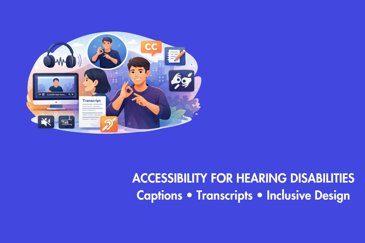
Designing for Screen Readers and Other Assistive Technologies
Screen readers and other assistive technologies enable users with disabilities to perceive web content; they operate applications by providing alternative or additional modes of input and output, including speech, sound, braille, and even magnification.
For the effective design of these tools that facilitate user perception and operation, consider the best practices outlined below:
- ARIA roles and attributes are crucial for enhancing the functionality and accessibility of form elements, making them more compatible with screen readers and assistive technologies. These attributes define the role and type of web content and application elements, providing additional information and context. They can be used to create new or custom form elements unavailable or supported by native HTML elements. Consistent and correct use of ARIA roles and attributes is crucial, as is following ARIA specifications and best practices.
- Form elements necessitate the essentiality of accessible colors, fonts, and images to enhance their perceptibility and distinction; however, these choices can engender issues with usability and accessibility. Thus, it is paramount that one employs a cautious or even judicious use of such features. It can be done by following guidelines and best practices in color selection, font application, and image incorporation.
Managing Form Errors
We refer to errors as form-related issues that arise when users inaccurately enter, submit, or retrieve data from a form with invalid or incomplete values. Such errors also manifest when users encounter problems with the server and network; they subsequently lead to unanticipated or imprecise outcomes.
These anomalies compromise the accessibility and usability of the form, preventing users from attaining their objectives and potentially inducing frustration, confusion, or dissatisfaction in them.
The following are some of the best practices for managing form errors and providing clear and helpful error messages:
Prevention
- Provide user guidance and feedback before, during, and after interaction with form elements.
- Use labels, placeholders, instructions, validations, and confirmations to help users understand form elements.
- Ensure visibility and accessibility of these elements, using a contrast ratio of at least 4.5:1 with the background color.
- Place these elements close to the form elements they belong to, using semantic HTML elements and attributes recognized by assistive technologies.
Detecting and Handling
- Identify and handle form errors using methods like client-side or server-side validation, exception handling, and error logging.
- Provide clear and helpful error messages that inform and assist users.
- Use plain and simple language appropriate for the target audience.
- Ensure error messages are visible and accessible.
Testing and User Feedback
Testing and user feedback are crucial for improving the quality and performance of web content and applications. They involve collecting and analyzing user data and web content, such as behavior, interaction, experience, satisfaction, errors, and issues. These processes are essential for the usability and accessibility of the web, as they help developers and designers evaluate and eliminate potential issues or gaps. Forms are particularly important for testing and evaluation, as they require users to input, submit, and retrieve data.
Best practices for testing and user feedback include:
- Using user testing to collect and analyze user feedback.
- Assessing the effectiveness, efficiency, and satisfaction of the form.
- Ensuring compliance with web accessibility standards and guidelines.
User performance in terms of time, accuracy, errors, and completion serves as the metric for usability testing. This method not only identifies problems or challenges users face but also provides valuable insights into their experiences. Accessibility testing is a process that guarantees compliance with web standards of accessibility and compatibility across various browsers, devices, platforms, and assistive technologies. We can ensure an optimal user experience; this is achievable via manual or automated approaches along with tools like WebAIM Accessibility Testing Tools.
Case Studies
To illustrate the best practices and benefits of creating accessible forms, here are some case studies and examples of accessible forms in action from various domains and contexts, such as education, health, government, etc.
Case Study 1: Online Course Registration Form
Road Warrior Creative, a specialized digital agency working with government agencies, nonprofits, and social good organizations, created this form. The form has the following features:
- Enhances accessibility and user-friendliness by employing a clear, consistent layout;
- Descriptive labels that are easily visible
- ARIA roles and attributes for improved navigation efficiency
- Keyboard focus indicators and shortcuts;
- Images are optimized to be accessible and compatible.
- as well as validation error messages.
These ensure an intuitive experience for all users, indeed! It’s your go-to platform for registering for online courses offered by universities and educational institutions.
Case Study 2: Online Health Assessment Form
Formspree, a service empowering web developers and designers to create and manage forms without coding effortlessly, crafted this form. It allows users to evaluate their health status and risk factors; in turn, they receive personalized recommendations, along with resources aimed at enhancing overall health and well-being. It features:
- A user-friendly design that incorporates clear labels
- Consistent layout
- Descriptive but visible indicators such as ARIA role attributes
- Keyboard focus indicators
- Shortcuts for accessibility
End Words
In summary, this blog post discusses the best practices and rules for creating forms that are accessible to all users, regardless of their chosen web access technology level of ability or disability. It explores several accessibility topics, such as text functionality, navigation, and interaction processes, error management techniques, testing procedures, and even user feedback.
Furthermore, case studies that illustrate how accessibility in form design appears in many sectors, such as government, healthcare, and education, are included to complement these talks. Web developers and designers are empowered to construct accessible forms with the help of these best practices and guidelines because they provide a pleasant and fulfilling user experience, efficient data input, submission, and retrieval, and even the ability to complete various actions or transactions.