
Accessibility in UX design is designing products for a wide range of consumers, including people with disabilities, impairments, or limitations, to comfortably navigate and use the product.
Usability, defined as how effectively a product can be used by specific users to accomplish particular goals, is closely intertwined with accessibility in UX design. It’s important to understand that usability and accessibility do not always align perfectly. A product may be usable for certain users but not universally accessible to all.
Table of Contents
Why is Accessibility Important in UX Design?
Accessibility in UX design is important to cultivate empathy and view accessibility requirements as integral design constraints in order to create a superior product. Other reasons include:
- Legal: Many nations mandate online accessibility for the public and private sector. Violations can result in lawsuits, fines, and reputational damage.
- Moral: Equitable access and opportunity are human rights. Accessibility design empowers users to engage and contribute to society by respecting their dignity and individuality.
- Business: Accessibility can boost market reach and consumer loyalty, SEO ranking and performance, brand image, and development and maintenance costs.
How to Design for Accessibility in UX?
Designing for accessibility in UX is not a one-time task or a checklist item. It is an ongoing process that requires continuous learning, testing, and improvement.
Here is a UX accessibility checklist for clear steps to prioritize accessibility in your design process.
Know Your Users and Their Needs
Designing for accessibility starts with empathy and awareness of users’ different requirements and preferences. User research, testing with real users, and using personas, scenarios, and empathy maps can help. Screen readers, magnifiers, and keyboard navigation can help you explore your product.
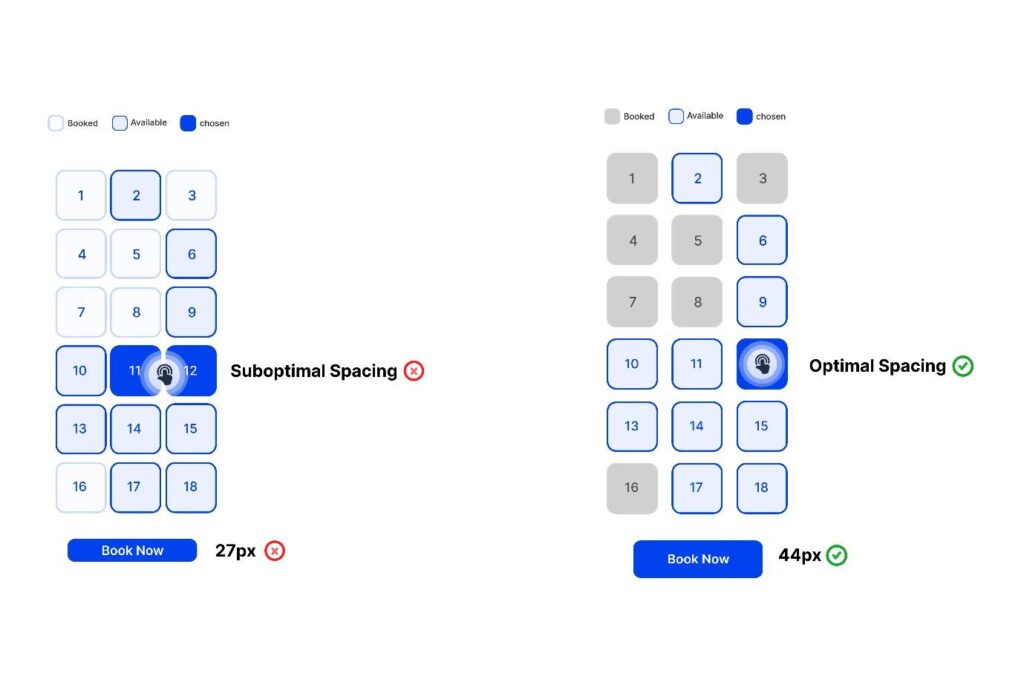
To understand this better, we have the below scenario where the user would be required to select his seats and then proceed to book the same. The spacing between the positions is crucial here, as that would ensure ease of use and make the booking process convenient and inclusive.
Key Accessibility Guidelines for UX Designers
The second step is to follow some essential accessibility rules and best practices to develop more accessible and inclusive products for your users. The Web Content Accessibility Guidelines (WCAG)‘s four principles, which are Perceivable, Operable, Understandable , and Robust, guide these guidelines. One can deem these as UX accessibility guidelines for bringing in inclusivity whilst parallelly enhancing usability.
1. Color and Contrast:
Color conveys meaning, emotion, and beauty in design, but inappropriate or irregular use of it can cause accessibility concerns. To ensure accessibility, use adequate contrast between foreground and background elements with a minimum contrast ratio of 4.5:1. Avoid using color to communicate status or information; use text labels or icons to signal errors or success. Customize product color palettes with dark, high-contrast modes or color pickers. Consider the color’s cultural and emotional connotations, such as red representing danger, love, or luck, depending on the situation and location.
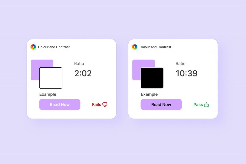
In the above case, the black text on the purple button has more readability and is presented in a pronounced fashion so as to be more inclusive. This not only enhances the accessibility factor but also adds to the look and feel of the presentation.
2. Typography and Readability:
Typography is crucial for making written language legible, readable, and engaging. It impacts the user’s understanding and usage of a product. Key readability criteria include using legible typefaces, user-friendly font sizes and spacing, hierarchy and alignment, contrast and color to enhance readability, and speaking clearly for the audience. Tools like Hemingway and Grammarly can help improve writing style and clarity.
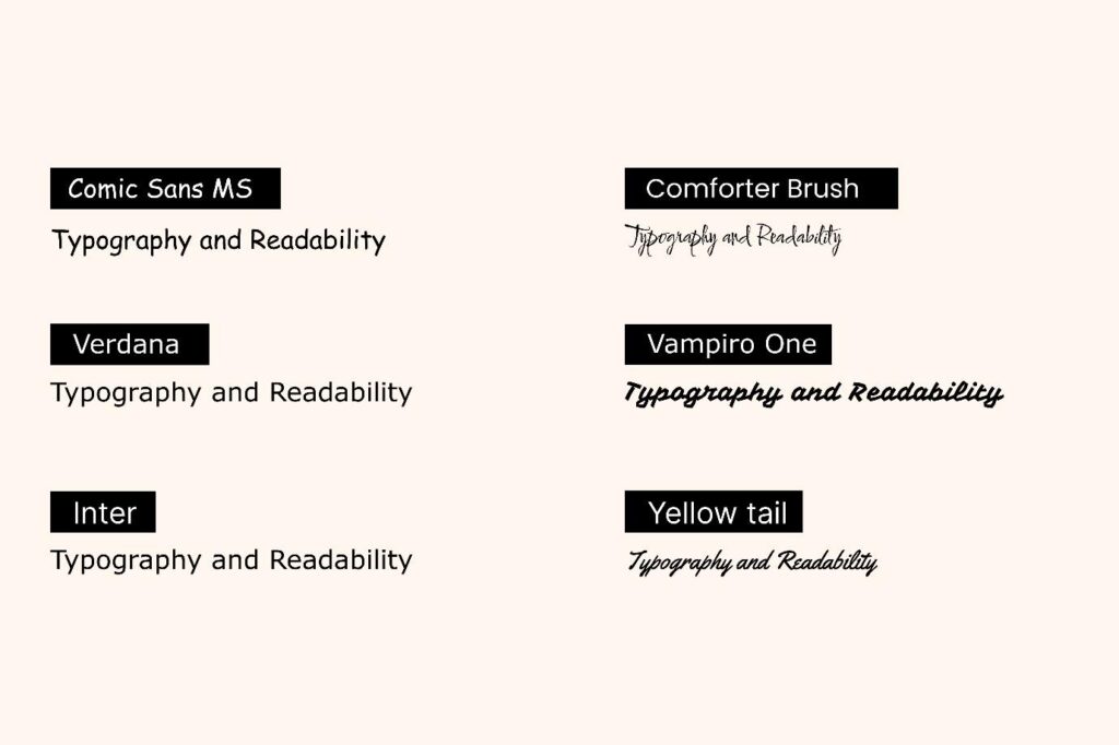
One might argue that the utilization of custom fonts which reflect a certain type of calligraphy that is akin to written text, bringing in a level of aesthetic value to the presented content is paramount to readership and comes in above inclusivity and accessibility in UI design. The fact still remains that accessible content covers more ground and is always above aesthetically enhanced presentation that skews accessibility.
A product’s usability greatly depends on its ease of use and navigation. To ensure accessibility and usability, navigation and interface design standards should include providing different methods for navigation, making interactive elements keyboard-accessible and focusable, clearly labeling and instructing interactive elements, and avoiding seizure-causing substances. These standards help users effectively find, access, and use features and functions. By following these guidelines, users can enhance their experience and the overall usability of their product.
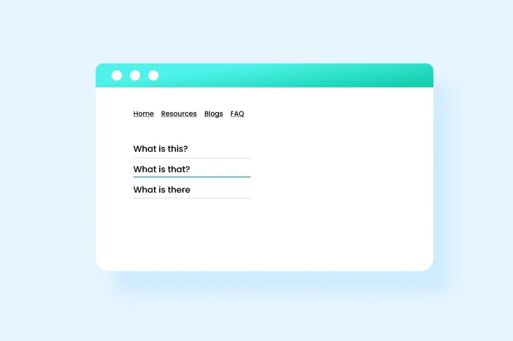
In the below example, the user is kept aware as to his positioning in the website. He can navigate to the third question in the page by pressing the tab button on the keyboard.
4. Images and Multimedia
Images and multimedia boost product appeal and engagement. Inaccessible images and multimedia might also cause complications. Images and multimedia in design guidelines:
- Give non-text content text alternatives.You can use the alt attribute to provide a short description of the picture content, the longdesc attribute to provide a deeper explanation, or the figcaption element to provide a caption.
- Caption, transcript, and describe audio and video content. The track element provides subtitles or captions for video footage, the audio element provides audio descriptions, and the transcript element provides a text version of audio content.
- Allow users to play, pause, stop, mute, and change their audio and video material. The video element can provide native controls for your video content, or you can utilize accessible and consistent custom controls.
- Give users who can’t see your graphics and videos suitable alternatives. For instance, the noscript element can give alternate information for JavaScript-disabled visitors, while the picture element can provide images for different devices or scenarios.
- Meaningful links are an essential aspect of user-friendly web design. Instead of using generic phrases like “Click here” or “More details” as link text, it is important to use descriptive and specific language that informs users about the destination or purpose of the link. For instance, rather than saying “Click here for more details,” a more meaningful link could be “Read the full product specifications.”
- Ensure that content is not designed in a manner that could trigger seizures. Avoid any flashing on the page that exceeds a frequency of three times per second, unless the flashing is small, low in contrast, and does not prominently feature red. For instance, in a movie scene with intense lightning flashes, ensure that such flashes occur no more than three times within any one-second interval.
5. Forms and Inputs:
Forms and inputs allow users to enter data about your product. Forms and inputs determine how users accomplish tasks and achieve goals on your product, affecting accessibility and usability. Forms and inputs in design guidelines:
- Label form inputs and fields clearly. For instance, you can use the label element to label an input or the aria-label or aria-labeled by attributes to name inputs.
- Give clear feedback and error notifications for forms and inputs. You can use the title or placeholder attributes to provide more information or hints, or the aria-invalid, aria-required, or aria-described attributes to indicate input validity, requirement, or description.
- Sort and organize forms and inputs. The fieldset and legend components can group relevant fields, and the aria-orientation attribute can indicate input direction.
- Page headings and labels for forms and interactive controls should clearly convey their purpose.
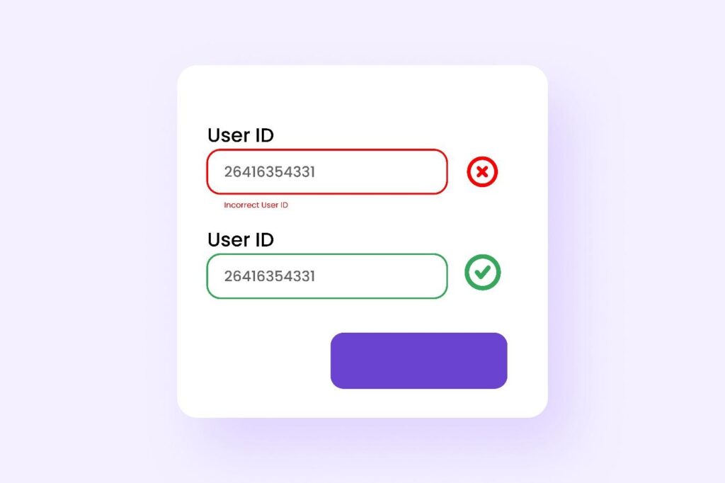
- In the below representation, the user is made aware immediately that he has entered the wrong input.
6. Device-independent design
Ensure that functionality can be operated through various inputs, enhancing usability across different devices.
- Interactions: Avoid relying on device-specific interactions like hover to convey information or complete tasks. If hover or focus-based design is necessary, ensure users can perceive additional content and dismiss it without disrupting their experience.
- Sensory characteristics: Do not provide instructions solely dependent on sensory attributes such as shape, color, or sound. Instead, use a combination of positioning, color, and clear labeling to identify content.
- Alternative to device motion: If device motion activates a feature, provide an alternative user interface or allow users to disable motion activation.
- Complex pointer gestures: Offer alternative single-pointer methods for complex gestures. For instance, provide buttons for zooming and panning in addition to pinch and drag gestures on a map.
- Orientation of content: Avoid restricting designs to specific orientations (portrait or landscape) unless necessary. This flexibility accommodates users with fixed device orientations or preferences due to visual impairments.
- Keyboard-only users: Ensure all interactions are accessible via keyboard alone, benefiting users with various disabilities and limitations. Clearly indicate the focus state without causing unexpected changes in content.
- Focus visibility: Design input elements to clearly indicate their focus state without altering content like text upon focus.
- Keyboard shortcuts: Define intuitive shortcuts for common operations that are easily accessible with one hand. Avoid conflicts with existing browser or screen reader shortcuts.
- Single-key shortcuts: Provide options to disable or remap single-key shortcuts to accommodate users relying on speech input or with specific accessibility needs, like those using screen readers. For example, Gmail allows users to disable or customize single-key inputs like ‘r’ for replying to emails.
Accessibility, Compliance, and Standards
The third step is to apply the accessibility guidelines and standards that are relevant to your product and target audience. The most widely used and recognized standard is the Web Content Accessibility Guidelines (WCAG), which provide a set of criteria and techniques to make web content more accessible to people with disabilities. The WCAG is organized into four principles: perceivable, operable, understandable, and robust.
The WCAG has three levels of conformance: A (minimum), AA (recommended), and AAA (highest). Depending on your product’s scope, audience, and requirements, you should aim to meet at least level AA of the WCAG.
Testing and Iterating for Accessibility
The fourth step is to analyze and validate your product’s accessibility during design. Combine methods and tools like:
- Automated testing tools: Software or browser extensions that analyze your product’s code or UI for accessibility concerns like AAC, WAVE, AXE, LERA and Lighthouse.
- Manual testing tools simulate different scenarios to test your product’s accessibility. Color Contrast Analyzer, NoCoffee, and the Web Developer Toolbar are a few examples.
- User testing tools: These tools let you get feedback from real users with varying abilities or scenarios. [UserTesting], [Loop11], and [Optimal Workshop] are some examples.
Accessibility design is an ongoing process. Learning, testing, and improving are continuous. Follow these standards and best practices to develop accessible, usable, enjoyable, and worthwhile products for all consumers.
Tools and Resources for Accessibility in UX Design
If you want to learn more about accessibility in UX design, here are some useful tools and resources that you can explore:
- A11y Project: a community-driven resource for web accessibility best practices.
- WebAIM: a non-profit organization that provides web accessibility consulting, training, resources, and tools.
- Accessibility Insights: a suite of tools that help you identify and fix accessibility issues in your web products.
- Inclusive Design Toolkit: a collection of tools and methods that help you design for diversity and inclusion.
- Microsoft Inclusive Design: a set of principles and practices that guide Microsoft’s approach to inclusive design.
- Google Accessibility: a hub for Google’s accessibility products, features, initiatives, and resources.
- Apple Accessibility: a showcase of Apple’s accessibility features, products, stories, and resources.
Conclusion
This article offers guidelines and best practices for UX designers to create accessible and inclusive products. It explains the importance of accessibility, its tools, resources, and future prospects. Designing for accessibility benefits both users and businesses. Don’t hesitate to contact us at info@aeldata.com if you have queries regarding UX designing for your website accessibility.


