This success criterion builds upon the minimum contrast ratio of 4.5:1 in success criterion 1.4.3 (Level AA). The minimum contrast ratio for Level AA is 4.5:1, while the range of the ratio for Level AAA is 7:1.
When the contrast ratio is enhanced to 7:1 or greater, it allows users with a significantly higher degree of loss of vision and/or color deficiency to view the website content without assistive technology.
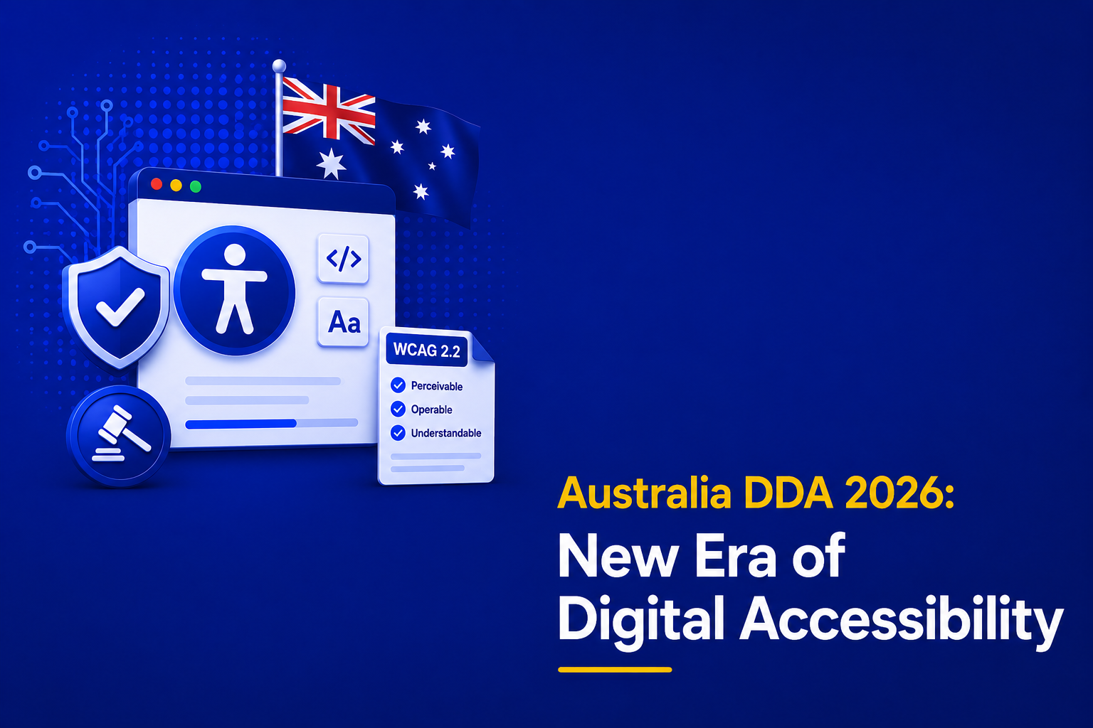
Table of Contents
Official Requirements
Success Criterion 1.4.6 Contrast (Enhanced) (Level AAA): The visual presentation of text and images of text has a contrast ratio of at least 7:1, except for the following:
Large Text
Large-scale text and images of large-scale text have a contrast ratio of at least 4.5:1;
Incidental
Text or images of text that are part of an inactive user interface component, that are pure decoration, that are not visible to anyone, or that are part of a picture that contains significant other visual content, have no contrast requirement.
Logotypes
Text that is part of a logo or brand name has no contrast requirement.
Why is it required?
Good contrast between the text on your website and the background color is beneficial to all users. Some people with visual impairments require a stronger contrast than others to understand your content, hence making use of appropriate colors is essential.
When the contrast ratio is enhanced to 7:1 it usually compensates for the loss in contrast sensitivity experienced by people with low vision who do not make use of assistive technology and provides an enhancement in contrast for color deficiency as well.
How do we fix it?
- Spot test various text and backgrounds throughout the website or application, by using color contrast analyzers to ensure a contrast ratio of at least 7:1. When insufficient contrast issues are detected, make an adjustment on either one or the other color to meet a minimum ratio of 7:1.
- An alternative way to meet this guideline is to provide a link or control on the page letting the user adjust contrast levels or provide another high contrast version of the content.
Exceptions
- Text that is 18 points or larger (or 14 points or larger, if bold) has a lower minimum contract ratio of 3:1
- Text that is entirely decorative
- Text that is an accompanying part of an image (For instance, a woman who is reading a newspaper or a landscape that happens to include a street sign)
- Brand logos