Web design is one of the most important fields of design, and it is the most direct, visual representation of a company’s products, values, and services.
It is also an area that’s constantly evolving and changing; designers must be flexible thinkers who can adapt to new methodologies. This shift in designing for digital experiences is focused on making them as accessible as possible.
Web designers need to think about allowing people with disabilities to interact with their designs. This way, they can avoid designing something that will exclude a section of the population.
Table of Contents
- 1 Web Accessibility Standards
- 2 Essential Accessibility Design Tips For The Best Digital Experience
- 2.1 Never use color as the sole source of information
- 2.2 Create contrast with your color schemes
- 2.3 Font type
- 2.4 Adding alt text to your images
- 2.5 Make sure your website is accessible to keyboard users
- 2.6 Structure content with appropriate HTML tags
- 2.7 Using labels in Form Design
- 2.8 Use descriptive link text
- 2.9 Avoid flashing lights, Images, or UI animations
Web Accessibility Standards
Web accessibility is the practice of removing barriers to the web and the degree to which websites are made usable by people with disabilities. When it comes to making a website accessible, there are web accessibility guidelines that one can follow to ensure an inclusive site.
The WCAG 2.0 (Web Content Accessibility Guidelines) is the international standard for web accessibility and consists of four principles that cover different aspects of web design for people with disabilities or impairments. These principles are known as the POUR principles of Accessibility.
Perceivable – Providing multiple ways of consuming information on a website that caters to each of the senses
Operable – Allowing a user to use more than just a mouse to operate interactive elements on a page like buttons, and controls
Understandable – How easy is it for a user to understand the layout and navigate a web page
Robust – The information provided on the web page must be able to be consumed with the use of alternate technology like assistive technology
As a designer, asking yourself at each stage of your design if it passes the POUR principles is a good practice to achieve Accessible designs.
Essential Accessibility Design Tips For The Best Digital Experience
Below are essential accessibility design tips to contemplate before designing a digital experience-
Never use color as the sole source of information
Using only color to convey critical information may not allow some users to understand the content. For example, low- or vision-impaired users who use screen readers will not distinguish colors. On the other hand, you may have users with cognitive impairments who may benefit from color alone.
When designing for maximum usability, ensure to use a color that meets the WCAG color contrast requirements, a visible focus, and a hover highlight.
Visual icons and lots of white space also help to distinguish text and buttons.
Create contrast with your color schemes
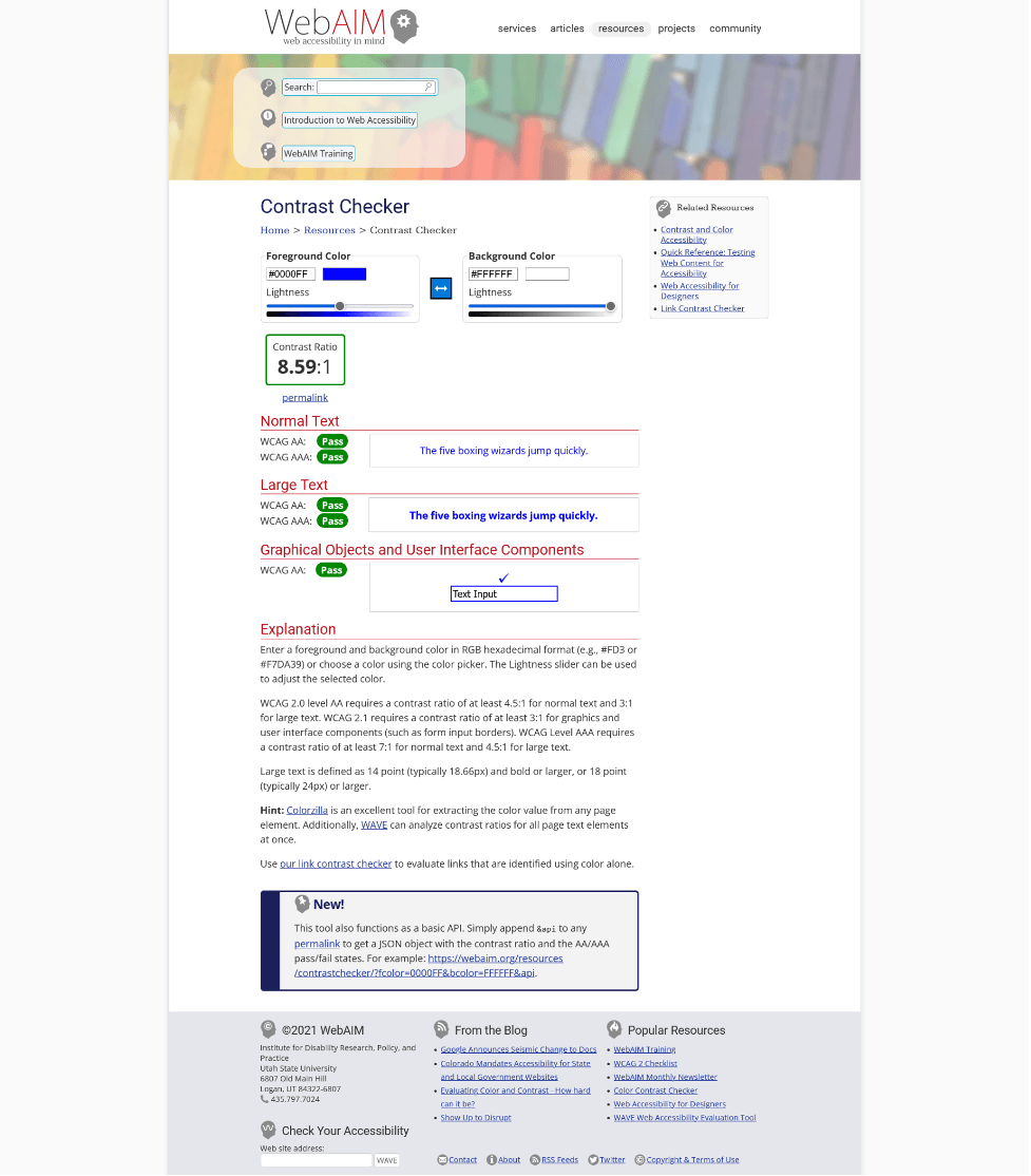
When designing, make sure that there is enough contrast between the background and foreground colors. A good rule of thumb is that if you can’t see the text from at least 20 inches away on a white background, it needs more contrast.
An important detail in web design is the contrast between different elements on the page. To make your features more noticeable, make sure there is enough contrast between their foreground and background colors. Having a good color contrast not only helps users with low vision distinguish elements but also makes for a more aesthetic experience for sighted users.
WCAG 2.1 requires a minimum contrast ratio of 4.5:1 for text and images and at least 3:1 for large text and images.
This is our favorite tool to check for color contrast while picking color schemes https://webaim.org/resources/contrastchecker/
An explanation of the success criteria also helps understand the need for the distinction between foreground and background color.
Font type
People with dyslexia or ADHD face difficulties while reading as they cannot identify the words correctly or have trouble concentrating on the task at hand. Best practices require using 16 point size and sans serif font type for more effortless reading for people with cognitive impairments such as Dyslexia or conditions like ADHD.
Adding alt text to your images
Alternative text is important content, allowing screen readers to understand what an image represents. Without alt text, a screen reader user may not understand the importance of the picture.
In HTML, alt text can be written using the “alt” attribute. The alt text should provide a concise and accurate description of the image and should not contain redundant information that can be found elsewhere in the content. For example, you do not need to write “an image of a zoo” since the screen reader will already announce the image.
Also Read: Important Steps For Your Website’s Accessibility Self Audit
The alt text should be descriptive and concise. For example, if the image contains a photo of a person at a zoo, the alt text should say “Zoo visitor taking a picture with her phone” or “Zoo visitor taking a photo with iPhone.” It should focus on describing what is depicted in the picture, not summarizing or critiquing it.
If there is no alt text, the screen reader will pick up the file name announcing “zoo.jpg,” which does not convey appropriate information to the user.
The exception to this rule is if an image is used purely for decorative purposes. In this case, you can insert an “empty” alt text, so screen readers skip it to focus on the critical part of the content.
An example of how empty alt text would look like –
<img src=” zoo.jpg” alt=” Zoo visitor taking a photo with iPhone”>
Make sure your website is accessible to keyboard users
Sometimes, keyboard input is the only way one can use a computer. But even though most websites are fine with mouse input, not all of them are accessible to keyboard users.
One doesn’t have to be a developer to test with a keyboard. Unplug your mouse, and try to see if you can navigate and interact with all the elements on the page with just the Tab key and Space/Enter key to select it.
Additionally, you need to ensure you can see where the “Tab” button is taking you using focus highlighting.
It’s wise to make sure your website is accessible to keyboard users by testing the page navigation with the “tab” button and ensuring you’ve got tab indexes and focusable elements in the correct order.
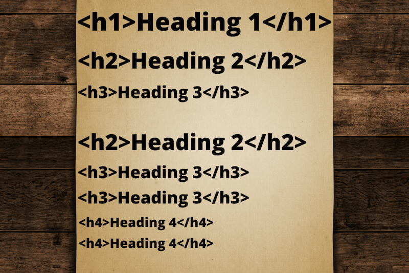
Just as we structure our blog posts and web pages with semantic heading structures for SEO, we need to do the same for screen reader users. A screen reader user uses the headings to navigate a web page, skipping or jumping to sections they want to read. Inconsistent heading markup, i.e., H1, H3, H2, will not accurately convey the information on the page to the user.
This is how an HTML markup with the correct heading structure will look-
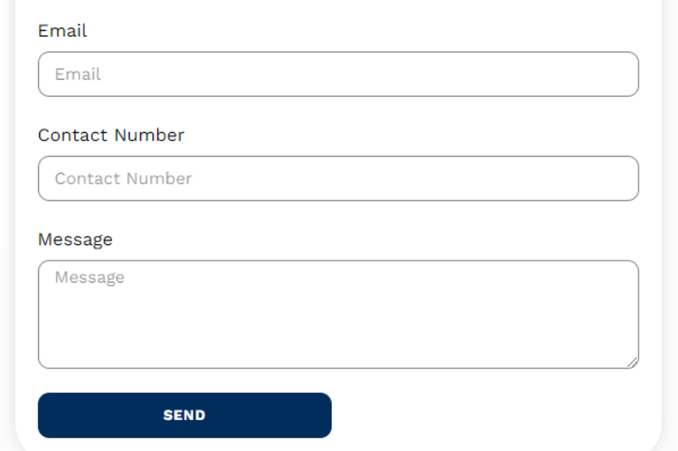
Using labels in Form Design
It is common to add a placeholder text in forms to help people fill form fields quickly. Unfortunately, this poses two problems if placeholders are used exclusively to identify form fields.
- Low vision users may not see the placeholders as a sighted user may due to the low color contrast.
- Screen reader users usually navigate the form fields using a keyboard. If the form field is missing a <label> tag, the screen reader will not announce the field requiring user input.
The tab order should be made so that the keyboard navigation is intuitive and includes labels for each field relevant to completing the form.
This holds true for required fields that are usually marked in red or with an asterisk. Since a screen reader may not announce an asterisk as a required field, ARIA labels are recommended in this instance.
Required fields should be coded with ARIA required = “true” and optional fields with ARIA required = “false”
Use descriptive link text
Most websites have inbound or outbound links to guide users to a specific page to perform actions like subscribing, downloading, etc. However, people with disabilities might be left with no context when driven to a different page through a link. Therefore, users must be informed about the destination page when they click on any link.
Using descriptive link text can help you improve your content by ensuring that your readers know exactly where a link will take them before they click on it. Avoid using phrases like “click here” in your links because it’s not very descriptive and tells nothing about where the reader will go if they click on the link. Instead, use phrases like “read more about our company” or “find out more about our company.”
Avoid flashing lights, Images, or UI animations
Some websites use lights, images, gifs, etc., to make their website more appealing to customers. Sudden bouts of flashing media can trigger seizures in people with photosensitive epilepsy.
For example, a quick flash of 3 times a second would trigger a seizure in a person who is susceptible to them. A Sci-fi tv series, Fringe, theorized that you could hypnotize people by flashing primary colors at a specific frequency. So, unless you are a supervillain trying to take over the world, we suggest you stay away from these. As a bonus, you can also avoid lawsuits.
Designing for Accessibility can be discouraging with so many rules floating around, still following the tips suggested above can be a good starting point. For a deeper understanding of creating accessible, friendly designs, check out our new updated WCAG 2.1 Checklist.