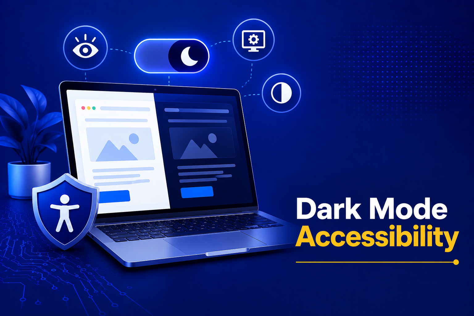
Dark mode dominates displays. Makers sell it as an eye-saving feature, and users adore its sleek style. Is dark mode actually available, though? Changes in color do not inherently improve accessibility. Dark mode presents obstacles many teams ignore.
There isn’t a one-size-fits-all answer. More often than not, the answer is, “It depends.” Dark mode can make the experience better for some people, but it won’t work equally well for everyone.
This piece debunks fallacies and outlines recommended practices for making dark mode work for everyone in 2026.
Table of Contents
The Promise and the Pitfalls of Dark Mode
Most people flip on dark mode to save battery life, tone down the glare in a dim room, or just because it looks sleek. But beyond the aesthetics, dark mode packs accessibility power. For users with photophobia, chronic migraines, or retinal conditions like retinitis pigmentosa, a glowing white screen isn’t just annoying; it actually hurts. A well-crafted dark interface makes extended screen time bearable.
That promise, however, doesn’t automatically equal accessibility. To get this right, we need to understand who benefits, who’s ignored, and where the design traps are hidden.
The Reality of Dark Mode Benefits
Emitting less light inherently reduces eye strain for people with corneal scars, cataracts, or early-stage macular degeneration. People suffering with migraine regularly report that dark themes either prevent attacks or at least take the edge off. For some people living with lupus-related light sensitivity or chronic uveitis, bright white screens can feel overwhelming. For them, an accessible dark mode is a pain-free ticket to work and read. Plus, in low-light environments, a dark UI matches ambient lighting, saving your pupils from the exhausting flex of adjusting to a glaring screen.
But here is the catch: these benefits are on and off with careful contrast management, thoughtful typography, and intentional color choices. You can’t just slap an “invert” filter on your palette and call it a day. Dark mode requires actual design.
The Myths Holding Us Back
Myth 1: It’s always better for visually impaired users.
False. People with astigmatism frequently struggle with light text on dark backgrounds because of halation i.e., the text blurs and bleeds, killing readability. A well-designed light mode might actually serve them better. True accessibility means offering the choice.
Myth 2: It automatically meets WCAG contrast standards.
Not even close. Red text on a dark gray background almost always fails. Grey body text might mathematically hit the required 4.5:1 ratio, yet look like a smudge to human eyes. Dark themes demand much stricter contrast vigilance.
Myth 3: It reduces eye strain universally.
In a brightly lit office or outside in the sun, dark mode forces your eyes to work overtime. It’s fantastic in the dark, but it actively fights ambient glare.
Myth 4: If light mode is accessible, dark mode is too.
Treating dark mode as a simple color inversion destroys usability. Focus indicators vanish, icons lose their meaning, and error states melt into the background. Your dark mode needs its own dedicated design system, testing, and auditing.
The Web Content Accessibility Guidelines (WCAG) set clear standards for contrast and legibility, whether your website uses a light theme or a dark one. A thoughtfully designed dark mode can absolutely meet WCAG requirements.
Applying WCAG Contrast in the Dark
Under WCAG 2.2, the rules remain the same: you need a 4.5:1 contrast ratio for normal text and 3:1 for large text. The problem?
Light text on a dark background suffers from perceived contrast loss. The light literally bleeds into the dark space, making the font look thinner than it actually is. Don’t assume light text on a dark background automatically meets these requirements. Softer grays, brand colors, and disabled text often fall short.
A ratio that easily passes the math test can still feel completely unreadable because human eyes process luminance non-linearly. To fix this, accessibility experts recommend aiming for at least 7:1 for body text, utilizing off-white fonts against backgrounds no darker than 121212. Automated accessibility tools can’t spot this psycho-visual effect, making manual verification absolutely essential.
How We Sabotage Dark Mode?
Using pure white text (FFFFFF) on pure black (000000) is a rookie mistake. It creates a blinding glare and leaves after-images. Stick to muted whites and dark grays instead. Watch out for sleek gray text, too—it might pass the contrast checker but look completely washed out to your actual users.
Another massive failure point is ignoring focus indicators. If a keyboard user can’t see where they are navigating, you’ve failed them. A blue ring that pops perfectly on a white page will often vanish against dark gray. Similarly, “graying out” disabled states on a dark background makes those controls practically invisible. And don’t forget layer separation! Without borders or deliberate drop shadows to create elevation, components like cards and modals blend into a confusing, flat mush.
Above all, don’t just invert your semantic colors. Flipping an error state palette turns crucial warnings into muddy, indistinguishable messes.
Best Practices for 2026
Creating an accessible dark mode takes more than swapping light colors for dark ones. Here are some best practices to help you build a dark theme that works for everyone.
- Build a dedicated palette: Start from scratch. Pick dark surface colors and define distinct elevation layers. Lock in text colors that exceed a 7:1 contrast ratio, and map out very clear color roles for error, success, warning, and info states.
- Beef up your typography: Increase your body text weight to fight off halation. If you use a 400-weight font in light mode, you probably need a 500 or 600 weight in the dark. Slightly wider letter spacing also drastically improves legibility.
- Strengthen focus indicators: Guarantee at least a 3:1 contrast against both the interactive component and the surrounding page. A bright cyan or yellow focus ring is usually a safe bet to keep keyboard users oriented. If users can’t easily tell what’s clickable or where their focus is, the interface isn’t truly accessible.
- Test every interactive state manually: Hover, focus, active, disabled, and error states all require human eyes.
- Respect user preference: Honor the OS-level `prefers-color-scheme` query, but always include a manual, visible toggle on your site. For maximum inclusion, consider offering a high-contrast dark mode variant.
- Bring in real people: Automated tests are fine, but recruit testers with astigmatism, low vision, and light sensitivity. They will flag perceptual failures that a machine never could.
Why Most Audits Miss the Mark?
Far too many accessibility audits still treat dark mode like a trivial add-on. Auditors run automated scans on the default light theme, check the boxes, and move on—usually due to tight deadlines or simple oversight. Some teams just assume a passing score in light mode magically carries over. It doesn’t. When an audit ignores dark mode, it signs off on an interface that actively excludes users who rely on it for medical reasons.
Automated checkers calculate ratios from hex codes and spit out a binary pass/fail. A button with CCCCCC text on a 333333 background hits roughly 4.7:1, passing AA standards. But a real person squinting at it in a dim room just sees a blur. The tool doesn’t experience halation, ignores font weight, and doesn’t care about ambient light. It just checks the math. It also lacks context; a machine can’t tell if a disabled control actually looks disabled or if your charts just lost all visual distinction. Relying solely on software for dark mode is like judging a painting by counting how many colors the artist used. Human observation remains irreplaceable.
The Case for Manual Testing
Manual testing bridges the massive gap left by automated tools. A trained human checking the interface on real devices in varied lighting catches the perceptual failures that math misses. Something as simple as the “squint test” instantly reveals when text is melting into the background. While no regulation explicitly spells out that manual dark mode testing is legally required, genuine compliance demands it. Scanners produce products that pass legal muster but fail actual people.
To fix this, embed dark mode verification from day one. Catalog every single component and state: buttons, form inputs, nav menus, modals, tooltips, data tables, charts, focus rings, and alerts. Measure the contrast manually, observe the legibility, and verify that the meaning remains intact when the lights go out. Use your contrast checkers as a baseline, then apply human judgment.
The Bottom Line
Dark mode isn’t inherently accessible, and light mode isn’t inherently better. The most inclusive experience comes from giving users a choice and making sure both themes are designed with the same level of care.
Dark mode holds massive potential for digital comfort and inclusion, but only if it’s built intentionally. The benefits are real, but so are the limitations. WCAG math is a floor, not a ceiling. Automated tools will miss the nuanced, perceptual issues that matter most, and far too many audits are still skipping the dark UI entirely.
When you design and audit dark mode with the exact same rigor you apply to light mode, you’re doing more than checking a box. You are giving every user a meaningful choice—one that lets people with photophobia work pain-free, lets migraine sufferers read without triggering an attack, and respects the diverse ways human eyes process light. When dark mode is treated as a first-class experience instead of an afterthought, it becomes more than a design preference. Accessible dark mode isn’t a design trend. It’s a responsibility.