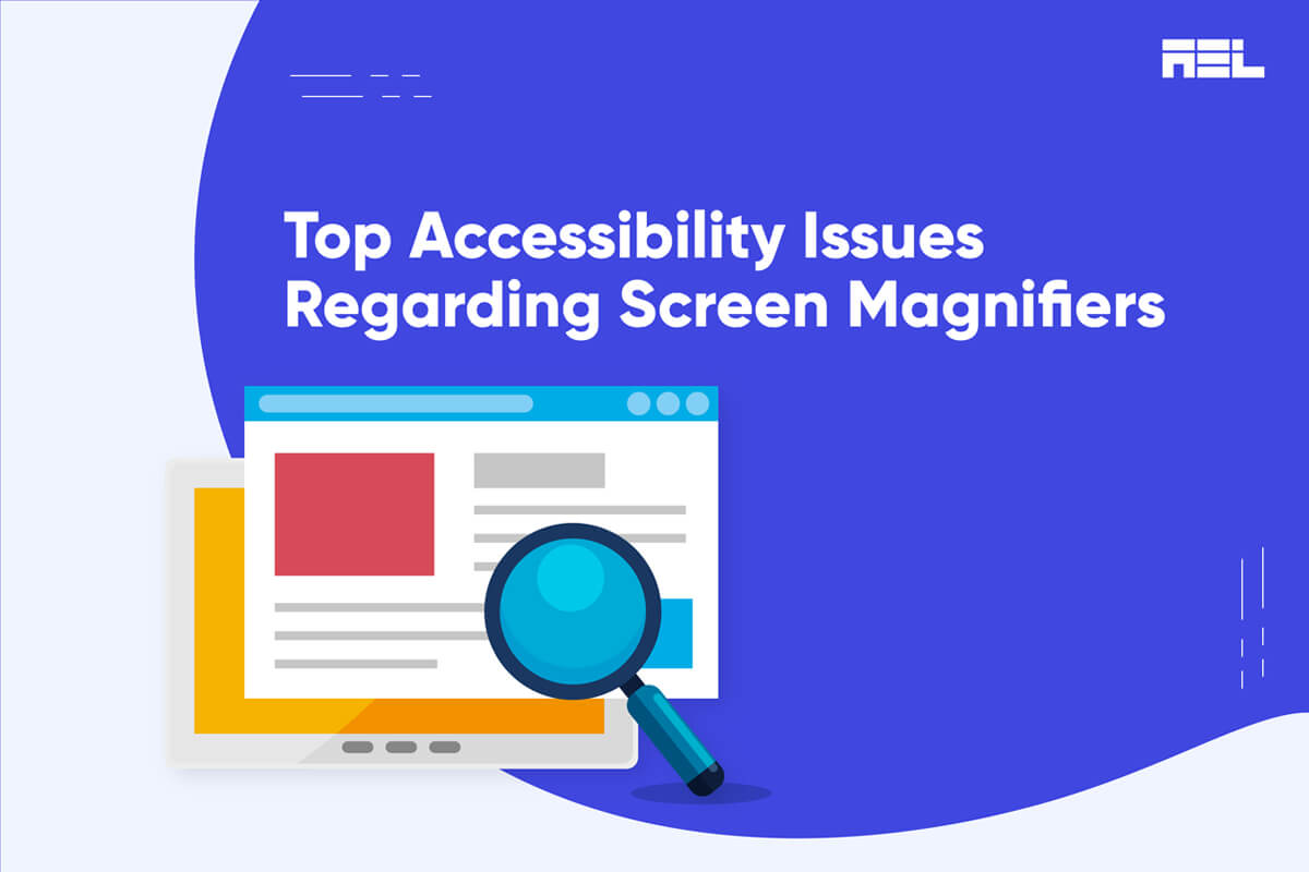
A screen magnifier is a type of assistive technology (AT) that enlarges the size of the screen’s content for users with visual impairments.
Screen magnifiers are designed to help visually impaired people utilize the internet and mobile applications. It’s crucial to cater to a wide range of needs when creating content. This includes allowing users to zoom in on web pages if necessary.
Make sure that users who use screen magnification aren’t hindered by the design decisions you make. Errors may be avoided by adhering to the WCAG (Web Content Accessibility Guidelines).
In this blog, we will explore the four most common accessibility barriers faced by screen magnifier users and how to fix them.
Table of Contents
Four Common Accessibility Issues for Screen Magnifiers
1. Improper Content Reflow
Although reflow isn’t required for screen magnifiers, many low-vision individuals still use browser-based scaling tools. Magnifying content by 400% may require the user to scroll horizontally and vertically if the text does not reflow. You might have encountered this problem if you’ve ever tried to access a non-responsive website from a mobile device; it’s annoying for all users.
Relevant WCAG Criterion to help you fix it:
Success Criterion 1.4.10 Reflow (Level AA): Content can be presented without loss of information or functionality and without requiring scrolling in two dimensions for:
- Vertical scrolling content at a width equivalent to 320 CSS pixels;
- Horizontal scrolling content at a height equivalent to 256 CSS pixels.
Except for parts of the content that require a two-dimensional layout for usage or meaning.
320 CSS pixels is equivalent to a starting viewport width of 1280 CSS pixels wide at 400% zoom. For web content that is designed to scroll horizontally (e.g., with vertical text), 256 CSS pixels is equivalent to a starting viewport height of 1024 CSS pixels at 400% zoom.
Reflow is a dynamic layout that provides a more pleasant reading experience by arranging text into a single column. It takes some work with CSS, but it’s worth it since it’s flexible and robust enough to respond to multiple viewports, which in turn lowers bounce rates and increases mobile traffic.
2. Low Contrast
The color contrast of your website’s font and background determines how easily the text can be read. Even when enlarged, text with a low contrast ratio might be difficult to read. This is particularly true for people with color vision deficiency (CVD).
Relevant WCAG Criterion to help you fix it
Success Criterion 1.4.3 Contrast (Minimum) (Level AA): The visual presentation of text and images of text has a contrast ratio of at least 4.5:1, except for the following:
Large Text:
Large-scale text and images of large-scale text have a contrast ratio of at least 3:1;
Incidental:
Text or images of text that are part of an inactive user interface component, that are pure decoration, that are not visible to anyone, or that are part of a picture that contains significant other visual content have no contrast requirement.
Logotypes:
Text that is part of a logo or brand name has no contrast requirement.
You can identify low-contrast content using automated tools that evaluate your website against WCAG contrast requirements and then remediate it.
3. Unavailability of Focus Indicators
Certain screen magnifiers, such as ZoomText by Freedom Scientific, may alter the size of the user’s mouse pointer, resolving some focus indication difficulties; however, you should not require the user to alter their settings to utilize your website.
Relevant WCAG Criterion to help you fix it
Success Criterion 2.4.7 Focus Visible (Level AA): Any keyboard-operable user interface has a mode of operation where the keyboard focus indicator is visible.
To adhere to this standard, you should evaluate your content for visual effects that might hide the focus signal and refrain from using CSS to override users’ focus indicators.
4. Pointer Gestures
Magnifying a small section of the screen might prevent the user from using certain gestures. For instance: If, on a website, you have to move one symbol to another, not everyone will be able to do it.
But it doesn’t mean you should discard gesture controls for the sake of accessibility just because they allow users to point and click. However, you should give them a choice of what to do.
Relevant WCAG Criterion to help you fix it
Success Criterion 2.5.1 Pointer Gestures (Level A): All functionality that uses multipoint or path-based gestures for operation can be operated with a single pointer without a path-based gesture unless a multipoint or path-based gesture is essential.
This requirement applies to web content that interprets pointer actions (i.e. this does not apply to actions that are required to operate the user agent or assistive technology).
Wrapping Up
If you want your content to be truly accessible, you should design your website such that it works with as many assistive devices as possible, such as screen readers, screen magnifiers, eye-tracking systems, etc. Adhering to WCAG standards can help you avoid accessibility issues and attract more users.
At AEL Data, we have a team of specialists who carefully audit each web page to identify accessibility issues and remediate them. We also offer post-project transition support plans to ease your team into tackling issues when you go live.


