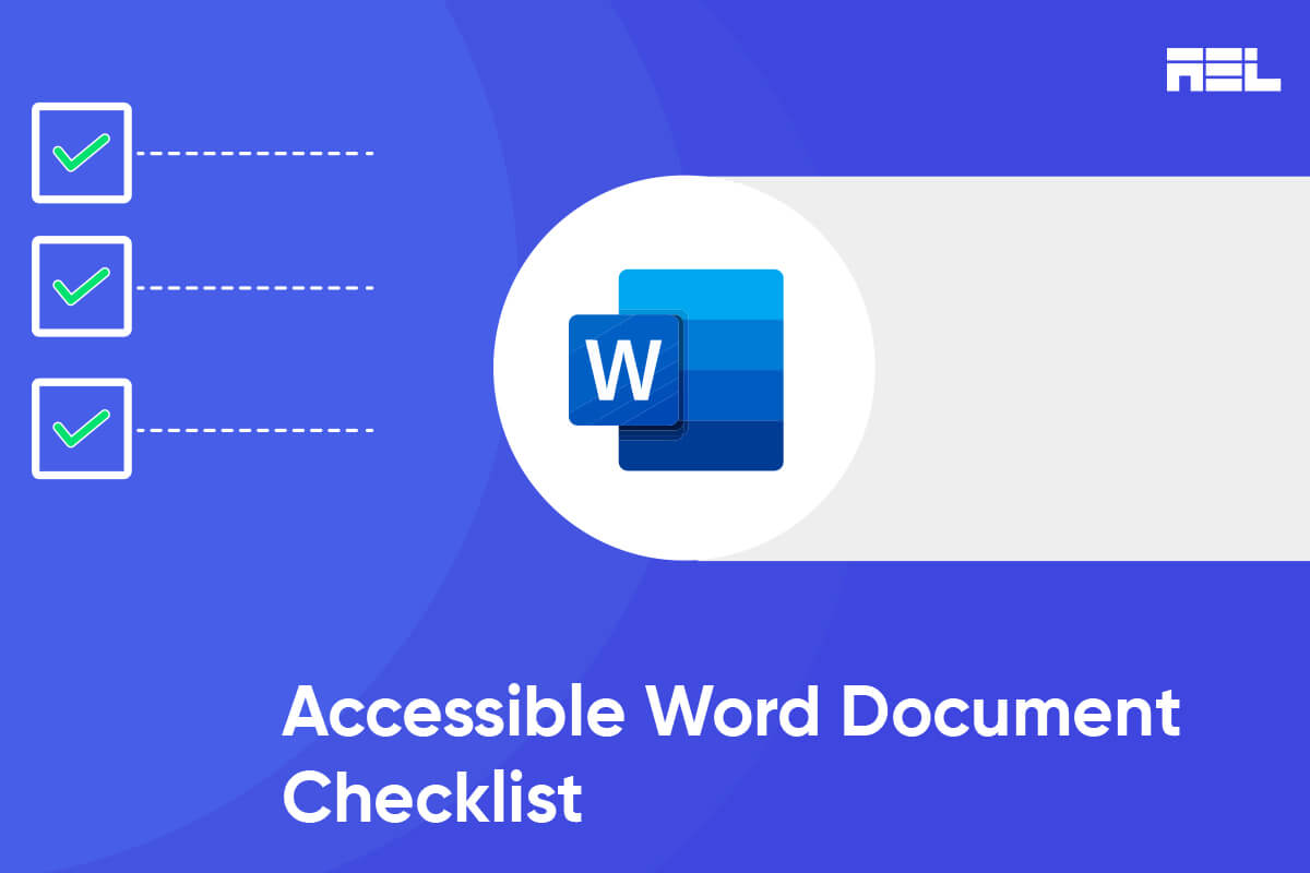
Creating accessible Word documents is not only about meeting legal requirements or conforming to accessibility standards; it is also about promoting inclusivity and ensuring that information can be accessed and understood by the widest possible audience. As Haben Girma, Disability Rights Advocate, rightly said, “Accessibility is not just a technical issue; it is a human rights issue.”
Additionally, creating an accessible Word document lays the foundation for producing accessible PDFs and other alternate formats. Starting with an accessible Word document checklist enables smoother conversions without losing accessibility features. This process streamlines the distribution of information and ensures that individuals with disabilities can access content in the format that best suits their needs.
Here is the checklist crafted for you on inclusivity and accessibility in your Word documents. By following these guidelines, you can create documents that are usable by a wide range of users, including those with disabilities, thereby promoting an inclusive reading experience.
Table of Contents
- 1 What Document Structure Should You Follow at Your Organization?
- 2 Points to Follow for Text Formatting and Readability
- 3 Tips For Alternative Text for Images
- 4 How to Use Hyperlinks and Navigation
- 5 What Color and Contrast Can You Use?
- 6 Experiment With Forms and Interactive Elements
- 7 Ensuring keyboard accessibility for better interaction:
- 8 How You Can Opt For Better PDF Conversion and Accessibility
What Document Structure Should You Follow at Your Organization?
- Use appropriate styles to format headings, subheadings, and text elements consistently.
- Avoid direct font formatting and rely on Word’s built-in styles for a uniform look.
- Create a clear hierarchy of headings using proper heading levels. For example, do not use Heading 4 directly after using Heading 2.
- Insert columns, which can be found in the “Page Layout” tab and “Columns” option, instead of manually using the space button and tab button.
- Create accessible tables using the “Table” option that is found in the “Insert” tab.
- Include proper table headings and check the “Header Row” checkbox.
- If a table spans multiple pages, repeat Heading Rows at the top of each page.
Points to Follow for Text Formatting and Readability
- Choose simple, familiar, and easily parsed fonts for improved readability in your document.
- Avoid using fonts that are more complex and extremely difficult to read. Use a simpler font to enhance legibility.
- Limit the different types of typefaces and font variations so that the document remains consistent.
- Consider font spacing and weight to optimize good text appearance.
- Ensure adequate contrast between text and background; avoid using very small font sizes as they can create ambiguity for the screen reader.
Tips For Alternative Text for Images
- Provide descriptive alt text for all images in the document.
- Avoid relying on automatic alt text generation; manually enter specific and meaningful descriptions.
- Mark decorative images as such in the alt text pane. However, “mark image as decorative” might not work well with older Word document versions.
- Consider the trade-offs between design aesthetics and accessibility for floating images with text wrapping. Although the image wrapped with the text looks visually pleasing, it is less accessible to a disabled person.
- Aim to keep images “In line with text” whenever possible for improved accessibility and proper layout wrapping style.
- Use the Accessibility Checker to identify and address potential issues with alt text and image positioning.
- Provide accurate alternative text (alt text) for graphics and images to assist blind readers.
- Avoid using WordArt, text boxes, watermarks, and background images, as they are inaccessible to screen readers and can hinder readability.
How to Use Hyperlinks and Navigation
- Use descriptive text for hyperlinks instead of raw URLs to provide context for all users.
- Avoid using generic link titles like “Click here” or “More info” to ensure clarity. Instead, the hyperlink title should include relevant keywords or a brief description of the linked content.
- Right-click on the particular word or group of words you want to turn into a hyperlink.
- Ensure the hyperlink makes sense as standalone information, as this should not create difficulty accessing it.
- Consider providing the full URL in brackets right after the descriptive link. It helps users with printed documents or for easy copying and pasting.
What Color and Contrast Can You Use?
- Make sure information conveyed with color is also understandable without relying solely on color.
- When using color to identify keywords, use an additional method, such as bold text, for enhanced visibility. Do not use low color contrast and very small fonts.
- Do not use italics to convey important information, as it may be difficult for individuals with visual impairments to distinguish between normal text and italicized text.
- Use high color contrast, such as black text on a white background, to ensure readability and check accessibility in Word not only for an individual with color blindness but also for everyone.
- Steer clear of poor color contrast, like light yellow text on a white background, which can hinder readability, especially for individuals with color blindness or aging eyes.
- Aim for a minimum contrast ratio of 4.5:1 for normal text and 3:1 for large text, as recommended by the Web Content Accessibility Guidelines.
- Use the Microsoft Word “built-in accessibility checker” to verify if the color contrast in your document meets the required guidelines. This can be viewed under the “review” menu.
- For printed documents, use a matte or non-glossy finish to reduce glare and reflections. This helps enhance legibility for all readers.
Experiment With Forms and Interactive Elements
When creating interactive forms in Word, it is crucial to consider the following key points:
- Display the “Developer” Section
- Create a Form template.
- Add Content to the form.
- Set Properties for Content Controls.
- Include Instructional Text
- Include Protection on the form.
Ensuring keyboard accessibility for better interaction:
- Disable your mouse and solely use the keyboard to navigate and interact with the content.
- Verify that the focus order is intuitive and aligns with the visual order of the page, ensuring a logical and seamless navigation experience.
- Confirm that all functionality is accessible and can be easily utilized using only the keyboard without needing a mouse or other pointing device.
- Ensure that the focus is never trapped within an element, allowing users to move freely and escape focus using keyboard navigation alone.
- Guarantee that the focus is always visible, regardless of the browser being used, and ensure that it is distinguishable for individuals with colorblindness or low vision.
- Avoid any changes in context when users change focus, ensuring that their experience remains consistent and stable.
- Adhere to the ARIA 1.1 Authoring Practices to ensure proper interactions and compliance with accessibility guidelines.
How You Can Opt For Better PDF Conversion and Accessibility
Here are some suggestions for structuring a Word document for easier conversion to PDF:
- Maintain a linear, single-column progression for your content in a Word document. This ensures a proper reading order for screen readers. Complex layouts may scatter the reading order, requiring manual correction using Adobe’s TouchUp Reading Order feature after conversion.
- Utilize the style formatting tool to provide structure to your document instead of text bolding. Screen readers can read out the document’s heading labels, creating bookmarks in the PDF for easier navigation.
- To create Alternative Text for Images, Right-click on images and select Format Object, then type alternative text in the text field.
- Use Microsoft Word’s Hyperlink tool to link web addresses if you want screen reader users to access web links from the PDF.
- Stick to standard text fonts like Times New Roman and Arial for better compatibility.
- Avoid nested data tables and use the Insert – Table option instead of text boxes or layers to create tables.
- Include one blank page at the end of the Word document to ensure complete reading by accessible screen readers.
- After converting to PDF, verify the tabbing order to ensure the document reads as intended.
Wrapping Up
An accessible Microsoft Word accessibility document is designed to accommodate various disabilities, such as visual impairments, cognitive challenges, and motor disabilities. Making these documents inclusive and adhering to word accessibility guidelines contribute to a more inclusive reading experience. Hence, this inclusivity fosters a more diverse and enriched learning, working, and social environment.
“Accessibility is about making things usable for people with disabilities. Accessibility is about inclusivity and diversity.”
Kathy Wahlbin, Digital Accessibility expert
By prioritizing accessibility, you can check for Microsoft Word accessibility and make documents user-friendly for everyone, leading to a broader audience reach.
At AEL Data, we provide
- Full Suite of Accessibility Services
- Innovative technological solutions
- Tailored solutions for your brand
- Long-term partnership and support
- Agile methodology as the foundation, and more!
Ask us today if you need any support or have inquiries related to accessibility services. Get in touch with us at info@aeldata.com.