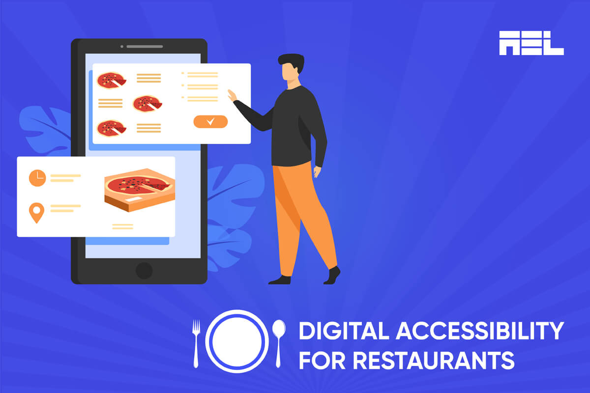
A successful restaurant must have a unique brand identity that sets it apart from its competitors, and an online presence is essential for attracting and engaging customers. It showcases the menu, provides information about the restaurant’s ambiance and location, and accepts online reservations or orders. This blog will explore the benefits of having an online presence and how to achieve it.
Table of Contents
Why restaurants can’t afford to avoid web accessibility
Here are the top 3 reasons why restaurants need to get started on digital accessibility:
Reach more customers
More than 1 billion people have a disability; therefore, you are missing out on a huge market by not offering accessible online services. Accessibility also benefits people without disabilities, such as people with situational or temporary disabilities like working in an unstable/low-bandwidth internet area, using unsupported or old devices to access websites, etc. Hence, restaurants with accessible websites can reach more customers and increase customer loyalty and satisfaction.
Avoid lawsuits and penalties
Restaurants that fail to meet these legal requirements may face lawsuits, fines, or negative publicity. For example, in 2019, a blind man sued Domino’s Pizza for violating the ADA because the website and mobile app were not accessible to him. The case reached the Supreme Court, which declined to hear Domino’s appeal and let the lower court ruling stand. This case sets a precedent for similar lawsuits against businesses not providing accessible online services.
Improve SEO and usability
Web accessibility is also good for search engine optimization (SEO) as it improves usability. The main goal of SEO is to ensure the best usability for all users. Therefore, many of the practices, such as providing clear headings, alternative text for images, etc., help improve the ranking and visibility of websites on search engines. Additionally, accessible websites are usually faster, simpler, and easier to use.
9 Tips to Support ADA Requirements for Web Accessibility
Here are the nine essential requirements for an accessible website.
1. Alt-text for images
Alternative text (alt text) is a concise description of an image in HTML code used by screen readers and assistive technologies to convey its meaning and purpose to those who cannot see it. It should be precise, devoid of redundant information, and empty if the image is decorative or has a caption. This helps avoid unnecessary repetition and ensures the image is easily accessible to users.
2. Captions and transcripts
Captions and transcripts are synchronized text alternatives for the video’s audio content, displayed at the bottom of the player and accessible by the user. They should be in appropriate formats and have tools for synchronization, formatting, and display options. Developers must ensure accurate and consistent captions and transcripts with audio content, including non-speech information like speaker identification, sound effects, music, and emotions.
Here is a Transcript of a lecture to help you understand how it works.
3. Keyboard accessibility
Keyboard accessibility ensures that all website functionality is accessible using the keyboard, including links, menus, buttons, forms, sliders, tabs, and dialogs. It also includes visual focus indicators indicating which element is active or selected. Developers must ensure all interactive elements are focusable and have a logical, consistent tab order.
4. Headings and landmarks
Headings are text labels that indicate the topic or purpose of a section of content, typically marked up using H1 to H6 elements in HTML. Landmarks are web page regions containing specific content, such as navigation, main content, etc. They are usually marked up using HTML5 sectioning elements or ARIA landmark roles.
Developers must use the appropriate markup and roles to convey the hierarchy and meaning of the content. Headings and landmarks should be descriptive and concise, nested correctly, and avoid skipping levels.
5. Labels and instructions
Labels are text that identifies the name and purpose of a form control, for example, a text field, checkbox, select menu, etc. They are usually associated with the form control using the label element in HTML or the aria-label or aria-labeled attributes in ARIA.
Instructions are text or visual cues that provide additional information or guidance for a form control, such as format, required fields, etc. They are usually provided using the HTML title attribute or the ARIA’s aria-described attribute. They should also be placed close to the form controls and avoid using placeholder text as labels.
6. Color contrast and alternatives
Color contrast is the measure of brightness difference between foreground and background colors on the website, with a range of 1:1 to 21:1.
WCAG 2.1 requires a minimum 4.5:1 ratio for normal text and 3:1 for large text or user interface components. Furthermore, you can also use alternatives to colors to convey information to users, such as links, buttons, status indicators, text labels, etc.
7. Font size and Space between paragraphs
You can alter font size through your browsers like Chrome. Check out this Chrome support page to change text, image & video sizes by Google to learn more. However, only some know how to change the font size. Using a relatively big baseline font that users can alter according to their requirements is recommended.
Furthermore, you can also provide a sufficient amount of space between sentences and paragraphs to improve the readability of your website.
8. PDF Accessibility
Providing accessible PDF furthermore improves the accessibility of your website as users with disabilities can easily consume knowledge from it. Learn more about the significance of accessible PDFs on our website.
9. ARIA Attributes
ARIA (Accessible Rich Internet Applications) is a set of attributes that can be added to HTML elements to provide additional information and functionality for assistive technologies. ARIA enhances the accessibility of dynamic and complex content, such as menus, alerts, live regions, etc. They should also be tested with different browsers and assistive technologies to ensure compatibility and usability.
Conclusion
Making websites accessible is neither optional nor a nice-to-have. It’s not only helpful but a must. Businesses can easily increase their online presence to attract more customers; however, they must ensure it is accessible to all users. Gen Z appreciates organizations that practice what they preach more. Therefore, an accessible website gets them on your side.
If restaurants’ main motto is to ensure customers feel it’s their home, then online accessibility is the mother in that house. We hope you understand why digital accessibility is important for restaurant websites. If you need assistance with accessibility services, don’t hesitate to contact us at info@aeldata.com.


