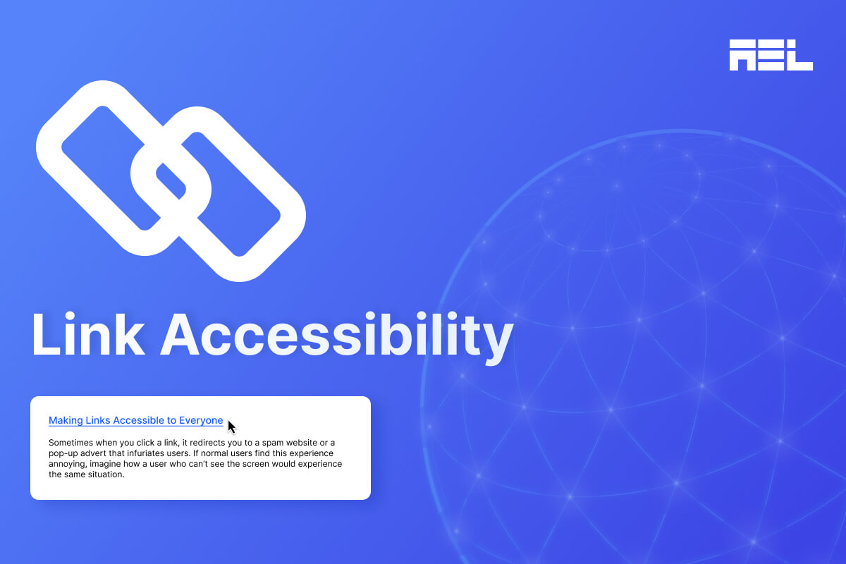
Sometimes when you click a link, it redirects you to a spam website or a pop-up advert that infuriates users. If normal users find this experience annoying, imagine how a user who can’t see the screen would experience the same situation. If this is the first time reading about accessibility and wondering how a user consumes digital content without seeing the screen, here is a quick introduction to assistive technology.
People with disabilities often use assistive technology such as screen readers to access digital content. Assistive technology comes in various forms, however we’ll talk about screen readers in relation to this article. Screen readers are software that are typically installed locally on a computer or mobile devices and act as text-to-speech engines. In simple words, someone who blind will have the software read back the text on the web page or application they are browsing through.
While most of the users of screen readers are blind, users with low vision or other forms of visual impairment also use screen readers. Screen reader usage isn’t limited to the visually impaired user groups, but also includes other disability groups such as those with hearing loss, cognitive, learning and motor disabilities.
With that context, it is paramount to focus on link accessibility to ensure that users with disabilities have the best experience on your website. In this article, we will explore topics surrounding link accessibility and their impact on users.
Table of Contents
How People with Disabilities Use Links
We introduced how people with disabilities use Assistive Technologies to read content online. There are multiple screen readers available based on the Operating System.
Here are the most commonly used screen reader and OS combinations:
- JAWS – Windows
- NVDA – Windows
- VoiceOver – MacOS and iOS
- TalkBack – Android
There are other screen readers that are used, however, to a lesser extent than the ones listed above.
A few of them are:
- Narrator – built-in for Windows
- Orca – Linux
- Dolphin – Windows
- ChromeVox – online browser extension
Whether navigating a page with a keyboard only, or with a screen reader, a user must first be able to reach the link with the keyboard. On the web, the TAB key is most commonly used to jump from link to links, and the ENTER key activates it.
Screen reader users, however, have shortcut keys available that allows them to quickly navigate to links without having to Tab through the entire content of the page.
- Pressing the letter key “K” with NVDA on, takes the user to the next link.
- VO + Command + L takes a user to the next link on VoiceOver.
- JAWS doesn’t have a shortcut key that takes a user directly to a link. It however, has a function that shows the list of links and a user can pick the links to visit from the list. The command is Insert + F7.
Role
Most screen readers announce the word “link” either before or after the link text that identifies itself as a link to someone relying on text-to-speech.
An example announcement is: “Making Links Accessible for Everyone, link”
Link Purpose
The last and probably the most important criteria around how a link is read out by a screen reader is the link purpose. The purpose of the link text should be clear to a user. Not only does having a descriptive link text help a user understand clearly where it will take them, but also serves another purpose that is commonly overlooked.
As we saw earlier, screen reader users use the shortcut keys to jump around and navigate faster. Often this results in the text in between links being skipped as a result of this way of skimming page content. It is imperative that the link text makes sense during this process, keeping in mind the text leading up to the link may be skipped.
Common Link Accessibility Mistakes
Here are some common mistakes in link accessibility:
1. Non-descriptive or missing Descriptive Link Text:
Non-descriptive link text such as “click here”, “learn more”, are overused in web copywriting practices that are geared towards a visual audience. These phrases are vague and ambiguous to screen reader users as the software announces them out without context. One key practice for creating accessible links is using descriptive anchor text that clearly conveys the link’s purpose. The main goal of having descriptive text is to convey the destination of the link. Short and generic phrases like “Read more” will further confuse users. Therefore, using specific text such as “Read more about WCAG Guidelines” can provide more context.
Furthermore, if the additional words can be avoided by using keywords alone that can communicate the context to users, that’s even better. “Read more about WCAG Guidelines” can be more efficiently written as “WCAG Guidelines”, letting a user know the link will take them to the WCAG Guidelines website.
2. Relying on Color alone:
Designing links only through the use of colors makes it difficult for color-blind, or low-vision users to identify them. As a cognitive impaired user, I often have a tough time differentiating links from the surrounding paragraph text that are not underlined by default. As a power keyboard user, I primarily rely on the focus indicator to highlight the link from text, but it’s not the end-all. Oftentimes there are no focus indicators on most websites.
Atleast, I have a work-around: think about a senior or a user whose computer literacy may not be advanced and have to use their mouse all across the page to identify links that are difficult to discern from the text.
Below is an example of link text that uses color alone to distinguish itself from the surrounding paragraph text:

Some could argue that underlining text is not a WCAG requirement, and they are correct; only if the following two conditions are met:
- The contrast of the link text to the surrounding paragraph text is at least 3:1.
Let’s look at the same image from above to determine if this check passes:
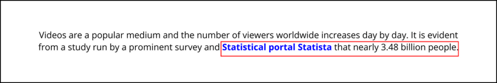
The link color is #0000FF and the text color is #000000. The link to body text ratio is 2.44:1, which fails the Level A required contrast ratio of 3:1
In addition, the link and body text must have a 4.5:1 contrast with the background color to meet the WCAG 2.1 Level AA guidelines.
Taking the same example, the background color of the page is white, #FFFFFF. The color of the link and the color of the body text now needs to be tested against the background individually.
The link color to the background has a contrast of 8.59:1, which passes.
Body text to the background has a contrast of 21:1, which passes.
- There is a form of identification without the use of color alone upon mouse hover or keyboard focus. Underlining links on hover, or focus is typically the design pattern used in this instance, if not underlined by default.

In the same example we’ve been using, the link has an underline on hover, which satisfies the condition, partially. I say partially, because on hover only targets mouse users and ignores keyboard-only users.
Below, we see a screenshot of the same link on keyboard focus, and there is a visible keyboard focus indicator and an underline is present to differentiate between the link and body text.

In this example, we saw that there is sufficient use of a non-color indicator on mouse hover and keyboard focus. The only other checkpoint to meet the criteria is increasing the link to body text contrast to meet 3:1, and it will pass all the requirements to use the link without using underline by default.
3. Missing or empty href attributes:
We see links without a href attribute, which will not make it focusable even if the correct anchor <a> element is used.
<a> I am a Link </a>Empty href attributes typically have the use of a placeholder hash “#” as the href has no action when a link is clicked. It looks like a link, announced as a link, but doesn’t go anywhere. This experience can be frustrating to all users, not just those with disabilities.
<a href=”#”> I am a link </a>In my opinion, using the # method is only acceptable when mimicking a page scroll effect – as long as the target element id matches the href of the link. Otherwise, a href should always have a valid href attribute.
4. Non-focusable custom elements:
A lot of developers use custom elements like a
As the <div> element is primarily used to create divisions or sections, or to serve as containers for HTML elements, they are not interactive. Which means they are not keyboard focusable. As we mentioned earlier on in the article, keyboard and screen reader users use the TAB key to reach links on a web page. If the element is not focusable, it can’t be reached with the TAB key, making the link inaccessible.
Incorrect example:
<div role=”link”> I am a link without focus </a>Correct example:
<div role=”link” tabindex=0”> I am a link with focus</a>Adding the tabindex=”0” will make the link now keyboard focusable. However, this isn’t complete yet. Remember the href attribute we talked about? Well <div> doesn’t support a href attribute. What do we do now?
Add an onClick event handler to the div via Javascript.onclick=”location.href=’example.com’
Seems like an awful amount of work.
It comes from a disease called “divitis” that makes developers forget they can use native HTML elements such as <a>, <button., <p> and so on that are accessible out-of-the-box.
No cure for this has been discovered yet.
Best Practices for Creating Accessible Links
1. Using descriptive anchor text
One key practice for creating accessible links is using descriptive anchor text that clearly conveys the link’s purpose. The main goal of having descriptive text is to convey the destination of the link.
2. Optimizing link styling for visibility
Optimizing link styling for visibility is crucial for user accessibility. This involves visually distinguishing links from regular text through underlining, color changes, or icons. To address color blindness, a combination of visual cues should be used. Good contrast ratios between link text, surrounding text, and background are essential for readability. Common indicators for links include underlining or bold, and changing the link’s appearance on hover can provide user feedback.
3. Ensure Adequate Size and Spacing
Make sure the size and spacing are sufficient. Expand clickable regions to cater to users with motor impairments. Aim for a minimum target size of 44×44 pixels, and ensure there’s enough space between links to avoid unintended clicks.
4. Offer Clear Focus Cues
Guarantee that links are keyboard-friendly by displaying visible focus indicators. This enables users to navigate links using the tab key, thereby improving accessibility for those who rely on keyboard navigation.
5. Programmatic Accessibility
To ensure proper HTML structure, use anchor tags to define links and provide clear text. Use descriptive title attributes for additional context. Ensure links are focusable and navigable using the keyboard for assistive technology users.
Lastly, don’t forget to test links. Screen reader testing tools simulate user experience to identify accessibility issues, while manual testing involves testing links with various browsers and assistive technologies.
6. Inform users when a link opens in a new tab
When links are clicked on, there is no telling whether they will open up in a new tab. This experience is consistent for regular users or those who use assistive technology. It is good practice to provide an indication that the link will open in a new tab. There are a few best practices to incorporate that will address this challenge:
- Add the phrase “opens in a new tab/window” within the link text. An example of this could look like, “WCAG Guidelines (opens in a new window)”. It is important to note that the alert should be placed in parentheses after the link text so that it isn’t confused with the actual link text and destination. This however, may cause very long link text if used across the site with a lot of external links and take away from the aesthetics.
- Include the alert in the aria-label, such that it is hidden from the visible link text and still available to screen reader users. Alternatively, hidden screen reader text can also be used via the CSS .sr-only class.
- Adding visual cues next to links that open up in a new tab will help visual users. This is implemented by placing the icon at the end of the link text. If an aria-label or sr-only text is used, there is no need to provide alternative text for the icon and can be marked decorative. This icon is called “New Tab Icon”

Wrapping up
In summary, the article emphasizes on accessible link practices which include providing clear, concise text that reflects linked content for all users. It cautions against relying solely on color for links, suggesting visual cues like underlining or bolding alongside varied colors.
By prioritizing accessible links and adhering to best practices, web designers and developers can create websites that cater to all users with diverse needs. This is an imperative in today’s digital landscape.
Embracing link accessibility represents not only just a step towards compliance with regulations but also. It stands as a testament to commitment: A pledge to crafting an online experience more inclusive for everyone. Reach out to us today to assist you with web accessibility.