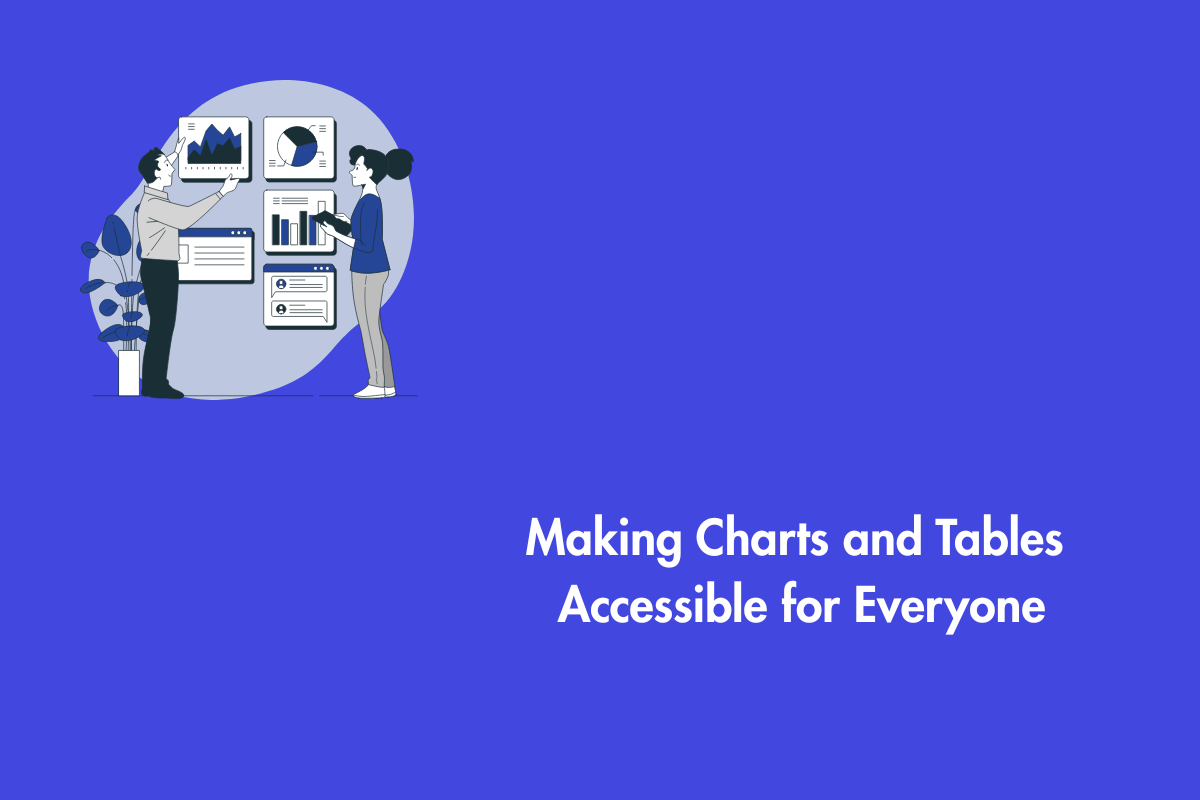
Data is the lifeblood of every business, helping organizations understand emerging trends and make informed decisions. Charts, graphs, etc. can weave stories that help you visualize information and empower your creative ideas. Data is often presented in formats that are not accessible to everyone. Our blog will help you create a practical framework that makes complex visual data accessible to all everyone including users with disabilities. Let’s make your charts clear and usable for everyone, no matter how they engage with your content.
Table of Contents
The Three Pillars of Accessible Data
Before diving into the main topic, let us understand the basics of making data accessible. To create anything from scratch you need start with a solid foundation. Accessible data rests on three pillars:
- Purpose
- Plain language
- Multiple pathways
Purpose:
It is essential to understand the purpose of your data before you start coding or designing it. For example: If you are comparing the data of annual sales of two regions, then instead of using a bar chart, it is better to use a simple data table so that screen reader users can find specific values.
Likewise a line chart is better when you are showcasing growth data spanning over five years as it shows the trajectory. Therefore setting a clear goal at the beginning will help you create designs that are accessible and meet the user’s needs. Furthermore, it also shields you from unknowingly choosing bad formats that don’t convey information to all your users.
Using Plain language:
Data is surrounded by titles, descriptions and labels which can easily perplex users when it is filled with jargon and complex words. Using plain language not only helps users with cognitive disabilities and non native speakers but it also simplifies the work for busy professionals.
Avoid using technical jargon and explain it clearly if it’s inevitable. Lastly, provide clear and descriptive titles and headings. For example, instead of using “Figure 1.24”, use “the annual decrease in adoption of iPhone 13 in Quebec, 2020-2025”.
Providing Multiple Pathways:
The core philosophy of inclusive design is that there is no perfect format that works for every user in every situation. Therefore, it is essential that you provide the same information in different formats especially when it comes to data.
For example, a data analyst might require a raw CSV file to explore data with their desired tools, however a user with low vision simply prefers a high-contrast bar chart. It is easier to offer options to users that help them choose their desired format rather than forcing them to use a default format.
When designing accessible data representation visuals, choose the right type and make small tweaks to help everyone interpret the data. Now, let’s delve deeper into best practices for different kinds of data representation.
Charts and Graphs Accessibility
Here are popular recommendations to make your charts and graphs accessible:
- Do not rely on color alone to convey information; approximately 1 in 12 men and 1 in 200 women have color vision deficiencies.
- Use additional distinguishing markers in bar charts and line graphs.
- For pie charts, label each slice with its category and value.
- According to WCAG guideline 1.4.3, text needs to have enough contrast with its background. Ensure sufficient color contrast with a ratio of at least 4.5:1 for normal text and 3:1 for larger text.
- Include accessible data tables for users who cannot perceive charts.
- Label clearly, use patterns or textures instead of relying on colour, and keep layouts simple.
- For complex visuals, break them into smaller charts and include a short text summary of the key insights.
- Make sure your charts stay clear and usable when resized, as WCAG 1.4.4 requires text to scale up to 200%.
These steps make your charts clearer, more inclusive, and easier for everyone to understand.
Data Tables Accessibility
Here are the best practices for making accessible data tables:
- Use <caption> element as it serves as the table’s title and provides essential context for screen reader users.
- Make use of <th> tags with the scope attribute to specify header and data cells’ relationships.
- Use <th scope=”col”> for column headers, indicating that it corresponds to all the data cells directly below it, and <th scope=”row”> for row headers to relate to data cells to the right.
- Breaking down complex datasets into smaller, simpler tables with clear headers is recommended. Offering downloadable formats like CSV or Excel enhances user flexibility and accessibility to the data.
Interactive Charts Accessibility
Here are some popular ways to make your charts accessible:
- Keyboard accessibility is essential for all interactive functionalities, ensuring operability for users with motor disabilities and those relying on screen readers.
- Users can navigate elements using the Tab key, activate them with Enter or Space, and move within components using Arrow keys, ensuring full accessibility even for elements activated by mouse hover.
- Interactive dashboards should provide just important information and let users disclose more as required. This method simplifies, decreases cognitive burden, and focuses the user experience, particularly for people with cognitive or attention-related disabilities.
WCAG and Data Representation
According to WCAG guidelines, charts and tables need text alternatives to be accessible. Simple visuals can use short alt text, while complex ones benefit from a brief summary and a well-structured data table. If space is tight, use aria-describedby to link to a longer description. Proper table coding with headers and captions helps screen readers convey the data clearly making your charts easier for everyone to understand.
Conclusion
When your data representation visuals are designed with accessibility in mind, you open the door for everyone to explore insights and make informed decisions, regardless of ability. By focusing on purpose, using plain language, offering multiple pathways, and following WCAG best practices, you ensure that your data tells a clear and inclusive story.
Let us do a quick recap of blog so that it stays fresh in your mind:
- Start with purpose to align the format with the user’s goals.
- Use clear, plain language for titles and descriptions.
- Avoid relying on color alone; use patterns and labels as supplements.
- Provide comprehensive text alternatives that summarize key insights and link to a complete data table.
- Employ proper HTML semantics for tables, such as <th> and <tr> with scope, to enhance logical structure for screen readers.
- Ensure all interactive elements are accessible via keyboard.
As a data professional, you have the power to make the information inclusive to everyone. Unlike other professions, data’s true potential can be unlocked only when it is understood by everyone. A comprehensive interactive dashboard might just be a blur to users with impairments and can become a labyrinth for keyboard users if it’s not accessible. Contact us to understand further about accessibility in data representation.