eLearning accessibility is about making sure online learning works for everyone, no matter their physical or cognitive abilities. When we design eLearning with accessibility in mind, we create equal learning opportunities instead of barriers.
The new must-have in eLearning is Accessibility. Compliance checks aren’t important; what matters is releasing potential. When your classes are made so that everyone can use them, you create a culture where all students feel welcome and can participate, contribute, and do well.
Put away your complicated rules. This checklist mentioned here, gets to the point quickly. We will be discussing actions you can take immediately to improve your material for all users, not just those who can access it. Together, we must be able to learn.
Table of Contents
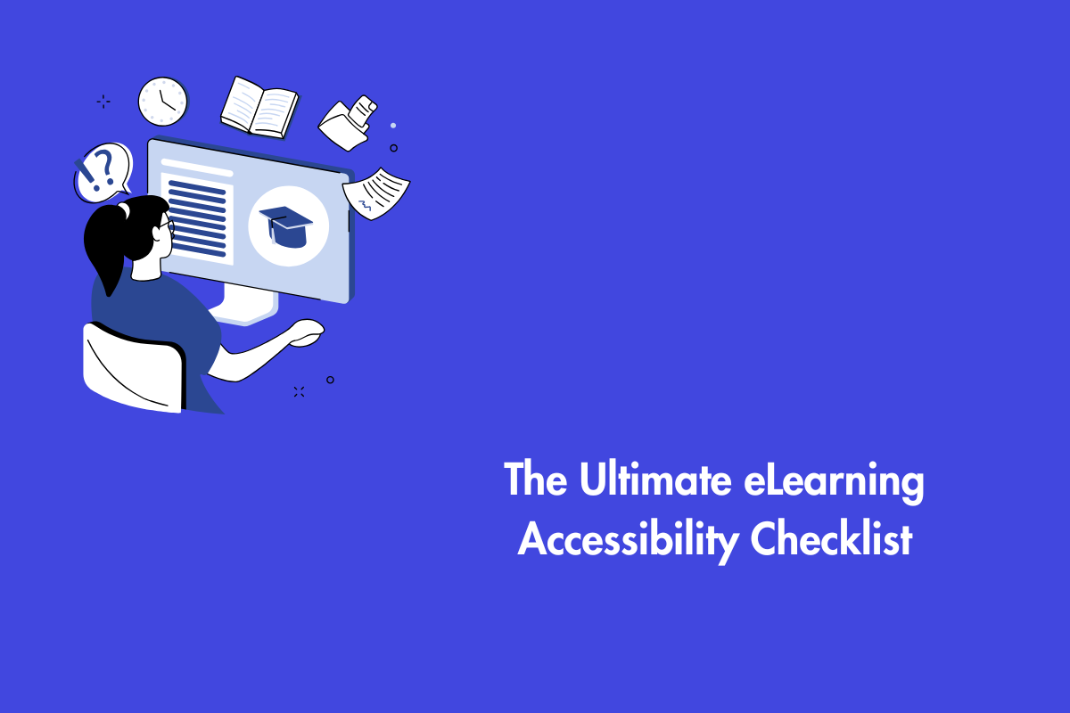
The Ultimate eLearning Accessibility Checklist
1. Master Your Media: Content for All Senses
Caption All Video & Transcribe All Audio
There is no way around this. Everyone profits from captions but they are especially useful for those who are hard of hearing or deaf. Consider an individual studying in a noisy café or the worker in an open workplace or anyone who just learns better by reading. Transcripts of audio snippets and podcasts are excellent searchable study aids.
Describe What You See (Alt Text)
Every image that conveys meaning needs a clear, concise text alternative. A screen reader will read this description aloud. Don’t just say “chart.” Say “Bar chart depicting a 40% increase in Q3 sales.” For purely decorative images, mark them as such, so that assistive technology can skip them.
Ditch Autoplay & Ensure Keyboard Control
Auto-playing media is annoying and may startle a lot of students, particularly those who rely on screen readers. People with cognitive problems may also experience difficulties as a result. Give users the play/pause button. Ensure all media players can be controlled with a keyboard alone.
Avoid Text over Images
Placing text over images is common in modern UX and UI design. While it can make a website look visually appealing, it often creates accessibility barriers for people with disabilities and can even lead to legal issues for website owners.
2. Structure & Navigation: The Backbone of Access
Craft a Logical Heading Structure
Headings such as <h1>, <h2>, and <h3> are not just for big, bold text. They create a navigational map for screen reader users. Your course title is the H1. Each module is an H2. Topics within the module are H3s. Never use a heading just for its visual size; use it to outline your content’s hierarchy.
Ensure Full Keyboard Navigation
Many users cannot use a mouse. They rely on the Tab key to navigate. Test your entire course using only your keyboard. Can you access every link, button, and interactive element? Does a clear, visible focus indicator show you where you are on the page? Else, you’re locking people out.
Visual Focus and Focus Management
Visible focus shows where you are on a page when you use a keyboard, usually with a clear outline or highlight. It helps users know what they are interacting with and where to go next. Focus management makes sure this movement feels natural, especially when pop ups or forms appear, by guiding focus to what matters and back again. Together, they make keyboard navigation simple, predictable, and accessible.
Write Meaningful Link Text
“Click here” is useless. Screen reader users often tab through a list of links, and “click here… click here… click here” tells them nothing. Be descriptive. Instead of “Click here to download the report,” use “Download the Q4 Financial Report (PDF).”
3. Color & Contrast: Design for Clarity, Not Just Aesthetics
Pass the Color Contrast Check
Low contrast text (like light gray on a white background) is a major barrier for learners with low vision or color blindness. Use free online tools to check that your text has a minimum contrast ratio of 4.5:1 against its background. This makes your content readable in bright light or on older device screens.
Never Use Color Alone to Convey Meaning
If you state, “Items in red are required,” you exclude someone who can’t perceive red. Always pair color with another indicator. For required fields, also use an asterisk (*) or the word “required” in the label. In a chart, don’t just differentiate lines by color use different shapes or patterns.
4. Interactivity & Comprehension: Engage Every Mind
Give Learners Ample Time
Not everyone reads or interacts at the same speed. If you have timed activities or quizzes, provide options to turn off the time limit, extend it, or request more time. This supports learners with cognitive disabilities, those who need to use assistive technology, which can be slower, or anyone who simply needs a moment.
Simplify Your Language
Jargon, complex sentences, and long paragraphs create cognitive load. Write in plain language. Use short sentences and an active voice. Break up text with bullets and whitespace. This helps non-native speakers, individuals with dyslexia, and frankly, every busy employee trying to learn quickly.
Provide Clear Labels & Instructions
Every form field, button, and interactive element needs a clear, programmatic label. A screen reader user needs to know what to type in a field or what a button does. “Submit” is okay; “Submit Your Final Assessment” is better. Provide clear error messages that explain what went wrong and how to fix it.
Audio decriptions for any visuals
Audio description simply means describing what’s happening on screen out loud. It covers things like actions, visual details, gestures, and the setting. With audio description, people who are blind or have visual impairments can enjoy videos just like anyone else.
5. Files and Downloads
Accessible PDFs
Ensure that any files on your website are accessible. PDFs are limited when it comes to styling and interaction. They can also become hard to access, especially if the document is complex or was not created with accessibility in mind. Before choosing a PDF, it is worth considering more accessible options, like an HTML web page or a view only Word document.
6. The Final Check: Test…
Run a Screen Reader Test
Download a free screen reader like NVDA (for Windows) or use the built-in VoiceOver (Mac/iOS). Try to navigate your own course. This is the single most revealing test you will ever do. You will instantly understand why structure, headings, and alt text are so critical.
Do the Zoom Test
Can your content be zoomed to 200% without breaking the layout or losing information? Many users with low vision will use browser zoom to read your content. If it becomes a scrambled mess, you have a problem.
Get Real User Feedback
The most valuable insights come from the people you’re designing for. If possible, include people with disabilities in your testing process. They will find barriers you never knew existed.
Your Next Move
Accessibility isn’t a one-time project; it’s a mindset. Integrate this checklist into your standard design and review process from day one. It’s easier and cheaper to build it right than to fix it later.
By committing to accessibility, you do more than just meet a standard. You build a learning culture that is modern, equitable, and powerful. You stop creating barriers and start creating opportunities.
Now, go create learning that works for everyone. Contact us at AEL Data to understand eLearning and accessiblity better.