You work at a product company as a developer. The message comes down from management on a Monday morning stand that they are introducing new features for the product. But they wanted it done yesterday.
It’s not uncommon to encounter this in the digital landscape that we, as designers and developers, live in today. It naturally puts a lot of pressure on all the cross-functional teams involved, and more likely than not, it resorts to using pre-built frameworks or UI libraries to meet targets. Oftentimes, such libraries are not built with accessibility in mind.
If your company is big enough to handle multiple products with tight deadlines, the answer lies in using a Design System.
Design systems are a collection of reusable design components, code blocks and usage guidelines to assist teams in building applications faster while maintaining consistency and efficiency.
If you have ever worked with a WordPress website, you may have noticed elements like a heading, button, or icon box can be styled and saved as a reusable block. This allows one to quickly drag and drop the pre-styled component to build a page faster. This is how a design system works, and the only difference is that it is hosted elsewhere on a larger scale instead of in the application itself – in our example, the WordPress backend.
In this post, we will define accessibility in design systems, what occurs when a design system forgets accessibility, and how to audit and enhance accessibility.
Table of Contents
Accessibility and Design Systems
Accessibility is often forgotten, and if applied to a product, it is introduced at the end of the product life cycle, typically after it is released.
A case study from Deque was performed in collaboration with one of their clients, US Bank, that demonstrates that 67% of accessibility issues can be addressed in the design phase.
The concept of incorporating accessibility from the start of the process is called Shift Left, and a Design System is a tool that makes that possible.
Because they have an impact on the creation of each page and component of a product, design systems are essential to guaranteeing accessibility. Teams that integrate accessibility into their design systems can benefit by ensuring the right checks and balances are put in place to develop an accessible end product.
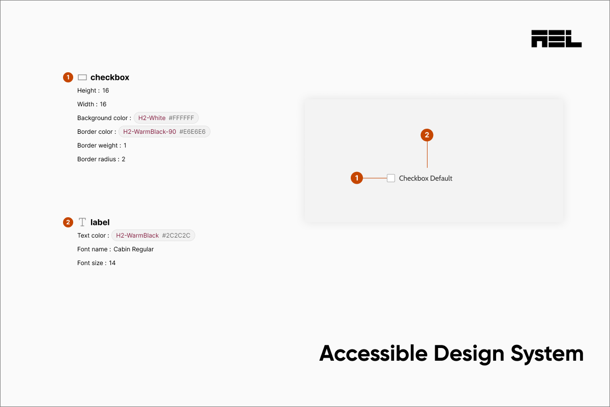
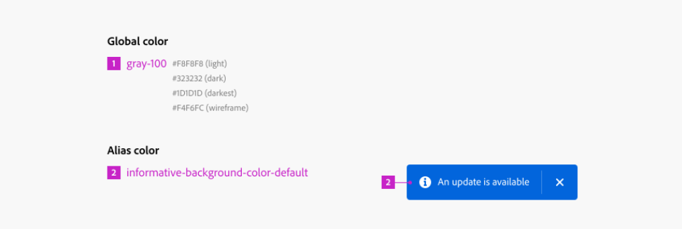
- Color Tokens – Color contrast can be evaluated on the brand palette to be used as reusable tokens. Most companies use Figma as a starting point to do this.
- Typescale – Typography styles for the headings and normal text can be defined and set for reusability. How is large text different from normal text? What font-weight do you use? Where do you use it? All of these questions are answered by documenting the usage and stored in the Design System. When setting up typography, we like to use the Golden ratio, which starts with setting a base font and multiplying it by 1.6 to achieve a uniform increase in size and spacing for headings. The Golden Ratio can also be used for page layouts and logo design.
WCAG defines large text as 18 pt or larger or 14 pt and larger if it is bold. Since we are using pixels in our example, this translates to 18 pt = 24 px, or 14 pt = 18 px if bold.
If you have a body font of 14 px, you can settle upon the large text size by multiplying 14 x 1.6 = 22.4 px.
Since 22 px falls short of the large text definition, we can increase the base font size to 16 px, which becomes 25 px or 18 pt when multiplied by 1.6 and meets the WCAG criteria for large text. This is how the Golden Ratio can be used to work your way up all the way to H1.
Heading 1
Heading 2
Heading 3
Large Text
Body Font
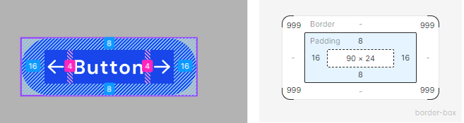
- Touch Target Size – The size of interactive elements can be defined to meet accessibility criteria. An example of this is ensuring minimum touch target sizes are met in the design itself. The WCAG minimum dictates the use of 24 x 24 px on touch screens. However, we take it a step further and try to follow the AAA recommendation of 44 px x 44 px. It may not always be possible to double the size of the component and keep the page layout the same. If this is the case, the padding around the component can be increased to provide a bigger touch target area.
These are a few examples of what can be achieved in a Design System, and the core concept revolves around reusable components. Once the foundation is laid, a team can come into the Design System and reuse the components to scale without having to worry about consistency or accessibility. In our examples, we dictated where and how the components should be used and already vetted them for accessibility.
In the Absence of Accessibility, what transpires within a Design System?
As we mentioned earlier, most organizations rely on pre-built UI libraries to speed up development. When they adopt someone else’s framework and customize it to match their branding, more often than not, they break whatever little accessibility there is to begin with. If accessibility isn’t considered in a Design System:
Teams lose efficiency
This involves having to modify code from the most likey free libraries or build components from scratch, and involves a higher level of effort than if accessibility was considered from the beginning.
Another example of inefficiency occurs during the QA stage when the components are already developed and the teams receive pushback from the Accessibility team (if they even have one!). When the finished components fail accessibility, they will be sent back for development, delaying the feature launch.
Non-scalable model
Design an inaccessible component. Develop it. Fail QA. Send back to dev. This is a classic break-fix model that hampers a team from achieving scale and pushing out features fast enough to meet market demand. A result of this is pushing the accessibility tickets further down the backlog, never to be seen again.
Sub-par UX
When components, whether from a design or code, are not uniform and consistent, we may encounter a differently styled CTA on different parts of the application. It may seem clever to do that, but it actually translates into poor UX for the end user. Accessibility is also about consistent end-user experience, which helps the cognitive disability group.
Another common example is styling links to look like buttons and vice-versa. This bad coding practice can be avoided if the usage and code blocks are settled upon during the design phase, resulting in a smooth experience for the user, with or without a disability.
Incorporating accessibility into the design
Adding or fixing accessibility after designing is problematic. Consider it early and throughout the design process. Design should consider accessibility by:
- Understanding the needs and expectations of the users, especially those with disabilities or limitations, such as using personas, scenarios, and user research
- Applying the principles and guidelines of accessibility, such as using WCAG, inclusive design principles, and universal design
- Testing and validating the accessibility of the design, such as using heuristic evaluation, user testing, and accessibility testing tools,
Setting up design systems
Building accessibility into a design system and its components is a mindset. To achieve this an organization needs to adopt the accessibility-first approach in everything design related.
Depending on the project’s objectives, resources, and scale, there are various approaches to setting up accessible design systems.
However, some of the best practices that anyone can adopt include:
Audit the current design framework
The first step in auditing an existing design “system” is to review what’s in the existing files, such as the design documentation, code, and assets. This can help teams to:
- Understand the structure and content of the design patterns.
- Identify the components and patterns that are used frequently.
- Assess the current state and quality of the design practices.
- Find any gaps such as outdated information or resources.
Document current components
The next step is to capture existing components that are used in the live product or website. This can help teams to:
- Take a stock of the components that are being used in production against any future designs in mind.
- Identify any inconsistencies between the current and future designs.
- Document everything found in steps 1 and 2.
Cross-reference gaps
The third step is to cross-reference and map issues, such as accessibility issues, that are found in production against the documented component designs.
- Evaluate the JIRA backlog and identify if any accessibility-related tickets are not being addressed.
- Categorize and prioritize the issues based on their severity, frequency, and impact.
- Assign and track the issues to the relevant components, pages, or stakeholders.
- Document and report the issues in a clear and actionable way.
- Plan and schedule improvement actions.
The components that have been flagged for remediation should be moved into a new Story that revolves around the redesign of the components. It may take a bit of effort to refactor the design and code, but this is the only way to get out of the holding pattern of the break-fix model.
Documentation
Documenting is by far the most important part of setting up a design system. Documentation is tedious and time-consuming, but this forms the foundation of a successful design system implementation. The following should be documented as best practices:
Visual Style Guide
Document the branding and style guide of the organization. This should include where to use colors, designs, branding and where not to.
Typography
Call out the different sizes of text and headings and where they should be placed. This includes accessibility considerations like an inclusive language editorial guide.
Component Library
Reusability is the theme of this article. When accessible components are developed, they need to be stored in a repository along with usage guides for design, development, and QA teams.
Documentation for components should include Developer considerations when using the base component for future development. A nice to have is a codepen sandbox to play around with the code without having to make Git pull requests and work locally.
Accessibility documentation for QA teams should include acceptance criteria that can be used during their testing process.
Conclusion
One of the key principles of accessibility is to design ‘With’ and not ‘For’ disabled people, which means involving and including people with disabilities or limitations in the design process rather than just designing for them without their input and feedback.
Design systems are essential for creating consistent and coherent user interfaces, and it can be a complex process. But you have to get started somewhere. It doesn’t have to be a complex system like Storybook or Zeroheight. Figma is a good starting point as well for refactoring existing designs and making them accessible. If you have inaccessible components, the next step would be to get expert help to audit them for design accessibility. AEL Data can help you take the first step toward accessibility designs through Accessibility Design Annotations.
Reach out to our team to learn more about Accessibility Annotation services.