Do you realize that everyone sees the same colors as you? Nonetheless, there are instances of individuals and civilizations seeing colors differently throughout history and into the present. For instance, ancient records from a variety of civilizations demonstrate that none of them had a term for blue. Imagine if everyone around you can distinguish a color difference between two shirts or two automobiles, but you cannot. It is a fantastic approach to imagining how people with color blindness experience the world.
In this blog, we will explore the basics of color blindness and simple ways to make your website accessible to people with color-vision impairments.
Table of Contents
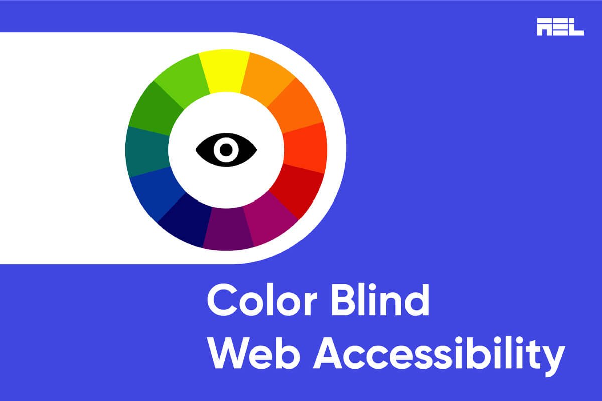
What is Color Blindness?
People with color vision impairments are usually born this way. Yet for the majority, it is such a small condition that they are never diagnosed and go about their daily lives unaware that they are color blind. For others with more severe instances, however, it might interfere with regular tasks like driving, doing schoolwork, and browsing the internet. Around 300 million individuals worldwide are colorblind, with males being much more susceptible than women.
Three major types of color blindness
1. Red-green Color Blindness
People affected by this condition find distinguishing between red and green hard. There are 4 subcategories in this deficiency:
- Deuteranomaly: It is the most prevalent kind of red-green color blindness. It makes green seem redder. This condition is modest and often does not interfere with routine activities.
- Protanomaly: Makes red seem greener and dimmer. This kind is also mild and often does not interfere with daily activities.
- Protanopia and Deuteranopia: With both of these conditions, people are unable to differentiate between red and green
2. Blue-Yellow Color Blindness
People affected by this condition find it hard to differentiate between blue and green, as well as between yellow and red. There are 2 subcategories in this deficiency:
- Tritanomaly: makes it difficult to distinguish between blue and green and yellow and red.
- Tritanopia: It makes it difficult to distinguish between blue and green, purple and red, and yellow and pink. Colors look less vibrant to those affected by this disorder. There is currently no treatment for color blindness. However, some people affected by this may use special glasses to help them distinguish between colors.
3. Complete Color Blindness
Complete color blindness is the inability to perceive any colors. This is also known as monochromacy, and it is exceedingly rare. Depending on the type, you may also have difficulty seeing clearly and increased light sensitivity.
5 recommended ways to help color-blind users easily navigate your website
1. Identifying the right color combination
It is often believed that only red/green color pairings are problematic for those who are color blind. But, green shouldn’t be used with darker colors, including gray, blue, brown, and black. As an extension of the advice to avoid yellow/blue pairings, color-blind persons should also avoid blue/purple combinations.
Here’s a list of commonly used color combinations that you should avoid using on your website :
- Green/blue
- Green/black
- Green/red
- Green/brown
- Green/gray
- Yellow/light green
- Blue/purple
- Blue/gray
2. Choosing the right background color
Mismatched backdrop colors are the most common issue I see on websites. If you’re designing a website, try to keep things basic with a white or off-white background and a dark color for the content.
Keep in mind the colors of the photos and visuals you create. The way you divide up your site into distinct parts is also crucial. Make your site’s headers bigger than the body content, for instance. Whenever possible, use a distinct font style for headers. If you rely heavily on color to differentiate your titles from the body content, readers who are color-blind may have trouble following your work.
Alternative ways to recognize links and interactive texts
On certain themes, links in the text aren’t highlighted. They’re just formatted differently and colored in comparison to the main text. Therefore, an alternative is to include many methods of distinguishing between links and interactive components.
3. Adequate usage of colors
Users, even those without color blindness, will have a more challenging time finding what they’re looking for if there are too many colors used in the interface design. This gets more challenging for a color-blind person as more colors are used. Because of this, you’ll need to work on creating a strong color palette to beat the odds. The color-blindness simulator in Adobe Photoshop CC is a useful tool for this purpose.
4. Text Descriptions
Have you ever ordered some clothes on an e-commerce site and received a different color compared to the one listed on the site? This is a clear example of why your website needs text descriptions. Therefore, adding text descriptions and alt text to images on your website will greatly benefit all users.
5. Labels
Eliminate confusing link labels such as “click here.” Those who employ screen readers commonly use a keyboard shortcut to reveal all the links on a page for more efficient navigation. This collection of links is devoid of context due to the absence of surrounding content. It is essential to create descriptive and clear link labels that make sense even when the context is removed since this is the best practice that benefits all users.
We hope you now know how to design your website for people with color blindness. If you need assistance with accessibility services, don’t hesitate to get in touch with us at info@aeldata.com.