Hyperlinks are crucial web page elements that enable users to navigate, access information, and perform actions. However, some hyperlinks, like text or images, lack associated content, causing accessibility challenges for users with disabilities. The article provides valuable information on accessibility guidelines and best practices for creating accessible hyperlinks. It also emphasizes the importance of accessibility testing, a user-centered approach, and continuous improvement.
Table of Contents
- 1 What are Empty Hyperlinks?
- 2 Impact of Empty Hyperlinks
- 3 Screen Reader Interpretation
- 4 Accessibility Guidelines
- 5 Identifying and Rectifying Empty Hyperlinks
- 6 Providing Contextual Information
- 7 Alternatives to Empty Hyperlinks
- 8 Developing a user-centered approach with Continuous Improvements
- 9 Wrapping up
What are Empty Hyperlinks?
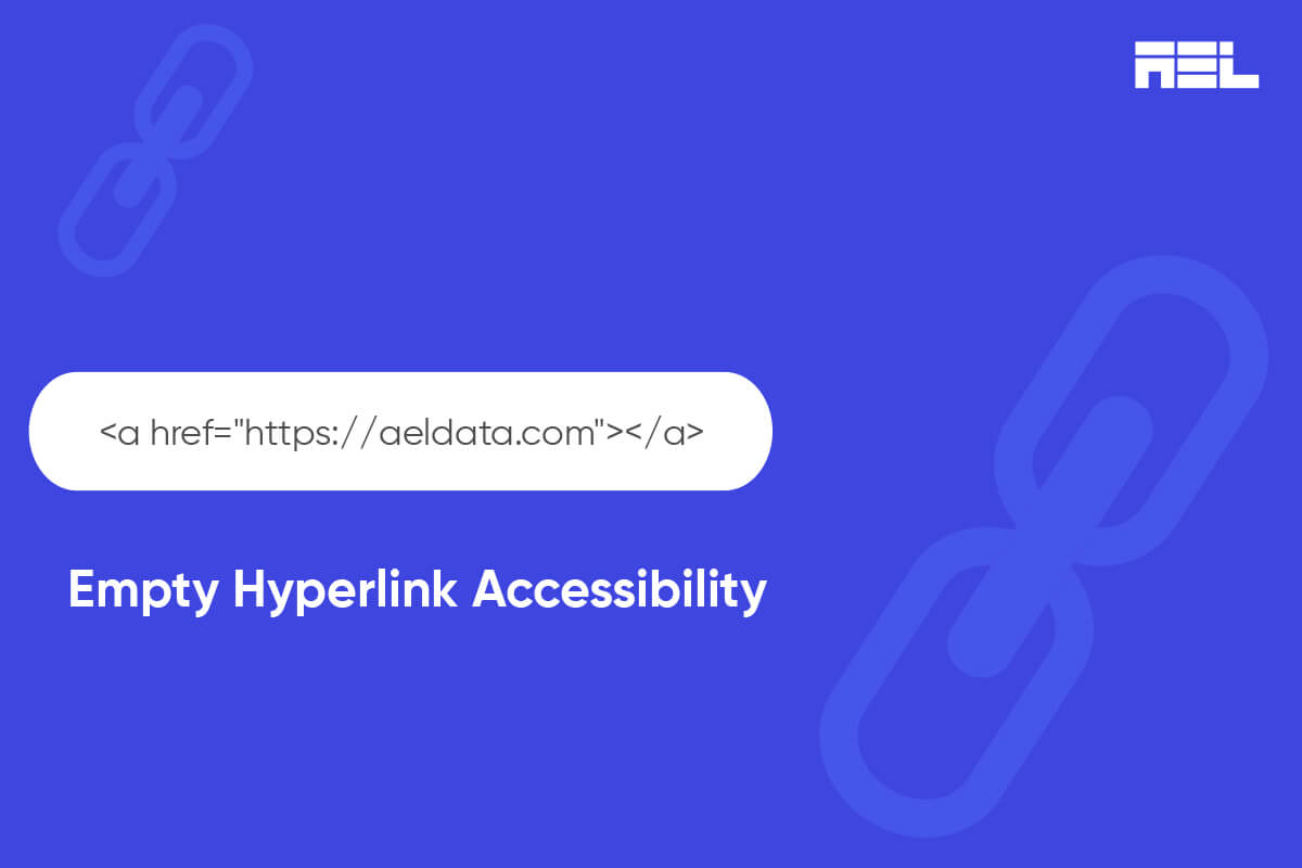
An empty hyperlink does not have any content or text informing users about its destination after they activate it. It is difficult for people with disabilities to understand an empty hyperlink, creating a bad experience for them.
The HTML for a typical hyperlink looks something like this:
<a href="https://aeldata.com">The AEL Data website</a>An empty hyperlink doesn’t have the relevant link text:
<a href="https://aeldata.com"></a> Although empty hyperlinks are easy to fix, they’re usually found on most websites. According to the WebAIM 2023 Million report, at least 50% of the internet’s top 1 million home pages had empty links.
Impact of Empty Hyperlinks
Empty hyperlinks cause issues for keyboard-only and screen-reader users. As the name suggests, keyboard-only users utilize or prefer only their keyboards to navigate the internet. Similarly, screen reader users exclusively utilize screen readers (software that converts text to audio or braille) and other assistive technologies to navigate the web.
Hyperlinks are essential content, so they receive keyboard focus. When users move their keyboard focus to an empty link with no text describing the destination, their focus indicator may disappear. The user may need to find out where they are on the page or how to proceed.
Although screen readers may alert users about the presence of hyperlinks, they might not understand the intended outcome after activating the link. That can be frustrating and indicates that the website doesn’t prioritize accessibility.
Screen Reader Interpretation
Screen readers help blind or low-vision individuals access web content by converting text to speech or braille and providing information on page structure. They announce hyperlinks, link text, and destination URLs when the user moves their focus, providing an idea of the link’s destination.
However, when a screen reader encounters an empty hyperlink, it may only announce the “link” followed by the destination URL. For example, a screen reader may say something like “link” followed by “https://twitter.com/.” This does not give the user any clue about why they are suddenly on Twitter or what they should notice.
Accessibility Guidelines
WCAG 2.1 addresses hyperlinks in two success criteria (SC):
- Success Criterion 1.1.1: Non-text Content: All non-text content presented to the user has a text alternative that serves the equivalent purpose, with several exceptions.
- Success Criterion 2.4.4: Link Purpose (In Context): Provide a link text that describes the purpose of the link so that people with disabilities can decide whether or not to follow the link.
To meet these criteria, web developers should ensure that every hyperlink has meaningful and descriptive link text or an image with appropriate alternative text that conveys its function or destination.
Identifying and Rectifying Empty Hyperlinks
There are several ways to identify and rectify empty hyperlinks on web pages. One way is to use automated accessibility testing tools that can check for empty links and other common hyperlink issues, such as redundant link text and broken links.
For example, you can make use of the free website analysis by LERA to check for empty links.
Another way is to manually inspect the HTML code of the web page and look for empty hyperlinks. For example, <a href=”https://www.reddit.com/”></a>. To fix the problem, web developers can remove the HTML hyperlink or add relevant link text. Since the hyperlink isn’t visible, removing the HTML is usually the best course of action.
Providing Contextual Information
Web developers should include contextual information for unclear hyperlinks to prevent confusion and misleading content, especially for screen readers.
Here are some tips to provide contextual information:
- Use descriptive and specific link text that summarizes the content or function of the link. For example, instead of being ambiguous, like “click here,” try to be precise, like “visit our website” or “download our handbook.”
- Use the title attribute to provide additional information about the link. For example, <a href=”https://www.reddit.com” title=” The Reddit website”>Reddit – Dive into anything</a>. However, some screen readers may not announce the title attribute by default, so it should not be used as a substitute for meaningful link text.
- Use the aria-label or aria-labeled-by attributes to provide an accessible name for the link that overrides the link text.
Alternatives to Empty Hyperlinks
Sometimes, web developers may use empty hyperlinks as placeholders for styling or scripting purposes. For example, they may use an empty hyperlink to create a drop-down menu or a button. However, this is not a good practice, as it creates accessibility barriers and semantic confusion. There are better alternatives to empty hyperlinks that are more accessible and appropriate for different situations.
Some alternatives to empty hyperlinks are:
- Use a button element (<button>) instead of a hyperlink for actions that do not navigate to another page.
- Use a list element (<ul> or <ol>) instead of a hyperlink for creating a drop-down menu or a list of options.
- Use a div element (<div>) instead of a hyperlink for creating containers or sections.
Developing a user-centered approach with Continuous Improvements
Test hyperlinks with screen readers and keyboard navigation to ensure accessibility and meaningfulness. A user-centered approach involves involving users with disabilities, soliciting feedback, and incorporating their needs. Web developers should continuously improve accessibility practices by staying updated with guidelines and technologies and monitoring web performance and user behavior.
Wrapping up
Hyperlinks are essential for web pages, but empty hyperlinks are a common accessibility issue for users with disabilities, particularly those using screen readers or keyboard navigation. To create meaningful and accessible hyperlinks, web developers should follow accessibility guidelines and best practices, test their content, and provide alternative text for every hyperlink.
Furthermore, provide contextual information and alternatives, test accessibility with screen readers, adopt a user-centered approach, and continuously improve for a more accessible website. An accessible site design is beneficial for all users, regardless of the technologies used to interact with your website. At AEL Data, we have a team of specialists who carefully audit each web page to identify and remediate issues. Contact us if you need help at info@aeldata.com.


