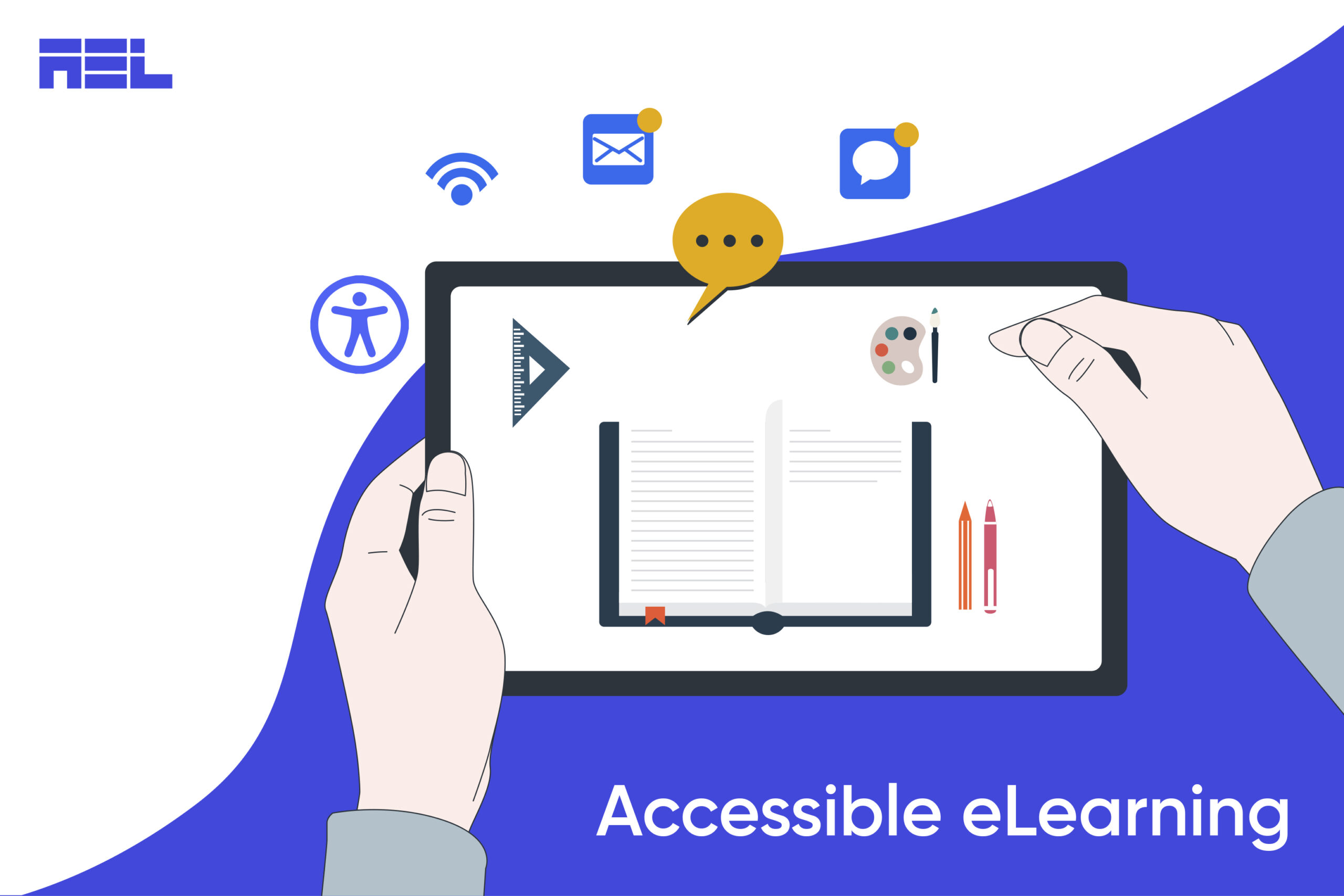
Accessibility is the practice of making your e-learning content usable by everyone, regardless of their abilities or disabilities. It also benefits learners who face situational barriers, such as low bandwidth, noisy environments, or small screens.
Making accessible e-learning engaging is not only a legal and ethical requirement, but also a smart and strategic decision. It enhances the user experience, increases engagement, and promotes inclusion.
In this blog, we will explore the best ways to create an accessible learning experience that is engaging for people with disabilities.
Steps to Transform Your eLearning into an Engaging Experience

It is estimated that over one billion individuals worldwide experience disabilities or impairments that could hinder their access to conventional e-learning platforms. Here are our recommended strategies for creating online content that adhere to the WCAG accessibility guidelines and are effective in their delivery.
It is estimated that over one billion individuals worldwide experience disabilities or impairments that could hinder their access to conventional e-learning platforms. Here are our recommended strategies for making engaging e-learning content that adheres to the WCAG accessibility guidelines and are efficient in their delivery.
1. Use Clear And Simple Language
Language can either facilitate or hinder comprehension and communication. To make your language accessible, you should:
- Use plain and simple words that are easy to understand and follow.
- Avoid jargon, slang, idioms, and acronyms that may confuse or exclude some learners.
- Use short, simple sentences and paragraphs that convey one idea at a time.
- Make sure to use an active voice and present tense.
- Use punctuation, capitalization, and grammar correctly and consistently.
- Use headings, lists, and bullet points to organize and highlight your content.
2. Provide Alternative Formats
Provide text replacements for non-text material, such as photographs, music, video, graphs, charts, etc. Give people access to the same information in various mediums (text, audio, video, photos, etc.). Offer the material in different download and printing alternatives (PDF, Word, HTML, etc.). The information may be accessed by students regardless of where they are or what devices they are using.
3. Use Consistent Navigation
Navigation can either enable or disable movement and orientation. To make your navigation accessible, you should:
- Use consistent and intuitive navigation elements throughout your content, such as menus, buttons, links, breadcrumbs, etc.
- Provide clear instructions, feedback, and orientation cues for your learners to know where they are, what they need to do, and what they have done.
- Allow learners to control the pace and sequence of your content.
- Provide options to skip or review sections, pause or resume activities, etc.
- Allow learners to customize their navigation preferences.
4. Maintain Proper Color Contrast Ratio

Contrast and color can either improve or impair readability and visibility. Try to use high contrast between your text and background colors. Did you know that the recommended contrast ratio is at least 4.5:1 for normal text and 3:1 for large text?
Furthermore, avoid using color alone to convey meaning or indicate actions. Use additional cues such as shapes, icons, text labels, etc.
5. Use accessible fonts
Fonts can either facilitate or hinder readability and legibility. To make your font accessible, you should use fonts that are clear and easy to read. It is advised that you avoid using small, fancy or similar looking fonts. Always use fonts that are scalable and utilize relative units such as ems or percentages instead. This allows learners to adjust the font size according to their preferences.
6. Use Multimedia That Supports And Complements Your Content
Multimedia can either enhance or distract from your content. Multimedia can include audio, video, animations, simulations, games, etc. To make your multimedia accessible, you should:
- Ensure that your multimedia is compatible with different devices, browsers, and platforms. Avoid using multimedia that requires special installation or plugins.
- Provide options to pause, play, stop, mute, or adjust the volume of your multimedia. Ensure that your multimedia does not autoplay or loop endlessly.
- Provide alternative formats for your multimedia, such as text transcripts for audio and video, captions for speech, alt text for images, etc.
7. Use Engaging And Accessible Interactive Elements
Certain interaction types are not fully-accessible to all learners. Some learning activities, such as those involving drag-and-drop, and sorting, require the use of a mouse and assume that the student is proficient with it. This rules out learners who prefer to use the keyboard. Consider if your business e-learning content may be altered slightly to provide an alternate, more accessible engagement.
Lastly, don’t just create interactive content; back it up with instruction and feedback. Give detailed explanations on how to use them, what to anticipate, and what to do if mistakes occur.
Wrapping up
E-learning is a powerful and convenient way to deliver learning content to diverse audiences.
Creating engaging accessible e-learning content is a rewarding and worthwhile endeavor that can benefit both you and your learners. By making a few easy adjustments to your development process, you can make your content more accessible to a broader audience and improve the quality of your work for everyone. Inevitably, this will improve communication and productivity across your firm. Workplaces today need easy access to digital education. Don’t let website accessibility hold you back any longer. Get in touch with our digital accessibility expert today to learn more about our services and how we can help your business succeed.


