Whether one likes to or not, users of all age groups, especially people with disabilities, use smartphones and apps that come with them. Just like web accessibility, designing apps for accessibility is equally important. We’ve been working on accessibility on iOS for the past couple of months at our company. I wanted to put together a getting started guide to iOS mobile accessibility to share with people what I’ve learned so far.
Table of Contents
The Importance of Mobile Accessibility
Why is mobile accessibility so important?
26 percent (one in 4) of adults in the United States have some type of disability.
When we talk about our services in accessibility, people often talk about the ADA and refer to wheelchairs and ramps. The small percentage of the users who know of web accessibility rarely think of mobile accessibility.
As the statistic shows, about a quarter of US adults have a disability, and almost everyone today uses mobile apps. And I can guarantee that most people have used some form of accessibility feature in their phones without even knowing it. An excellent example of this is speech-to-text or voice typing. Those of you who text-and-drive may have used this feature (I condone the action, but it’s safer than texting if you have to do it). In all seriousness, when my hands are full, I like using the voice assistant or clicking on a button and speaking into the microphone to convert my speech into text automatically. These are examples of mobile accessibility features built into your phone’s OS.
We mentioned the ADA earlier. The Americans with Disabilities Act covers mobile apps to the same accessibility standards as the web, and legal compliance is another reason to ensure mobile accessibility.
We have found that mobile accessibility is best built in the design phase for maximum efficiency, especially in Agile methodologies. Too often, we end up testing applications that have accessibility built into them as an afterthought, which delays the updates and increases costs for the clients.
What is VoiceOver and how does it work?
What is a screen reader?
A screen reader is an assistive technology that converts text to speech. It is available for different OS like Windows, Mac, iOS, and Android. This software can either come bundled with the native operating system or be installed as a standalone program or application. Since our focus is on iOS, we will discuss Apple’s built-in screen reader called VoiceOver. Users primarily use it to access their devices with spoken descriptions. A user will need a physical device running iOS to use VoiceOver. A simulator can also be used; more on that later.
Users with visual impairments or cognitive learning disabilities greatly benefit from VoiceOver. By default, the screen reader is programmed to read aloud every element starting from left to right of the screen and then top to bottom.
What are Accessibility Labels, and some common issues associated with them?
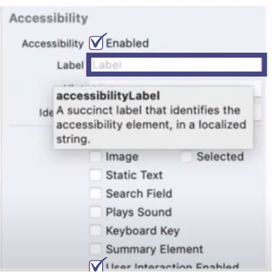
An accessibility label is a succinct method of identifying the control.
When elements contain text, an accessibility label is automatically inferred by iOS, but not for switches, images, image buttons, amongst others, for which an accessibility label will have to be set manually. For VoiceOver to announce the labels, they have to be checked off to enable them.
Accessibility Label Best Practices
An action verb or element type shouldn’t be enabled
For example, labelling a button “Back Button” that will navigate you to the previous screen. VoiceOver already recognizes the element as a button and will read out “Back button, back button”.
Hints should be used sparingly
As hints describe an action that takes place when you interact with an element, they should be used sparingly as too many hints will crowd the screen.
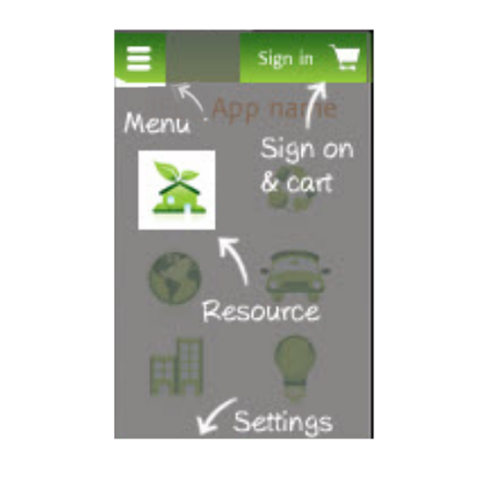
Not everything actually needs an accessibility label
This is true of decorative images that don’t add any value. We can determine if an image is decorative or not by foreseeing if everything on the screen makes sense without the image.
Common accessibility label issues
Images
Images don’t have text (just like the web) and they need to have alt text written for them.
Buttons
Similar to images, if you have a logo for example that is coded as a button and nothing else descriptive around it, VoiceOver will announce a button, which is unhelpful for a user who’s using a screen reader.
Logos
On the other hand with logos, sometimes you don’t need an accessibility label. Because if the logo is just text, and next to it is the name of the company, then you don’t need it because it will announce it twice and be repetitive.
Nested Elements
With nested elements, we’ve found it is more of a problem with focus order. So for example, when you’re swiping through with VoiceOver, and you get caught in a nest of elements, then it won’t know how to get back out. That’s more of an issue with the focus order rather than with labels, but a good point to note.
Lastly, we need to remember to write descriptive labels and make sure that they add value to explain the context on the screen.
Testing with VoiceOver and related tools
Below are some steps to start testing with VoiceOver-
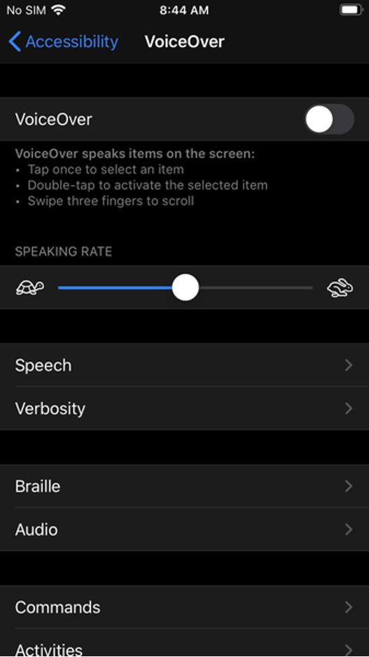
- Navigate to Setting > VoiceOver On (double tap to turn VoiceOver on)
- Switch to the app that is being tested
- Navigate through the app by swiping right from the top left corner
- Testing considerations-
- Does the reading order in which the elements are placed make sense – are you going left to right, top to bottom?
- Does every relevant element on screen have an accessibility label – like a decorative image or an important element that needs to be labelled.
- Is there anything that is not clear to the user when being read out by the screen reader
- Do the user get trapped anywhere while navigating the app – if this does happen it is usually an issue with the focus order rather than labels.
- Enable screen curtain and test again without looking at the screen
- Disable screen curtain and test by looking at the screen to cover anything that was uncovered while using the screen curtain
iOS VoiceOver Accessibility Testing Tools-
Screen Curtain
Screen Curtain is a built-in feature of iOS that turns off the display for added privacy when using the screen reader. Essentially, it allows a user to use the phone with the screen turned off and navigate just by listening to VoiceOver. This is useful for screen reader users when accessing private information in public spaces.
On the other hand, it is also a really good way for developers to test app interaction like a native user. By testing with the screen off and VoiceOver on, it replicates an actual scenario of how a blind user would interact with the app and give you the best feedback outside of user testing.
How to use screen curtain on iOS-
- With Zoom feature on + VoiceOver, tap the screen four times with three fingers to turn it on/off
- With Zoom feature off + VoiceOver, tap the screen three times with three fingers to turn it on/off
Accessibility Inspector
The Xcode Accessibility Inspector is another useful tool. It is similar to any web inspector you would find in a web browser. While it is not a substitute for actual VoiceOver testing on an Apple device, it is very useful during the development stage, and also if you are testing and modifying an app for accessibility.
Being a simulator it inspects different elements, labels, traits and other properties of an accessibility attribute when checking the app for common accessibility errors. It also provides live previews of the elements without having to exit the app. The main reason why we like the simulator is that it supports macOS, iOS, tv and watchOS, and can be helpful when testing on a budget without having to own all the devices.
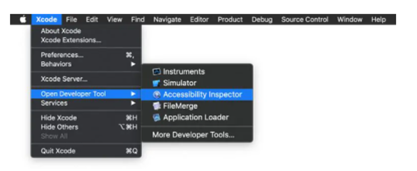
To open AI, open Xcode > Open Developer Tool > Accessibility Inspector
GSCX Scanner
And then finally, there is the GSCX scanner by Google. It is an objective-C library scanner that supports the scanning for a range of accessibility issues. The scanner returns a lot of information without specifically testing for them. For example, if you are testing for button sizes that are too small, GSCX will also return information about color contrast. It also lets you add your own checks to the framework.
Sometimes it can be an overkill when you are just looking for errors at a basic level, like labels for example. On the other hand it is a tool that is very handy when you are looking for a more comprehensive scan.
To recap, making your app more accessible, benefits everyone and it improves user experience across the board. Now you have the basic tools to make your app more accessible, and with this knowledge you can impact a user’s experience positively.
Resources –
https://www.w3.org/WAI/standards-guidelines/mobile/
https://www.w3.org/TR/mobile-accessibility-mapping/
https://mobilea11y.com/blog/ios-accessibility-labels/
https://support.apple.com/en-ca/guide/iphone/iph3e2e2281/15.0/ios/15.0
https://developer.apple.com/videos/play/wwdc2019/254
