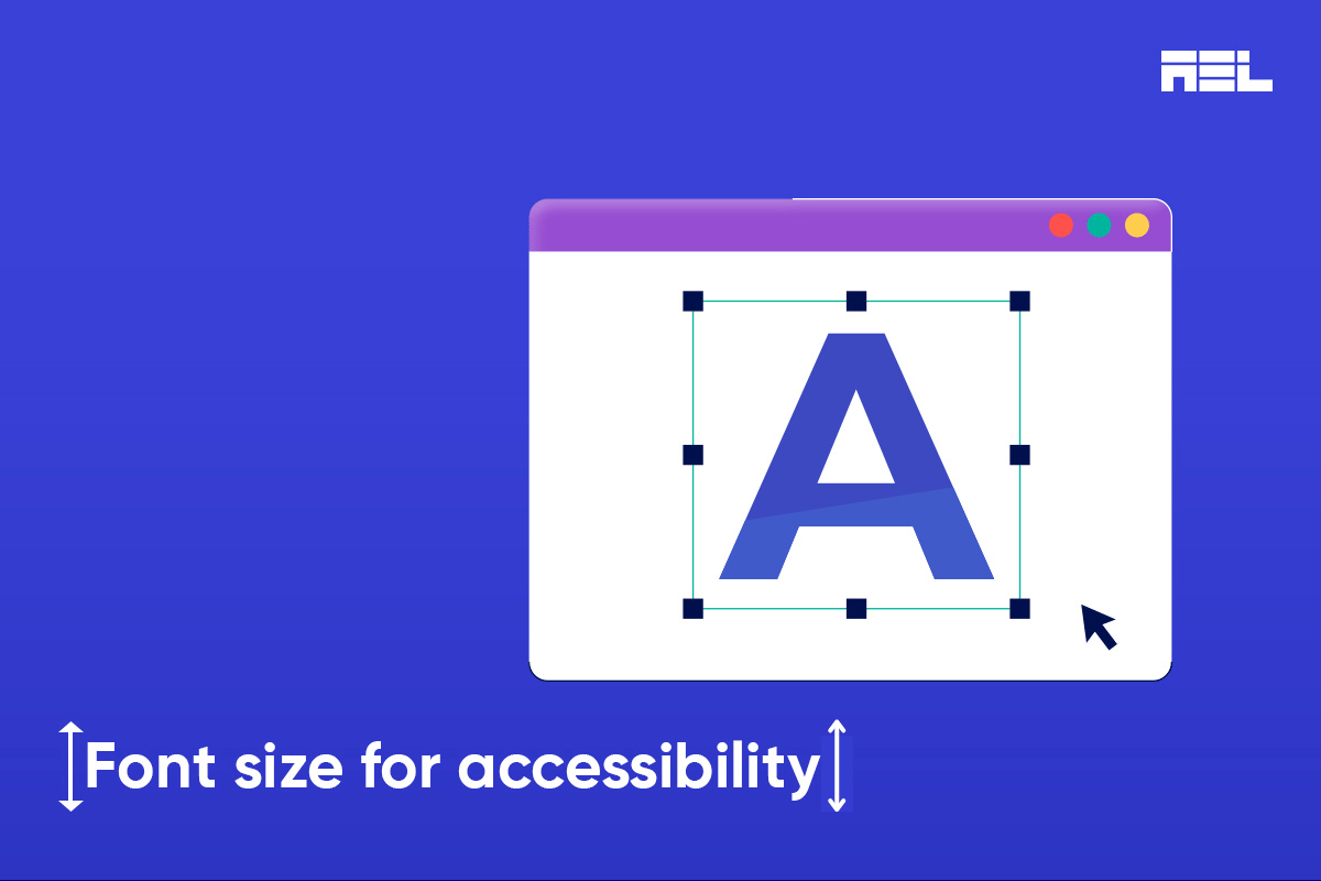
The minimum font size in web design plays a key role in accessibility. Users with visual impairments may struggle to read very small text, so setting a minimum font size ensures that everyone, including those with disabilities, can access the content. Choosing the right font size is essential for creating a more inclusive and user-friendly web experience.
What Do Guidelines Suggest for Minimum Font Size?
The Web Content Accessibility Guidelines (WCAG) provide recommendations for font sizes to enhance readability and contrast. WCAG suggests a minimum of 12pt for regular body text and 18pt for large text for accessibility.
To choose an appropriate font size, one must take into account factors like contrast ratio, user control, device use, font family and audience need.
For normal-sized text, a minimum contrast ratio of 4.5:1 and for larger text, a ratio of 3:1 ratio is acceptable. . Furthermore, the WCAG explicitly states that visitors should be able to resize all text on the page to a minimum of 200% of its original size.
Guidelines can be checked for compliance using tools such as WebAIM’s Contrast Checker.
Users can adjust font size through browser settings and CSS. Fonts that are easy to read and accessible, like Tiresias, OpenDyslexic, etc., provide better readability for everyone, but especially for people with dyslexia. The choice of font size depends on the target audience. Whenever possible, opt for a widely available sans-serif typeface. Examples include Arial, Verdana, Helvetica, Tahoma, Calibri, and Times New Roman.
Practical Recommendations
To create accessible web content, start with a base font size of 16px or 1 rem for body text, ensuring readability and flexibility. Use relative units like em and rem to scale text according to user preferences. Allow user adjustments without breaking the layout through an ‘Accessibility Options’ panel.
A quick and easy way to test your content for accessibility is by zooming in your web browser to 200%. In most browsers, you can hold the Ctrl key and press the + key until the window is scaled to 200%.
Here are some additional tips:
- Maintain consistency in the hierarchy for headings and paragraph texts to aid screen readers.
- Continuously evaluate choices based on user feedback and usability tests.
- Regular audits for accessibility compliance using services like AEL Data or Section 508 Standards are recommended.
- Engage real users, especially those with disabilities, to test text readability.
- Lastly, Stay updated on accessibility standards.