You head to a restaurant that a friend recommended because you enjoy Japanese cuisine. However, upon arrival, you notice that only those who speak Japanese are receiving better service. The menus are in English, but there are no descriptions under the food items, making it impossible for you to try a new appetizer or main course. These little inconveniences can make you avoid the restaurant the next time. In a similar vein, individuals who cannot use a mouse or prefer using a keyboard to navigate new websites might skip your website if it’s not keyboard-friendly.
Your website may have a lot of positive aspects, but if it’s not accessible by keyboard, users with disabilities, especially those with motor and vision impairments, may think twice to visit it.
In this blog, we will cover the basic topics surrounding keyboard accessibility and its shortcuts.
Table of Contents
What is keyboard accessibility?
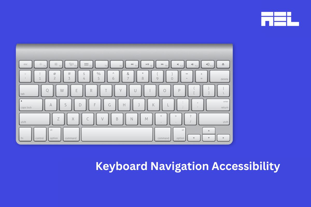
Keyboard accessibility is a practice of removing barriers that prevent all users from accessing the website only through the keyboard. The purpose of this feature is to let a user know which interactive element receives keyboard focus through the use of a visible focus indicator. The WCAG success criterion that dictates the use of visible focus indicators is WCAG 2.4.7 Focus Visible (Level AA). Keyboard accessibility requires four main things:
- Keyboard focus
- Accessible interactive elements
- No keyboard traps
- Skip Navigation Links
1. Keyboard focus
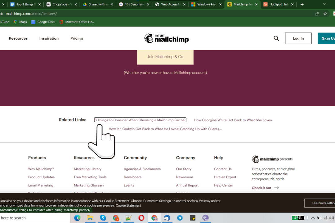
Keyboard users can be those with motor impairments, low vision, cognitive impairments, or just power users. They rely on focus indicators to be informed of their current position on the screen, or they might lose track of their navigation. Focus indicators highlight every interactive element upon keyboard input, typically using the TAB key to move forward and SHIFT + TAB to move backwards on Windows and Mac.
Fortunately, this feature is available by default in common web browsers like Chrome, Firefox, Safari.
The styling of the default browser indicators differs from browsers and the rendering engines that power it.
If a browser provides focus indicators, why do you need to account for it in your code?
In order to meet WCAG 2.4.7, the focus indicator needs to be clearly visible to meet the Success Criterion. Clearly visible means having enough contrast for users with low vision to be able to perceive it. The expected ratio is 3:1 for the focus indicator against the background of the page and the element’s background.
It is highly possible that the custom brand palette of your website may be so jarring against the default focus indicator that it fails Color Contrast WCAG 1.4.3 Contrast Minimum (Level AA), or be so dark as to be engulfed on the background you use.
This is the reason to use custom focus indicators on your website.
Here is a sample code to demonstrate how a custom focus indicator might look on different backgrounds.
.button: focus {
    outline-style: solid !important;
    outline-width: 2px !important;
    outline-color: #ff0000 !important;
    outline-offset: 3px !important;
}
2. Navigation Order (Tabindex)
Tabindex is an HTML attribute that allows an element to be focused or not. Moreover, it helps determine the navigation order with the keyboard.
Tabindex can range from negative to positive integers. If an element has a negative tabindex then it is removed from the keyboard navigation hierarchy and cannot be reached with the keyboard. This is most commonly denoted with tabindex=”-1” placed on the element.
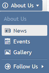
tabindex=”0” is the default value provided to interactive elements like buttons, links, input fields as a few examples. If these components are used as native HTML elements such as <button> <a> <input>, they will automatically have a tabindex of “0” applied to them. However, if they are built using custom elements like a <div> or a <span>, they need a tabindex to receive keyboard focus.
Note: We recommend developers to use native HTML elements as they are accessible by nature.
A positive tabindex can range from any integer above “0”. If an element has a positive tabindex value, it means that the element will be focusable in the order of the number – 1,2,3,4, and so on. This is, however, not an acceptable accessible practice as the underlying CSS properties may make it difficult for people using keyboard and assistive technology to operate.
Also read: Understanding Success Criterion 2.1.1: Keyboard
3. No Keyboard Traps
Keyboard traps refer to situations where a user can navigate to a particular interactive element and cannot get out of it to the previous screen, thus resulting in a “trap”. An example of this is a pop-up dialog modal.

When a user activates a modal, the focus remains within the modal tabbing to the “Dismiss” button. If the button is activated and the user remains inside the modal, it is considered a keyboard trap.
Best practices to prevent keyboard traps
- Developers should avoid using customized HTML elements and strictly make use of standard elements like <button> that can be easily accessed
- Avoid using apps, plugins, widgets, or JavaScript techniques that trap the keyboard
- If custom elements can’t be avoided ensure that the keyboard focus is seamless
- Lastly, make sure users can get in and out of all elements available on your website.
4. Consider a Skip Navigation Link
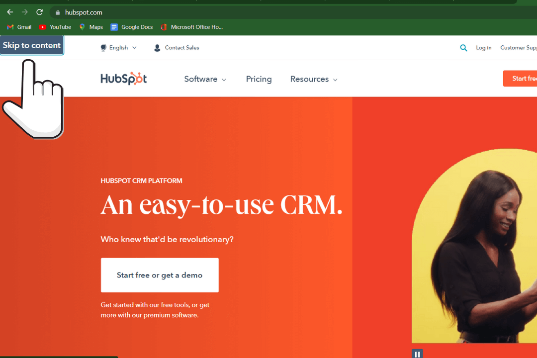
Complex header menus like megamenus have become popular in the eCommerce industry today. A keyboard user may navigate through all of the menu items if they are exploring the site for the first time, usually the home page.
What happens if they visit an inner page?
It will be tiresome to repeatedly hit the TAB to navigate through each menu item before reaching the main content of the page, for every web page. This problem can be combated with the use of Skip Link Navigation. Skip links are hidden links that are placed above the header navigation that are activated with the TAB key upon a page refresh or a reload. Upon activating the link, the user is taken directly to the main page content, similar to the concept of scroll-to-section.
How do you check keyboard accessibility?
Here are 3 keys that are most commonly used to navigate a website through the keyboard:
- TAB key – Allows users to navigate from top to bottom jumping to different elements of the website
- Shift+ TAB – Helps in navigating from bottom to top, it is often used to jump back to the previous button or link
- SPACEBAR, RETURN or ENTER – Used to activate selected link or button
To check keyboard accessibility, go to any website using popular browsers such as Firefox, IE, Chrome, or Safari.
Click the address bar in the browser and use only your keyboard to navigate the website till you reach the bottom element.
- Were you able to access all features?
- Were you able to access all elements?
- Did you easily know where you were on the page?
If you can answer these questions without any hesitation, your website is keyboard-friendly. If not, you need to work on the keyboard accessibility of your website.
List of top keyboard accessibility shortcuts
1. keyboard accessibility shortcuts
| Shortcut Key | Function |
| Windows logo key + A | Opens Quick Settings |
| Windows logo key + Ctrl + C | Turns color filters on or off |
| Windows logo key + H | Opens voice typing |
| Windows logo key + Alt + H | Moves keyboard focus to the voice typing dialogue |
| Windows logo key + Ctrl + N | Opens Narrator settings |
| Windows logo key + Ctrl + S | Turns on Windows Speech Recognition |
| Windows logo key + Ctrl + O | Turns on the On-Screen Keyboard |
| Windows logo key + U | Opens Accessibility Settings |
| Windows logo key + W | Opens Widgets |
You can check out more accessibility shortcuts by visiting the official windows site.
2. Keyboard Accessibility Shortcuts for Mac
| Shortcut Key | Function |
| Option-Command-F5or Triple-press Touch ID (power button) on supported models | Displays Accessibility Options |
| Command-F5 or Fn-Command-F5or Hold Command and triple-press Touch ID on supported models1 | Turns VoiceOver on or off |
| Control-Option-F8 OrFn-Control-Option-F8 | Opens VoiceOver Utility, if VoiceOver is turned on |
| Option-Command-8 | Turns zoom on or off |
| Option–Command–Plus sign (+) | Zooms in |
| Option–Command–Minus sign (-) | Zooms out |
| Control-Option-Command-8 | Inverts colors |
| Control-Option-Command-Comma (,) | Reduces contrast |
| Control-Option-Command-Period (.) | Increases contrast |
You can check out more accessibility shortcuts by visiting the official apple support site.
Conclusion
People who are unable to use a mouse or power users who prefer using a keyboard over mouse need websites to be accessible.
To make your website keyboard accessible, your visitors should be able to:
- Follow the keyboard focus
- Navigate and interact with all elements
- Navigate easily without getting the keyboard trapped
- Skip the navigation if there are a lot of links
Although keyboard accessibility is an essential part of web accessibility, it doesn’t mean your website is accessible to everyone. It is good to be proactive and work towards making your website more accessible rather than fixing issues only when users complain. Whether it’s accessibility auditing, consulting, training, or creating an accessibility policy, our experts at AEL Data will help you to achieve your accessibility goals.
