The internet is now a vital component in our daily existence, offering data, ways to communicate and fun. Yet for several users who have trouble seeing or reading, reaching this information poses a problem. A very important thing for making sure everyone can use a website is the size of the letters. This article will go deep into why letter size matters so much when you want your website to be easy to use, how different writing styles play a part, and what are the good ways to do this so all people have an easy time using it.
Table of Contents
How Does it Impact Accessibility?
Here’s a breakdown of how font size impacts accessibility:
- Readability: Larger fonts are easier to see and recognize, improving reading speed and comprehension for users with visual impairments
- Cognitive Load: Smaller fonts require more effort to process, increasing cognitive load and making it harder to focus on the content
- Zoom Functionality: Users with low vision often rely on browser zoom features to enlarge text. However, excessively small fonts can become pixelated or distorted when zoomed, further hindering readability
- Compatibility: Not all devices have the same screen size or resolution. A font size that appears reasonable on one device might be too small on another, making choosing a size that adapts well across platforms is crucial.
In Ensuring The Accessibility Of The Web, What Function Do Fonts Serve?
The function of fonts in communicating information and influencing the user experience is crucial. Accessibility can be considerably increased by selecting the proper font and size:
- Readability: Clear fonts with good definition are more readable, particularly for people who have visual processing challenges such as dyslexia. Fonts with simple letterforms and consistent spacing promote better recognition and comprehension.
- Aesthetics: The overall user experience is improved by the use of an aesthetically appealing font. Readability must never be compromised in pursuit of aesthetic appeal.
- Branding: Fonts can contribute to a website’s branding and identity. It is important to ensure that the font you select is easy for people to read and fits well with the design plan.
Accessible Font Characteristics
An accessible font is clear, easy to read, and functions well at various sizes. Some key characteristics of accessible fonts include:
- Simple Letterforms: Fonts with straightforward shapes for each letter are easier to distinguish, especially for users with visual impairments or learning disabilities
- High Legibility: Clear differentiation between letters and adequate spacing within words and between lines are crucial for optimal reading
- Large X-Height: The term “x-height” denotes the vertical distance between ascending and descending points of lowercase letters (e.g., “b” or “p”). At reduced proportions, it is generally more legible to utilize fonts that have a greater x-height.
Accessible fonts Usage:
- Main Body Text: This is the primary content users will be reading, so prioritize clarity and legibility
- Navigation Elements: Menus, buttons, and other navigation elements should be clear and easy to understand, especially for users with motor skill limitations
- Forms and Labels: Ensure form fields and labels are readily readable to avoid confusion and frustration when filling out forms
Best Fonts for Web Accessibility
Several fonts are widely regarded as excellent choices for web accessibility due to their simplicity, legibility, and scalability. Here are a few popular options:
- Arial and Verdana: Arial is a widely recognized font known for its clean letterforms and good readability, while Verdana, similar to Arial, has a clear, open design suitable for large text amounts.
- Times New Roman: Although traditionally used in print, this font can be a good option for body text due to its clear serifs (small strokes at the ends of letters) and spacing.
- Open Sans: It offers a variety of weights and is well-regarded for its readability on both screens and in print.
Best Practices for Font Size Accessibility
There isn’t a single “best” font size for web accessibility that works universally. However, there are some key considerations and best practices to follow:
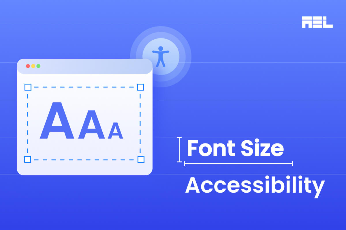
- WCAG Font Size: A widely accepted minimum baseline for body text is 16 pixels (px). This size ensures a reasonable starting point for most users and allows for browser zoom functionality
- Relative Units: Using relative units like ems or rems is recommended instead of absolute units like pixels (px) or points (pt). They allow the font size to scale proportionally with other elements on the page, improving responsiveness across various devices
- User Scalability: Enables users to independently regulate the font size through the utilization of browser zoom functionalities, hence allowing those with visual impairments to modify the size to achieve optimal comfort and legibility.
- Line Length: The optimal line length and space between lines also determine the font size. Here is the criteria to achieve optimal reading experience
- Line Spacing: It should be around 1.4-1.6 times the font size, so that it prevents crowding and improves legibility.
- Comfortable Reading: Lines should be no longer than 60-75 characters.
- Sufficient Contrast: Aim for a contrast ratio of at least 4.5:1 for normal text and 3:1 for large text. Large text is defined as font size above 18px and bold or larger, or 24px and larger.
Conclusion
Optimal font size ensures that all users can access websites. If you choose fonts that are easy to read and follow the standard font size rules as per WCAG your website will be better for everyone. Remember that making things easy to reach is not only about following rules, it’s also about providing information in a way that everyone can access and understand without depending on others.