Imagine eating Domino’s Pizza with no salt. Now, the next time you order from Domino’s won’t you give it a second thought? Text spacing is crucial likewise on every website. It sounds minor, but do it wrong and now every single user’s website experience is ruined. In this blog, we discuss text spacing, why it is important, techniques to achieve balanced text spacing and testing for their effectiveness.
Table of Contents
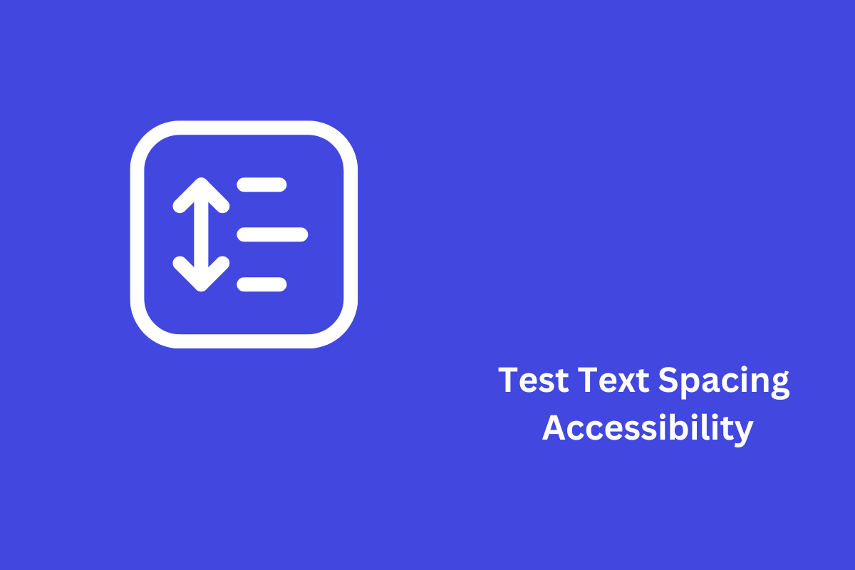
What is Text Spacing Accessibility?
Text spacing accessibility as the name suggests is about maintaining and adjusting the space between lines, letters and words. The main parts of text spacing are:
- Line Spacing (Line Height): The vertical space between lines of text.
- Letter Spacing (Tracking): The horizontal space between characters.
- Word Spacing: The horizontal space between words.
The Web Content Accessibility Guidelines (WCAG) 2.1 Success Criterion 1.4.12 speaks directly about text spacing. According to it, users should have the power to modify these text characteristics and without changing content or functionality:
- Line height (line spacing) to at least 1.5 times the font size.
- Spacing following paragraphs to at least 2 times the font size.
- Letter spacing (tracking) to at least 0.12 times the font size.
- Word spacing to at least 0.16 times the font size.
Significance of Text Spacing
Text spacing is very beneficial for making text easy to read and understand. It avoids clutter of words and thus helps users to process information more effectively. This feature is especially useful for people who have vision impairments, cognitive difficulties, or reading disorders.
For instance, in a block of text that has very little spacing, the lines are close and the letters and words are tightly packed. This could make it hard for users to see separate lines, words or letters which may result in strain on the eyes and comprehension difficulties. Conversely, when a chunk of text is spaced out with the recommended line height, letter spacing and word spacing, it becomes easier to read and comprehend.
How does Spacing affect users with Disabilities?
Users with disabilities may encounter difficulties due to incorrect font spacing. Here are some examples:
People with visual Impairments may have trouble seeing closely spaced text. When the spacing is correct, they are better able to differentiate between lines, words, and letters. A user who has trouble seeing small-font text may use a screen magnifier. However, as the magnifier may not show the whole line if the text is too closely spaced, reading it could be a challenge.
Users with cognitive impairments: For instance, people with dyslexia can easily bypass visual clutter and read desired text with large spacing. Furthermore, increased letter and word spacing can make text simpler to read, reducing the risk of letters and words merging.
People who have trouble reading will find text that is evenly spaced out easier and less threatening. For instance, when we increase the line height, users with reading disabilities might find it easier to read as there is enough space between lines, and they are less likely to skip the lines.
Best Practices for Accessible Text Spacing
Line height: Often known as line spacing, it is the vertical space between lines of text. To ensure line height:
- Adjust the line height to at least 1.5 times the font size. For example, if the font size is 16px, the line height must be at least 24 pixels.
- To ensure flexibility across multiple devices and screen sizes, use relative units such as em or percentages rather than fixed numbers. For example, you may change the line height to 1.5em, or 150%.
- Consider the context of the text’s reading. Lengthier lines of text may need a minor increase in line height to retain readability. Shorter lines of text, such as those in a sidebar or caption, may need a lower line height.
Paragraph Spacing: It is the gap between paragraphs. To improve text readability:
- Set the gap between subsequent paragraphs to at least twice the font size. For example, if the font size is 16px, the paragraph spacing should be at least 32 pixels.
- To keep a uniform look, make sure that the spacing is maintained across the material. Inconsistent spacing may make writing seem disorderly and difficult to read.
- To efficiently adjust paragraph spacing, use CSS features such as “margin-bottom.” For example, to provide constant spacing between paragraphs, set margin-bottom: 2em.
Letter spacing (tracking) and word spacing are essential for reading. To improve spacing:
- To ensure optimal text flow, adjust the letter and word spacing to at least 0.12 and 0.16 times the font size, respectively, for a font size of 16px and 2.56 pixels, respectively.
- Avoid excessive space, since it might break the reading flow and make text difficult to interpret. Excessive spacing may leave wide gaps between letters and words, making the text seem fragmented.
- Use CSS attributes like ‘letter-spacing’ and ‘word-spacing’ to change these values. To guarantee adequate spacing, set ‘letter-spacing’: 0.12em; and ‘word-spacing’: 0.16em.
Testing Text Spacing Accessibility
Testing text spacing accessibility involves both manual methods and automated tools. Here are some effective approaches:
1. Manual Testing
Manual testing involves adjusting text spacing properties and observing the impact on readability and functionality.
For manual testing, follow these steps:
1. Adjust Text Properties: Manually increase line height, paragraph spacing, letter spacing, and word spacing to the recommended values. Use browser developer tools or custom CSS to make these adjustments.
2. Check for Content Loss: Ensure that no content is lost or overlaps when spacing is adjusted. For example, check that text does not overflow its container or is cut off.
3. Evaluate Readability: Assess the readability of the text with the adjusted spacing. Read through the text to ensure it is easy to follow and is understood.
4. User Feedback: Gather feedback from users, especially those with disabilities, to understand their experience with the adjusted text spacing. Conduct usability testing sessions and ask users about their reading experience.
2. Automated Tools
Here are some popular browser extensions and plugins can help test text spacing accessibility:
- Stylus for Chrome: This extension allows you to apply custom CSS to any website, making it easy to test different text spacing configurations. You can create and apply custom styles to see how different spacing values affect readability.
- Accessibility Insights for Web: This tool provides comprehensive accessibility testing, including text spacing checks. It can help identify issues related to text spacing and provide recommendations for improvement.
Common Issues in Text Spacing
When testing text spacing accessibility, look out for these common issues:
- Content Overlap: Ensure that increased spacing does not cause text or other elements to overlap. Make sure that headings, paragraphs, and images do not overlap when spacing is adjusted.
- Loss of Functionality: Verify that all interactive elements remain functional with adjusted spacing. Make sure that buttons, links, and form fields are still accessible and usable.
- Inconsistent Spacing: Check for consistent application of spacing throughout the content. Inconsistent spacing can make the text look disorganized and harder to read.
Conclusion
In summary, ensuring the accessibility of your content is essential. To enhance this aspect, it is advisable to follow the WCAG 2.1 guidelines regarding text spacing. Specifically, maintain a line height of 1.5 times the font size, a paragraph spacing of twice the font size, letter spacing of 0.12 times the font size, and word spacing of 0.16 times the font size. Implementing these recommendations will significantly improve the accessibility and readability of your content, making it more user-friendly for all individuals, including those with disabilities. To further understand how to test text spacing, contact us today.