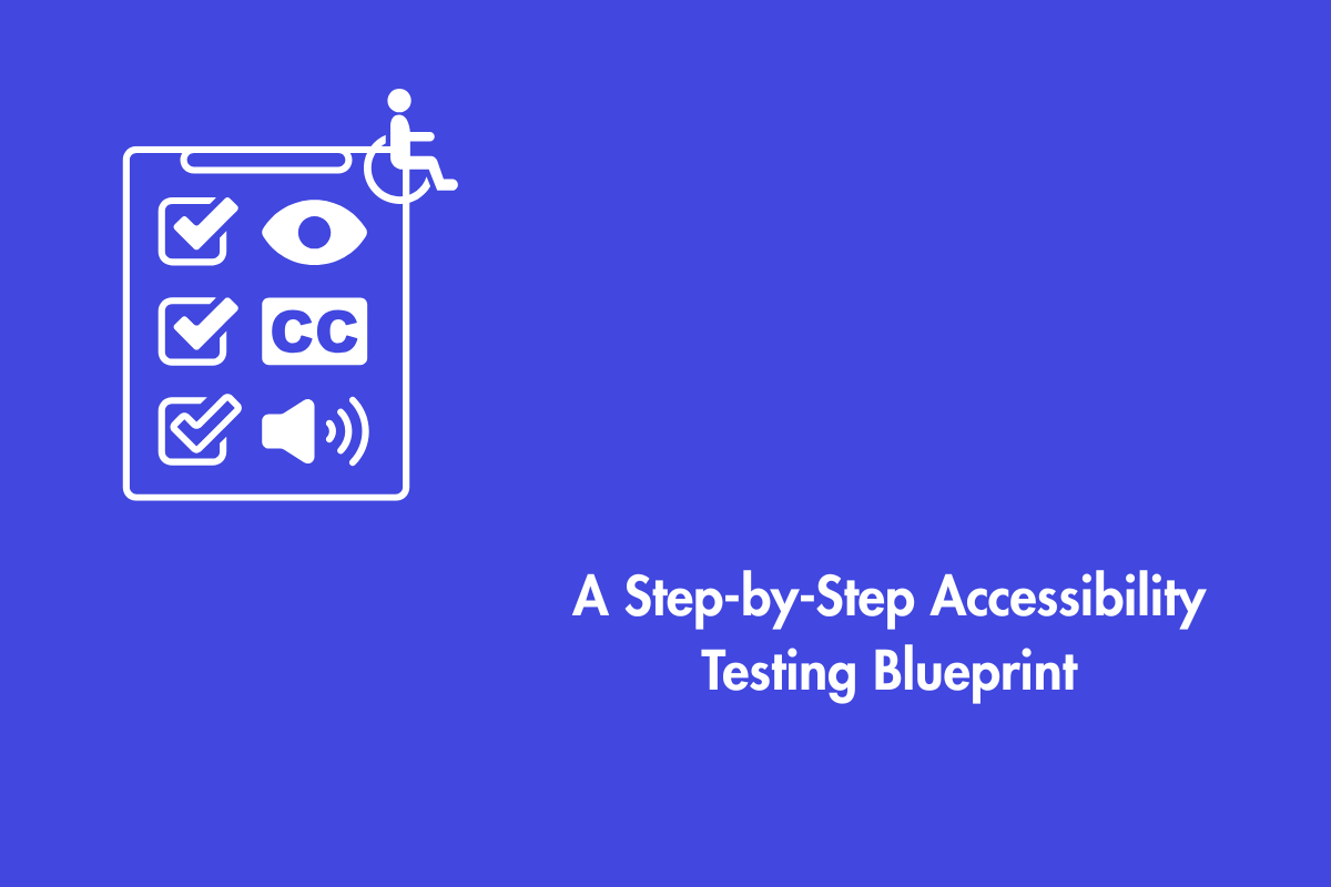
Imagine building a spectacular store, only to find out that the door is locked for a significant number of your customers. This is the daily digital reality for millions when websites and apps ignore accessibility. Accessibility is not an add-on or a special feature, it’s the fundamental architecture of inclusion. But how can you be sure your digital space is truly open to everyone? You don’t guess; you test. This guide cuts through the complexity of Accessibility Conformance Testing, giving you the simple, intuitive rules and methods to ensure no one is left outside.
Table of Contents
In reality, what are we testing against?
Consider accessibility testing akin to a building inspection. You need a clear code to inspect it against. In the cybernated era we live in, the code is known as the Web Content Accessibility Guidelines (WCAG). WCAG is the worldwide standard that divides compliance into three levels:
A (Minimum and Baseline), AA (The Standard Objective and Widely Recommended), andAAA (The Maximum and Most Stringent). Most organizations aim for Level AA to meet for both legal and ethical needs.
Accessibility Conformance Testing (ACT) is the simple process of checking your website or app against these WCAG rules. It’s the systematic inspection that tells you if your digital building is sound or full of violations.
Understanding POUR Principles
The POUR principles (Perceivable, Operable, Understandable, Robust) keep things simple: people need to be able to sense your content, use your interface, follow your logic, and access it reliably with the tools they prefer. When any of these break, someone gets locked out, whether it’s a missing label, a keyboard-only user stuck in a menu, an unclear error message, or a site that only functions on one browser. This guide brings those principles down to earth, showing you the practical rules and checks that make accessibility conformance feel less like compliance and more like basic digital hospitality.
Now, that we understand the building blocks, let’s delve further.
‘The Triad’ of Efficient Testing
Think of accessibility testing as the safety inspection your digital product cannot skip. Just as a building must be checked against a reliable code, your website or app must be examined against established accessibility standards to ensure no one is blocked from entering, using or understanding it. In practice, this inspection sits on three legs: automated scans, manual human checks, and real-world testing with people who rely on assistive technologies. Each leg reveals a different layer of truth. Together, they give you a full picture of how inclusive your experience actually is.
1. The Automated Scan (The Broad Net)
Automated testing tools are your first line of defense. These are software programs that quickly scan your web pages to find common, rule-based issues.
What It Catches: Missing image descriptions, poor color contrast, incorrect HTML structure and missing Form labels.
The Restraints: Automation is smart, but it’s not Intelligent. It can’t point out if an image description is accurate or absurd. It can’t understand if the logical order of the page makes sense. It only catches about 30-40% of potential issues.
Popular Tools: AAC, axe-core, WAVE, Lighthouse.
Actionable Tip: Run an automated accessibility testing on your homepage right now. In two minutes, you’ll spot high-impact problems you can fix immediately.
2. The Manual Check (A Human Eye)
You may simulate real-world use of the interface by actively interacting with it during manual testing. This is something automation cannot replicate. This leg of the stool checks for everything automation misses.
Keyboard-Only Navigation: Put your mouse away. Can you access every interactive element — Links, Buttons & Forms using just the ‘Tab’ key? Is there a visible focus indicator for you to always know where you are? This is crucial for motor-impaired and power users.
Screen Reader Testing: Use a screen reader like ‘NVDA (Windows), VoiceOver (Mac), or JAWS’ to experience your site as a blind user would. Is the content announced logically and clearly? Does the form provide helpful instructions? This feels unfamiliar at first, but it’s a revelation.
Zoom and Magnification: Zoom your browser to 200%. Does the layout break? Does content get clipped or become unreachable? Many users with low vision rely on this simple browser feature.
Actionable Tip: Pick one key task on your site (e.g., “add to cart”). Try to complete it using only your keyboard. You will likely discover navigation traps you never knew existed.
3. The User’s Truth (The Real-World Test)
The most vital leg of the stool as it involves real people with disabilities who bring a layer of understanding and lived experience that no tool or checklist can replicate.
Why It’s Irreplaceable: A user with dyslexia can tell you if your chosen font and spacing actually make reading easier. A motor-impaired user can reveal if a timed form is impossibly fast. They find the practical, frustrating barriers you never anticipated.
How To Do It: You can engage with disabled users through formal usability studies, partner with advocacy groups, or hire specialized testing firms.
Decoding the Rules: A Tester’s Cheat Sheet
WCAG can read like legal code, but most of its rules translate into simple checks you can run in minutes. Think of this as the practical cheat sheet: quick tests, common failures, and the everyday ways accessibility succeeds or breaks. Let’s translate some of the most critical WCAG rules from legal text into practical testing steps.
Rule 1: Keyboard Accessibility (WCAG 2.1.1)
The Test: Tab through your entire page. Can you see where the focus is at all times (a visible focus ring)? Can you activate all buttons and links with the Enter or Space key? Can you open and close all menus?
Common Fail: A custom-made dropdown menu that opens on mouse hover.
Rule 2: Meaningful Sequence (WCAG 1.3.2)
The Test: Turn on your screen reader and listen. Does the order in which content is read aloud match the visual logic of the page? Does it jump from the header to the footer and then back to the main content?
Common Fail: Using CSS to visually position content in one order, while the underlying HTML code places it in another. CSS moves elements visually but the HTML order stays messy.
Rule 3: Color is Not the Only Visual Means (WCAG 1.4.1)
The Test: Look at all the places you use color to convey information. In a form, is the only indicator of an error a red outline? On a graph, is the only difference between bars their color?
Common Fail: A form message that says “The fields in Red are required” with no supporting icons or text.
Rule 4: Link Purpose (WCAG 2.4.4)
The Test: Read every link on a page out of context. Does “Click Here” or “Read More” tell you anything? A screen reader user often navigates by a list of links; imagine hearing “Click Here, Click Here, Click Here” with no other information.
Common Fail: Using generic, non-descriptive link text throughout a site.
Building Your Testing Workflow: A Step-by-Step Plan
Testing isn’t a one-time event. It’s an ongoing process.. Integrate this process into your development lifecycle. Here’s a simple way to weave accessibility testing into every stage of your workflow.
Plan & Scope: Decide what you’re testing. Is it a single new component, a full page, or an entire user journey? Decide your target conformance level (AA is the standard).
Automate First: Run your automated tools across the scoped area. This catches the low-hanging fruit and gives you a quick win list of fixes.
Manual Deep Dive: For the key pages and flows, conduct your manual keyboard and screen reader tests. This is where you find the complex, interactive bugs.
User Validation: For major launches or redesigns, include users with disabilities to validate your fixes and uncover hidden issues.
Report & Prioritize: Document your findings clearly. Categorize them by severity (e.g., Critical, Major, Minor) so your team knows what to fix first.
Re-test: After development makes fixes, go back and test again. This closes the loop and ensures the problems are truly resolved.
The Bigger Picture!
Moving beyond compliance to embrace genuine inclusion transforms your work. An accessible website isn’t just about avoiding lawsuits; it’s about building a better, more resilient product for everyone. Accessibility isn’t something you finish. It’s something you build into every step of your process. When you treat accessibility as an ongoing habit, your product becomes naturally more inclusive for everyone.
The curb-cut effect is a perfect example. Ramps designed for people in wheelchairs also benefit parents with strollers, travelers with rolling suitcases, and delivery workers. Similarly, captions added for deaf users help people watching videos in a noisy gym or a quiet library. Clear navigation and simple language help non-native speakers and those with cognitive differences.
By testing for accessibility, you are not just checking boxes. You are building a more robust, user-friendly, and future-proof digital experience. You are ensuring that your magnificent digital store has a wide, automatic door that welcomes everyone in. You are choosing to build a web that is truly for all.